Almost every digital marketing campaign today is based on a jump, offer or signup pages.
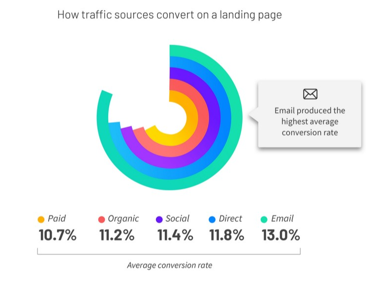
According to a recent survey by Unbounce Marketing, an average conversion rate of effective product pages varies between 10.7% and 13.0% regarding the traffic source.
Email campaigns paired with lead-capture tools tend to generate more leads and sales comparing to other traffic sources.
Unlike home pages aimed at showcasing online business, product web pages are to encourage visitors to act – sign up for a newsletter, buy a product, watch media files or whatever.
Some product microsites are very successful while others don’t serve their purpose well.
What makes a great landing page a powerful sales funnel?
Medium.com
What you will learn:
The role of highly converting landing pages for online business
Why should you create a high-converting landing page?
First, if you’re going to sell a product or service as part of a marketing campaign, a homepage or inner pages are not a good means to an end as they include distracting content.
Second, microsites are value for money and work well for boosting the number of conversions.
What you can build:
- squeeze or lead-capture page to learn more about users;
- reference or click-through page to educate online readers about your unique selling point;
- transactional page to entice people to complete an action;
- microsite to demonstrate your business idea, project or an end product.
Finally, if you’re planning to improve your search engine ranking, you can’t go without building a jump page.
Generally speaking, landing pages function as microsites. Their goal is to communicate an offer to the audience, collect leads, convert random visitors into paying clients, get top rankings in Google.
How to create a high-converting landing page: a detailed guide
There are tons of content giving expert advice on how to craft a jump page that converts.
However, you should understand that there is no all-purpose approach to it as every industry is specific.
We’ve decided to share our view on the creation of landing layouts and made a list of useful tips.
What and for who
The first task on your way to a landing page that converts is to find your core audience.
They may be pensioners who are planning a trip around the world; a teenager looking for a new phone case; a startupper who needs an online budget planner.
When you have a clear portrait of your prospects together with their preferences, problems, and desires, it’s far easier to make them pleased.
Start with prototyping your ideal customer. Literally. Create this person, give him or her a name, think about their family and friends, interests and hobbies.
In marketing, it’s called a buyer persona.
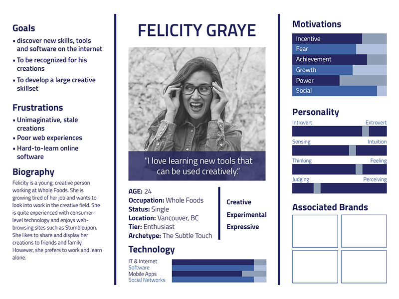
If you have more than one target group of customers, differentiate them by social-demographic features, language, tone — it will help to craft several product offers.
Next, talk to your prospects. The easiest is to ask your friends and family what they would like to see on your microsite if they were your customers.
Look for forums, communities, blogs where your potential customer could hang out and talk to them directly.
After that, discover what makes people satisfied. It may be something that generates feedback or provokes debates. Or something that’s very popular and hype.
Lastly, look at your competitors. Critically scrutinise what they put on their websites and what products or services they offer.
All this will help you to speak the same language with your clientele and solve their pain points.
More is better
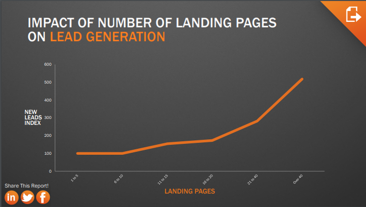
In its recent survey, HubSpot reports that over 40 offer pages on a website may enhance conversions up to 500%.
If you think this number is too high, note that companies with 10-15 product pages see a 55% increase in leads. On the other hand, most firms don’t notice any changes in the lead quantity when increasing the total number of landing pages from 1-5 to 6-10.
Why do you need many high converting landing pages?
- they increase the likelihood that online readers will find your jump page;
- enhance your Google/Facebook ads campaign;
- provide an optimal way to run A/B tests and confirm your assumptions;
- bring more leads through social sharing;
- help you attract different target markets and differentiate your offers.
Copy is king
A copy is the heart of any landing page. The method you choose to communicate your message will define whether or not your marketing channel is influential.
Writing a good copy is a big deal, and it’s better to delegate it to a professional copywriter.
A few things for you to bear in mind.
Speak about benefits rather than features and characteristics.
Of course, you love your product or service, but people you are talking to are not interested in it. They want to see how it’s going to help them solve their tasks, so bring the value of your solution to the fore.
Create eye-grabbing headlines and scannable paragraphs. Online readers tend to skim web pages and often pay attention to subheadings, bullet points, infographics.
What else should you remember to make your copy stronger and more appealing?
- structure your text blocks, make sections shorter and use numbered lists;
- add relevant images, data, and infographics to enhance the visualisation;
- simplify everything: from the word choice to the language patterns;
- avoid cliches, be clear and straightforward;
- write like you talk to sound more natural;
- test your CTAs to see what encourages people to complete an action.
Make use of media content
Here are a few facts about images and videos:
- users spend more time on websites with the relevant and informative media content;
- people tend to memorise 65% information if it includes images, infographics, or other visual elements;
- today users spend 10M minutes more watching video content than a couple of years ago.
Hope these reasons are convincing enough for you to start adding killing images and clips to your marketing pages.
Finding proper visual elements can be tricky though.
The most important tip: if you use a hero image or a video, make sure it’something your target customer can relate to. The majority of companies do the opposite — show off their products and inventions rather than consider clients as a focal point.
As a result, such microsites don’t evoke emotions and are far from resonating in potential customers.
Another hint on how to make a great landing page is about using visuals to emphasise your CTAs.
Given that a call-to-action is an integral component of your product page, you can put it in the spotlight by scattering other design elements around it.
Using photos or images that reflect a client’s’ emotions when their goal is achieved is a win-win.
The good idea is to run A/B tests to find out what page layout is bringing you more conversions.
For example, version A will have an image that describes users’ challenges and version B will come with a photo that reflects their feelings when the problem is solved. Google Analytics, as well as other online marketing software, allows measuring the KPIs of various design versions.
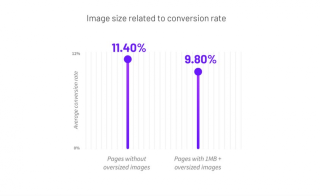
Another little detail is to keep in mind that image size greatly influences page loading time and conversion rate.
Offer like a pro
How to force people to stay on your microsite and click on CTA?
Easy-peasy: make your offer or value proposition non-obtrusive and understandable.
Begin with mapping out your offer. It may include a headline, a subheading, a short list of benefits, media elements.
Then, try to make it short and simple so that anyone can understand what you mean. Use non-technical language, tell about the outcome, highlight the difference, keep it short.
Don’t forget that your offer should be unique even if there are hundreds of similar products on the web.
What you can do to find your key differentiator:
- perform a SWOT analysis. Discover your strengths and weaknesses, think about potential threats and opportunities;
- compare your value with existing offers as it may help you find things which you can do better than others: customer service, shipping methods, atmosphere;
- validate your business assumptions by running Google and Facebook ads campaigns.
Generate trust
Human beings very much rely on the opinion of others. In psychology, it’s called social proof.
Remember the last time you were buying or ordering something online? We bet you read feedback, considered stars, and searched for critiques.
When a random visitor drops by your landing page, they may not trust your compelling copy at once. Instead, they want some social proof of your product or service value and usefulness.
Client testimonials are a great idea in this case.
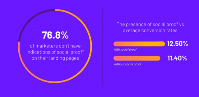
The presence of social proof on your website is likely to increase conversions up to 12,50%. If you already have some regulars, ask them for feedback and share it with the world.
How to make people believe the testimonials on your landing page:
- ask existing clients to share their stories about how your product or service helped their business;
- make the section noticeable by adding animation, visuals, and social media buttons;
- match reviews with actual products or features that were beneficial for your clientele;
- make sure the text sounds natural.
Examples of high-converting landing pages you will want to copy
Seeing is believing.
Let’s check out some great examples of high converting eCommerce landing pages and microsites that will boost your creativity.
Some of them are just landing page, while some are a combo of a homepage and a product page.
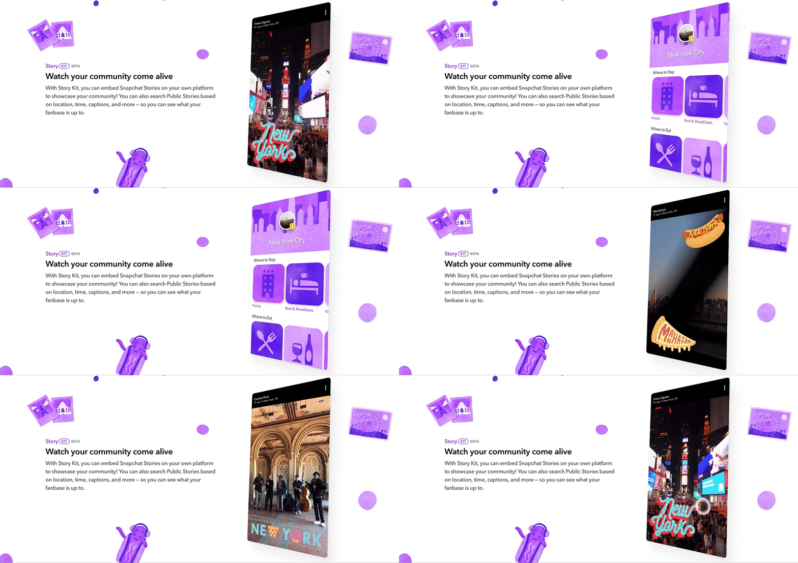
What you may want to borrow:
- engaging design with bold colours and user-friendly navigation;
- highlighting app benefits for users in every feature section;
- adding animations to make browsing a real fun;
- publishing testimonials and direct CTAs like Try Snap Kit, Play Video, Get Started.
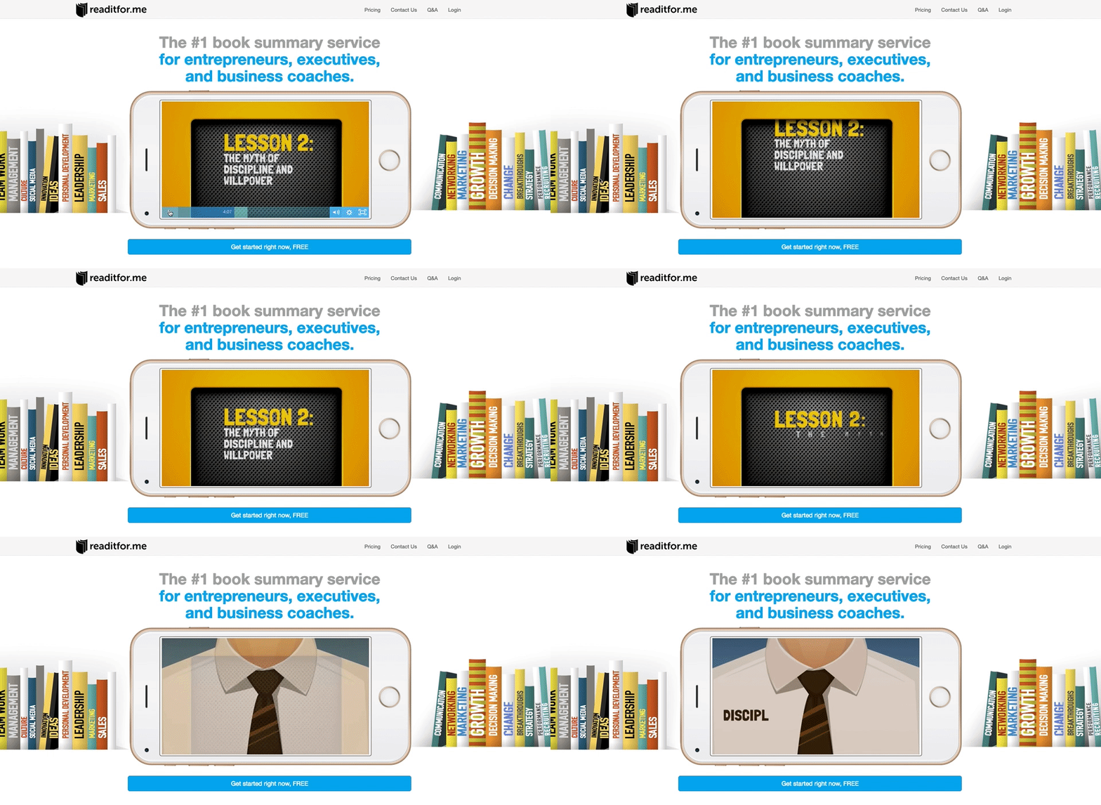
What you may want to steal:
- a video promoting the service;
- responses based on personal experience that sound natural;
- a laconic and plain-spoken headline: “The #1 book summary service for entrepreneurs, executives, and business coaches.”
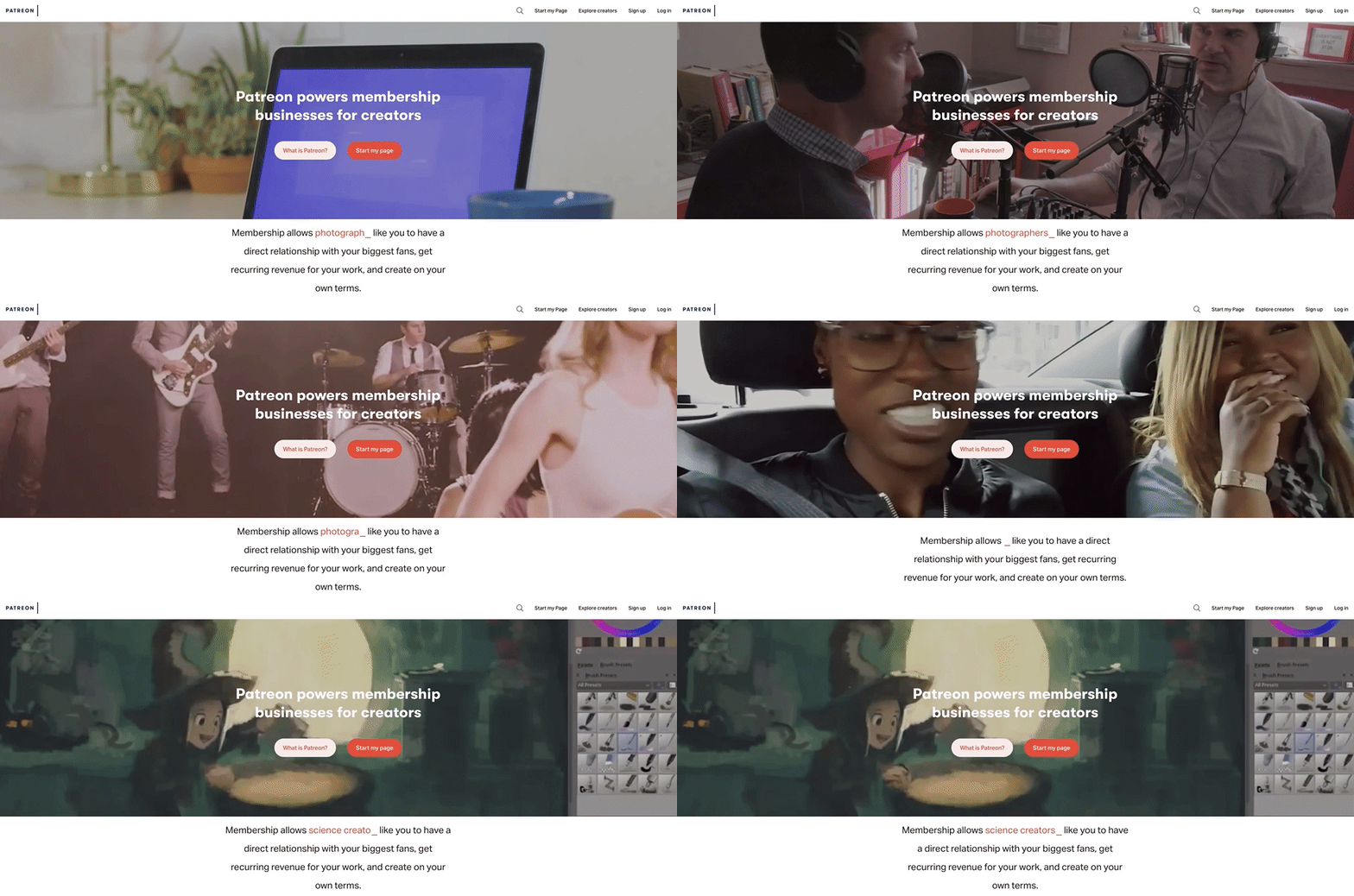
What you may want to copy:
- simple and handy menu that consists of several elements;
- background video in the main section;
- strong headlines and subheadings;
- modern and light design that highlights the brand uniqueness;
- focus on a service merits for users.
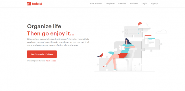
What you may want to copy:
- educational media content explaining how the platform works;
- persuasive and user-centred headlines like “Organise life. Then go enjoy it;
- testimonials and partners section;
- several eye-catching CTAs that stand out;
- clean design with custom illustration and graphics.
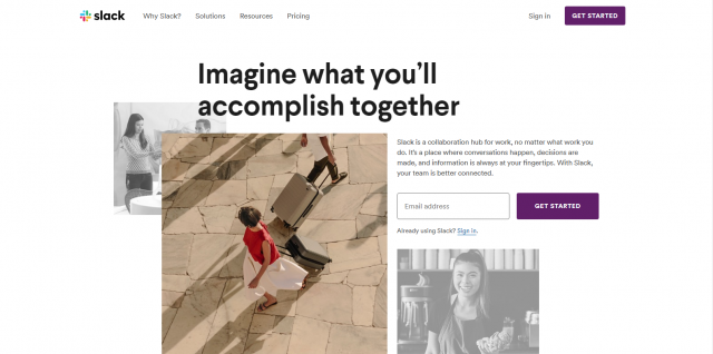
What you may want to copy:
- laconic opt-in form in the first website section;
- various kinds of CTAs: Learn More, Get an E-book, Get Started;
- creative custom iconography and life-like images;
- social proof section.
Our projects
We at JustCoded know a thing or two about design and marketing and will show you how to create a landing page that converts with our own example.
Although most of our projects are NDA protected, we have designed landing pages for our in-house products.
Meet LenderKit — a software for building online investment and crowdfunding platforms.
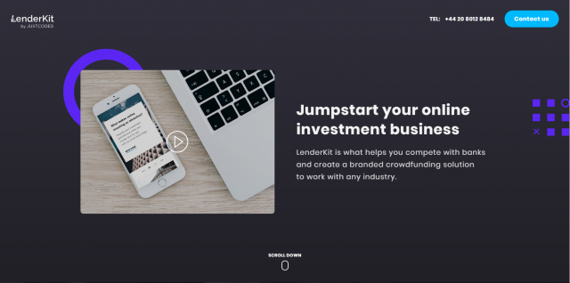
What you may want to copy:
- handy navigation and well-thought layout;
- explanatory video;
- simple copy written in an understandable language;
- clean flat design with optimal typography, natural colours, and shapes;
- mobile-optimised site that loads in seconds.
Wrapping up
Creating landing pages that convert is not difficult if you know the right way.
We can summarise all the tips from this post in one statement.
Either you go with ready-made templates or craft a product page on your own, always focus on the end user.
Hope to see your landing page in the list of top-notch design examples soon!
We have a straightforward design process in place to reach the best results so if you need help designing your page or website, give us a shout.


