Imagine two situations.
A friend of yours has failed an important job interview and didn’t get a dream offer. You understand all the tragedy and recommend upgrading his or her skills to apply for this job later.
And now imagine that this very friend already got a job and is going to get married. You’re beyond happy for intending spouses. You help with preps, run errands and feel like you’re a going on a honeymoon to French Riviera.
In both cases, you get a feel for your friend and try to be helpful. You show empathy.
Empathising is important not only in private life. It’s super beneficial for businesses wanting to know their clients better.
Today we’re going to talk about the benefits of empathy maps in UX design: what, how and why.
What you will learn:
What is an empathy map and how does it benefit you?
Let’s start at the very beginning.
Empathy is the ability to get a sense of the feelings of others; a way to reveal people’s thoughts and experience.
Empathising is about stepping into someone’s shoes or seeing through someone’s eyes if you wish.
But if in the case of your friend, it’s a piece of cake –you ask and get an honest answer (or not so honest). When it comes to crawling into your customer’s head, the real adventure takes place.
What is an empathy map?
It’s an attribute for design thinking, a visualising technique aimed at summarising everything we know about the potential customer or buyer persona.
Creation of visual maps accompany the research phase, that’s why it’s important to give special attention to this technique at the start of the project cycle.
Dave Gray, a visualisation guru, suggested using special maps to reveal the hidden needs of clients. Needs not wants.
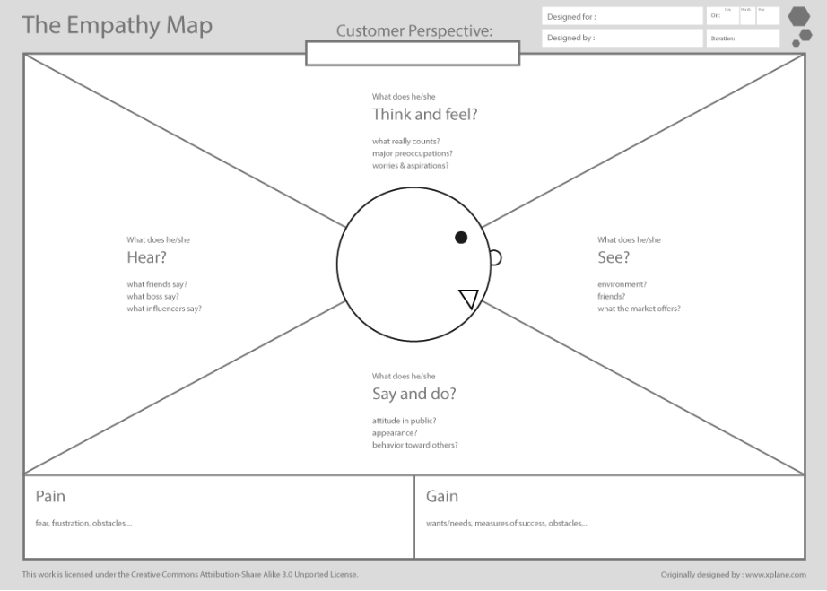
The template Dave shares with everyone is a plain picture with a cartoon head in the centre and four or six quadrants. Each describes a certain aspect of the buyer persona: thoughts and feelings, words and actions, perception through vision and hearing.

Plus, there are two sections for clients’ pains (problems they want to solve) and gains (solutions to these issues).
No matter what your imaginable client will look like or how you’ll name the sections, the result should be a full picture of your buyer persona.
For instance, Adobe suggests that you divide a map into 5 categories: feelings, tasks, influences, pain points, and the overall goal.
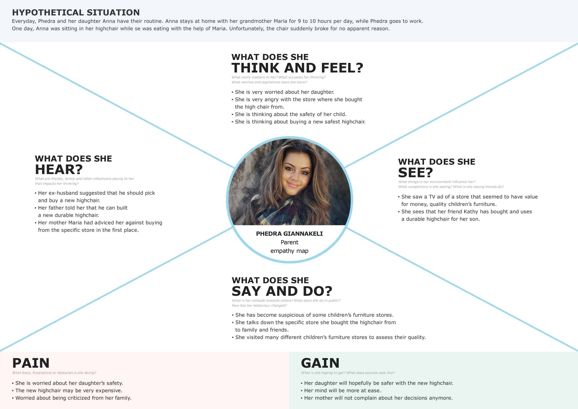
Here’s what an example of what an empathy map looks like after having done proper brainstorming and empathy session:

To some extent, empathy mapping reminds a brainstorming technique called Cubing. If you have a topic, problem or issue, you try to analyse each aspect aka a cube’s side to grasp all the details that may shape your strategy.
By the way, what’s the difference between design thinking empathy map and buyer persona?
To answer this question, let us share the Quora comments embracing all the differences between the notions.
To put it simply, design thinking is an approach to problem-solving that concentrate on the ultimate goal – to deliver the solution.
Empathy mapping is a tool in design thinking and UX focused mainly on users’ emotional aspect.
In the case of visual maps vs buyer personas, it seems to be more complicated. Both things are co-dependent but with a slight difference in nature.
Buyer personas are models of real people, your core market. They come in the form of documentation or visual presentations.
If you’re selling skates for teenagers in California, then your target market is boys and girls aged 14-17 living in Sacramento. It’s an aggregated image of your buyer persona.

Unlike the mapping technique, buyer personas don’t include the info about users’ needs, they mainly focus on their buying habits, behavioural patterns and viewpoint.
You can have several buyer personas and create a visual presentation for each of them. Or synthesize all your customer models in one empathy map (it also works this way).
Note, that synthesized maps are good only for preliminary analysis since they’re too generic.
How and why use empathy maps?
Let’s look at the merits of this technique for product creators and the core audience.
Benefit #1. Empathy mapping is an easy and quick task to complete. There’s no need to invest lots of time and money in the process. All you need is a team and simple equipment. As an alternative, you can apply software that is advanced yet affordable even for a slim budget.
Benefit #2. The visualisation process allows involving many people. You invite product owners, management, tech and non-tech specialists, designers. The more ideas and point of views you get, the better.
Benefit #3. It helps creators think beyond their expectations and understand that their ideal product vision may differ from the clients’ point of view.
Benefit #4. Using empathy maps for better UX design goes beyond the research stage. They can function as an additional tool or a guideline for further design and development steps – prototyping, mockuping and testing.
Benefit #5. Using the data from field survey, empathy maps create a life-like image of your marketing persona rather than subjective insights. It means they’re a reliable source of information.
Benefit #6. These tools are universal and can be applied to any domain, industry or type of business.
Those companies doing empathy mapping compare favourably with those who don’t.
Gartner predicts that almost 90% of businesses will be competing for client experience in the nearest future.
Those taking this task as a priority will stand apart from the crowd. In this regard, by applying visual mapping, companies will be on the same page with clients and achieve a boost in sales and profits.
Okay, now let’s talk about how to use these smart maps.
4X and 6X empathy maps for UX designers
To understand better the idea of mapping, let’s assume that you’re developing a banking app that will cater to the most important needs your clientele have.
A classic map consists of several areas:
- What does a client do and say? This aspect includes the steps clients take to launch and use your app, their reaction and feedback to the product’s toolkit and the way it works. You can get this info from the body language and interview transcript.
- What does a client feel and think? Unlike the first block, this one is much harder to fill in. It’s for possible thoughts, emotions and feelings the client has throughout the test-drive. The psychological aspect requires a lot of guesswork on what the user conceals or really has in mind. For instance, either they fancy the virtual assistant or it irritates them but they remain silent.
- What does a client see? Everything related to the market, environment and surroundings refers to this block. For instance, what alternative apps exist on the market? How often and why do the client’s friends and family use them?
- What does a client hear? Just like in the “See area, this part consists of factors or people affecting the decision-making process. What do their colleagues say about banking apps? How do reviews and testimonials influence the buyer’s decision?
- What are his/her pains (problems)? This block is very important as it describes challenges, pain points and extra drivers affecting clients’ success. Has a person got an optimal experience with mobile banking? What problems do they face while using such apps?
- What does he/she want to gain? This one is for benefits and solutions the buyer persona needs to cope with the existing challenges. What functionality do people want to see in a banking app? What issues can it solve? What is the user’s idea of success?
How to build an empathy map: tips and hints
The visualisation process should ideally take place at the introductory or business analysis stages prior to the development of product specs and project strategy.
For instance, the development process at JustCoded consists of 5 stages:
- Discovery and planning.
- Business analysis.
- UX/UI design.
- Development and testing.
- Launch and post-launch support.
We empathy map within the first two stages preparing the ground for project requirements, user stories and flows, wireframes and prototypes.
Later, an empathy map helps UX teams to keep in mind the buyer persona and create an optimal user experience and interface.
Typically, empathy mapping looks like as follows.
1. Collecting data
Right from the start, you should forge a clear vision of your marketing persona, their demographics, background, hobbies, buying habits.
There are several ways to collect this info: online surveys, crowd marketing, one-on-one talks with potential clients, communication via social media, focus groups, interviews, etc.
2. Getting prepared
Now think about the end goal of the whole deal. Why do you need a map?
To better understand your clientele or to discover a behavioural pattern of factor influencing the client’s decision in a given situation.
Then you need to make a list of questions for each section of your map. Questions should be clear and straightforward.
Also, assign a person who’ll be moderating the discussion since it’s better to do this task collectively.
The moderator should understand the end goal of the process and ask questions without expressing their subjective judgement.
3. Brainstorming
Print visual materials and give sticky notes to each team member. When the moderator asks the question, everyone writes their answers. Then all the answers are put on the board. To distinguish answers to different questions and group them, use colourful post-it notes.
4. Summarising
At the end of the meeting, group all the notes under a category they refer to. By analysing the results, you can make a conclusion of what drives the user’s buying decisions and what behaviour is likely to happen in a certain case.
If your team is scattered, there is the only way to get everyone together – online software like Mind Tools, Creatlr or Userbitapp.
We love the last tool and use it in designing bespoke UX for our clients.
Other tips for efficient empathy mapping:
- don’t rush, invest more time in the process;
- add as many details about the buying persona as possible;
- involve specialists from different departments and a management team in the discussion;
- save the draft with the summary for further processes;
- create new maps for new markets.
Bottomline
There has been much talk about a reason to use empathy maps and the flow of this procedure. Now let’s sum up:
- Empathy maps are a cool visualising method to get a synthesised knowledge of ideal customer base.
- Research results are the data for visual mapping. The delivery is the description of customers’ needs, their behavioural patterns and attitude.
- Meetings should be well-thought-out and require some preparations.
- Visual presentations can be created manually or with the help of online software.
If you like the article and want to continue the discussion, drop a comment below 😉 For business inquiries, contact us by email.


