Novice designers, web developers, project managers, and copywriters ask around Q&A websites striving to grasp the difference between wireframe mockup and prototype.
Despite being very similar, these terms have a different nature that makes them stand-alone yet interlinked.
We’ve decided to get to the bottom of this topic ourselves. Here is what we learned.
What you will learn:
What is a wireframe?
Imagine you want to build a house.
First, you need to define where you will have rooms, bathrooms, corridors because the layout affects how you’ll connect electricity, where and what kind of doors you’ll install and so on.
What you need is a plan.
A wireframe is a plan of your website that outlines the arrangement of textual and media elements.
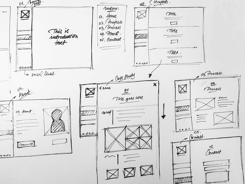
Sometimes ideas come to your head in the least expected situations, so website wireframes can be sketched with anything from a pen on a piece of paper.
The main thing here is to fix whatever came to your mind really fast so that you can return to it later. This is what a hand-sketched wireframe may look like:
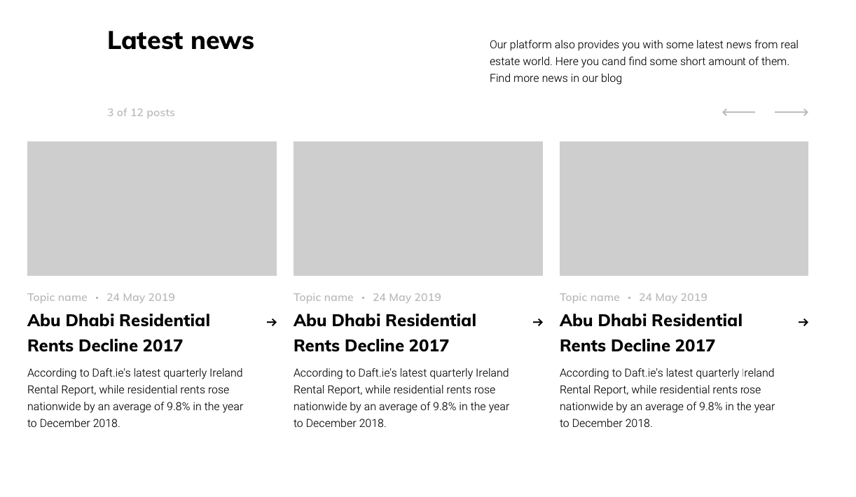
Besides, designers and business analysts, who create wireframes, use special software. We will talk about it in detail later.
We usually create wireframes in Sketch (software for designers) and it looks black and grey. This is the primary step that marks the early development stage. A wireframe can be used to develop a specification as well.
Why is wireframing important?
Before wireframing a simple visual structure, we learn the initial requirements and conduct basic research.
Skipping this step you risk getting the design of your website wrong. And by wrong, we don’t mean ugly. It may not serve the business needs that are closely related to the needs of your visitors.
Some designers go straight to the visual design creation (UI) without any research and wireframing (UX). Instead of saying they are wrong, I’d rather give you a few reasons that may change your approach and help realise why you need to spend extra time (and money, of course) for the planning stage.
Abstract structure visualisation
Research is one of the very crucial steps in the design process: we learn about your business, your current website, any issues that occur, where on the website you lose potential customers, and how an average visitor behaves on your website.
This analysis is called UX research, and the findings help us create a wireframe that reflects the needs of your business as well as the needs of your target audience.
They are usually black/grey and white and convey the layout of the main navigation, sections, buttons, and text blocks.
In addition, wireframes allow you to understand what content you’ll need to provide or produce: text, images, videos, etc.
Early feedback from the client
Creating a skeleton of a website let us understand whether or not we meet your requirements.
Wireframing tools allow both parties—the designers and the client—discuss and comment on a sketch.
Our clients know a whole lot about their business, however, they are not necessarily tech-savvy. This is totally okay because wireframes allow us to visually explain what we mean when we say these odd phrases like multi-level menus, carousel, or parallax.
As a result, you understand the layout of every page and can give us your thoughts on it.
Easy amendment
Whether our wireframe is hand-drawn or made in a program, we can easily update it during each iteration.
Remember: it’s way easier and cheaper to adjust a wireframe than completely revamp a ready-made design.
It’s like with that house example I gave at the beginning: if you’ve already tiled your bathroom, it will cost you a fortune to make changes to the water supply system or add an extra faucet somewhere.
Types of wireframes
Wireframes vary according to the level of detail aka fidelity.
They can be low-fidelity (or lo-fi) and high-fidelity (hi-fi). This is what sets them apart from prototypes and mockups.
Low-fidelity wireframes
They are quick, flexible, and easy to discard. Sometimes we even draw them on a white-board during our brainstorming sessions, and this is how they look in the digital form:
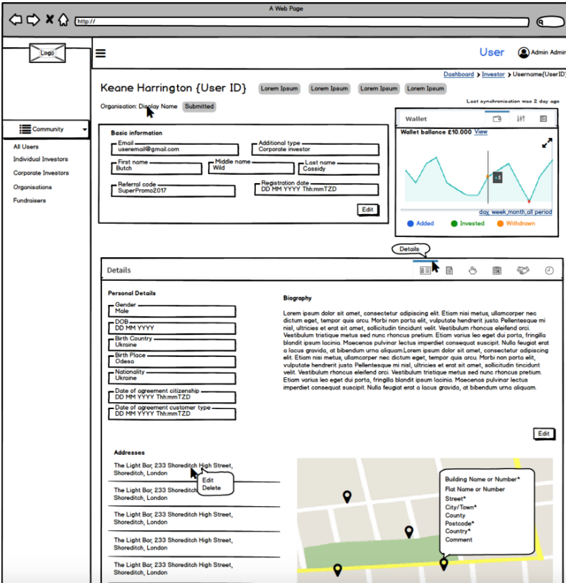
As you can see, there is no real text and nothing looks even close to sophisticated. Yet, this page already helps us see the big picture and notice whether we’re missing something.
Abstract wireframes are very quick to make and easy to change, that’s why they are mostly used at the early stages of a project.
High-fidelity wireframes
This is where different designers have completely different views 🙂
Some say that a high-fidelity wireframe is a ready visual presentation of a website.
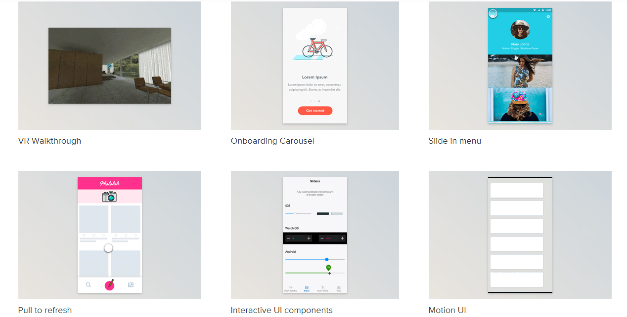
At JustCoded, we agreed that a high-fidelity wireframe is still a grayscale image but it’s more precise in terms of layout, text, and visual elements. If a button is round it means it will be round in the final visual design, too.
Here’s an example of a hi-fi wireframe we’ve created for one of our current projects:
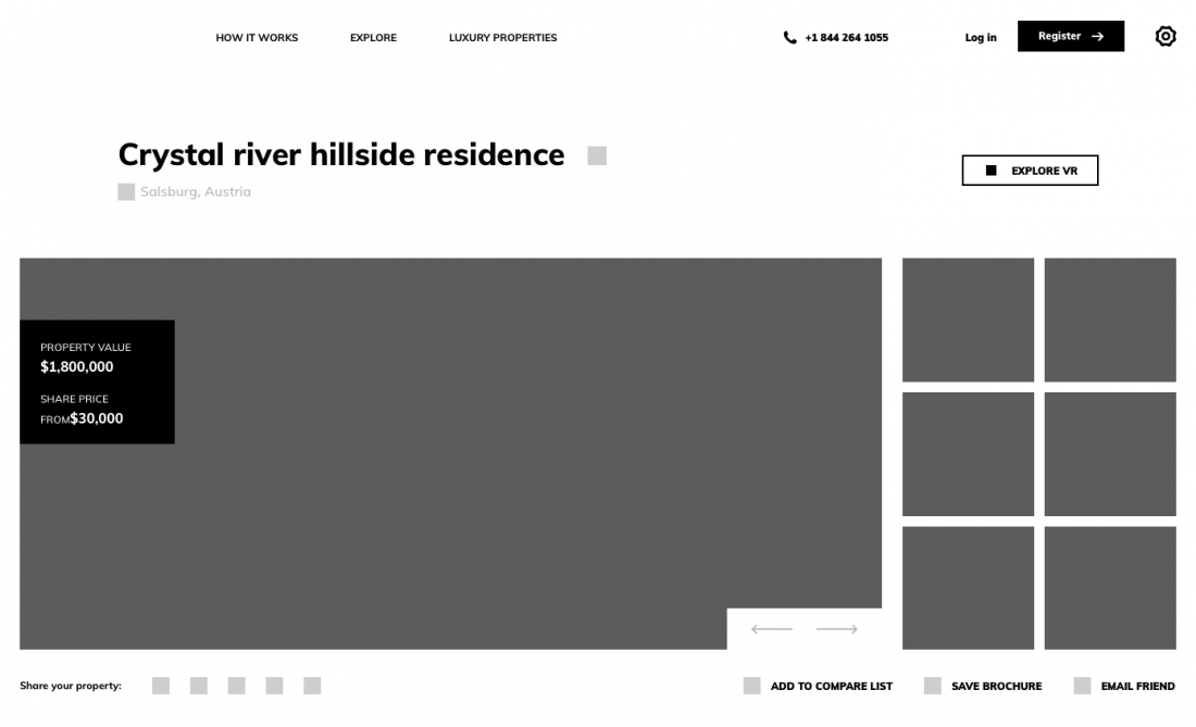
The more precise a presentation is, the better.
Mixed outlines
The middle way is somewhere between the first and the second approach.
It is called a hybrid method when you start with a raw plan and then make some areas more detailed.
This technique is a perfect fit for websites with several sophisticated areas. The greatest thing about the mixed type is that it provides the opportunity to achieve more flexibility.
What tools are used for creating wireframes
There is a myriad of wireframing tools on the market, each with a different a different set of functions.
Here’s a selection of software you can use if you decide to wireframe your own project.
Mockplus
It is by far the quickest and the most intuitive tool for making smart wireframes.
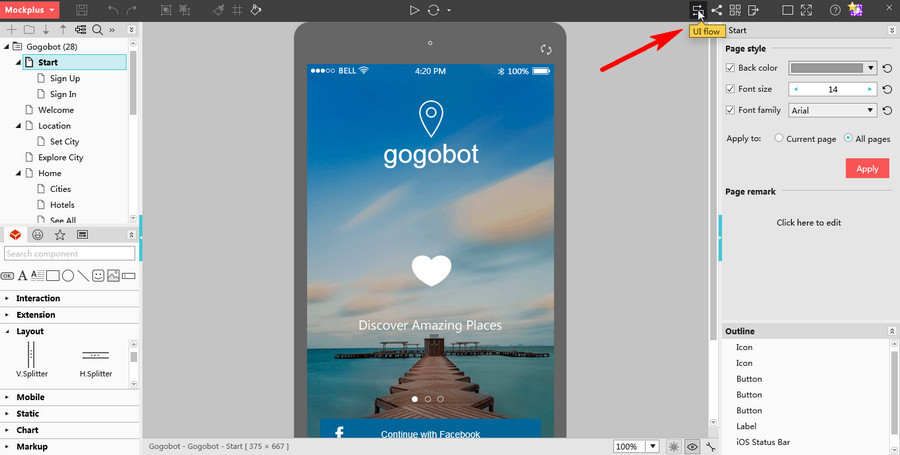
Mockplus is a WYSIWYG editor and a drag-and-drop builder that allows turning predefined elements into ready-made sketches in a matter of minutes.
No coding skills are needed.
Moreover, you can test your wireframes on any device.
Balsamiq mockups
Balsamiq is a one-size-to-fit-all solution intended for creating wireframes of websites, mobile apps, dialogue boxes, etc.
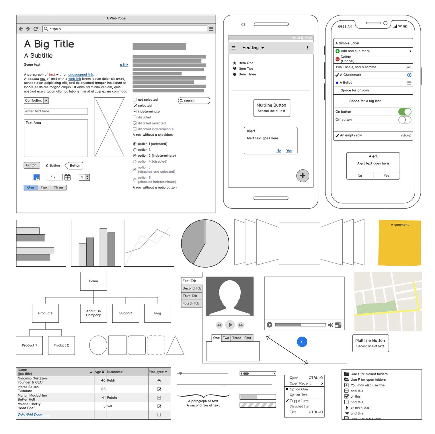
It lets teams collaborate productively within the design process right in their environment.
Lucidchart
Lucidchart is ideal for creating user flow diagrams, wireframing, sketching roadmaps and many other things.
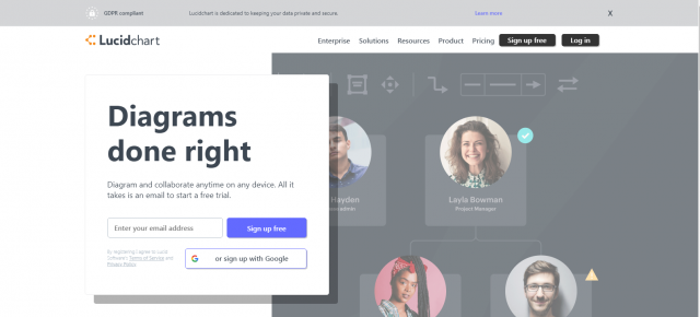
It is very feature-rich and suits any project—from a small to big.
It offers solutions for sales teams, engineers, project managers and other types of users.
Wireframe CC
Need something simple? Try Wireframe CC.
The interface is super user-friendly with minimal yet adequate functionality.
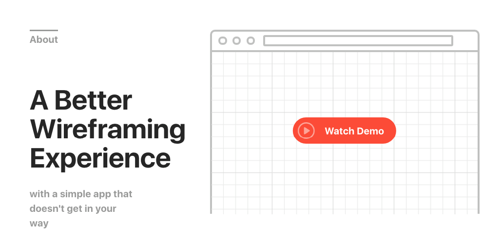
Even a newbie can easily build a sketch with Wireframe CC.
There are free as well as extensive plans with extra features if you are more ambitious.
What is a prototype?
This is another case where designers do not completely agree regarding the definition, but one thing is universal: a prototype allows to see your website or product in action, that’s why it’s clickable.
The prototypes we create look like the final designed pages linked together. We usually demonstrate them via InVision.
Why is the prototype important?
If you hesitate whether or not to start with building a prototype, here are a few points that may change your mind.
Project demonstration
Unlike wireframes, prototypes are crafted with a great level of detail as they are applied to real interaction simulations. Prototypes may vary from simple product overviews to “semi-final versions of apps or software.
Simplified product models usually come with a system structure, its features, interactions, and content.
User testing
The goal of website demos is to make sure that you’re doing the right thing. The common mistake is to think that user testing comes after the site launch.
Actually, it’ much harder to make amends in a finished system rather than change its early model.
Collecting users’ opinions greatly helps in making the best version of a product.
Types of prototypes
There are many types of prototypes and they serve some unique purpose.
Paper sketches
A good way to get started. Paper, pencil, and an excellent idea is everything you need.
Don’t like the outcome? Crumple the paper and throw it away, start again.
Presentation software
It is another solution for newbies in prototyping.
Instead of getting into how a sophisticated program works, you can start with making a simple product overview.
Pro solutions
Basic presentation programs are not suitable for big projects with lots of parties while professional prototyping tools serve this purpose well.
Plus, you can always share a sketch with colleagues.
Interactive demos
This is our way of doing the prototypes at JustCoded.
You get a clickable model that looks like a finished product. If approved, we will create mobile and tablet versions based on it.
Speaking about the difference between mockup and prototype, it’s hard to say that there’s a clear one.
Experts state that prototypes are more like sketches yet very detailed, while mockups can be considered as finished designs.
Just like mockups, prototypes are designed for the client and end-users.
What tools are used for creating a prototype
Just like with wireframes, the market is full of tons of tools. Here’s a selection we suggest to review.
InVision
A cross-functional platform for prototyping and designing. Our favourite so far.
It has all the essential features for rapid site modelling: the drag-and-drop, responsive templates, one-click files import, previewing on different devices.
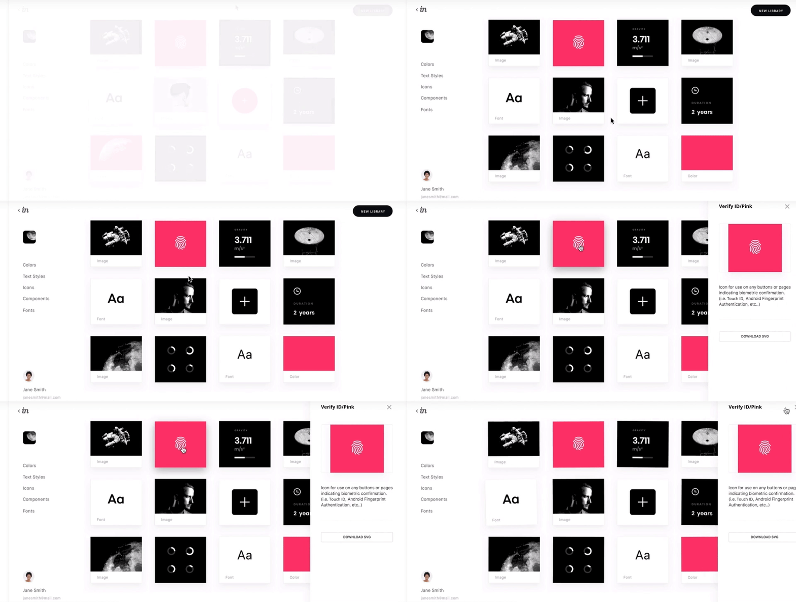
For experienced users, there are other bells and whistles – mobile skins, micro-interactions, animated effects, gestures.
Origami Studio
If you want to be as successful as Facebook, Messenger or Instagram, go for Origami.
Within the platform, you can:
- make prototypes with layers, masks, and live camera;
- integrate built-in components for Material and iOS design;
- simulate interactions;
- preview, test, and amend the outcome.
Proto.io
Need an instant result? Go for Proto.
Introducing Proto.io 6 from Proto.io on Vimeo.
The app is very intuitive and easy-to-use. It is designed for creating hi-fi samples, testing project ideas, and sharing the outcome.
The solution is packed with advanced features like Asset Manager, gradient colours, vector animation, UI libraries, and masks.
Justinmind
A handy tool for building functional web and mobile prototypes for free.
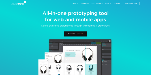
You can make detailed demos out of UI kits and test them on any screen size.
To get a real feeling of a product, add smart forms and lists, interactions and transitions, and animated elements.
What we like about Justinmind is its integration with project management tools like JIRA and TFS.
Wireframe vs prototype usability testing
The house building is a gradual process with several construction stages. No matter either it’s a roof competition or interior set-up, the final results are compared with the plan and undergo thorough checks.
The same is with web design sketches. To make sure that you’re heading the right way, it’s essential to run a usability testing.
Right at the early stages, it’s important to make up a focus group who will be testing lo-fi and hi-fi models.
You should develop tests for static and interactive designs so that testers can share their feedback on the look and functionality of your site.
Make a list of questions to find out what testers see, how they understand and interact with a website interface.
These questions may include:
- What do you see on the page?
- What will happen if you click this link/button?
- Is the navigation mechanism simple and comprehensible?
- Are there any design elements you don’t understand?
Other tips to make prototyping vs wireframing usability testing more effective:
- make sure that the prototype fully reflects the design concept of a future website;
- create a detailed guideline and explain the limitations of the wireframe/prototype;
- test both lo-fi and hi-fi sketches; if it’s impossible – run tests on medium versions;
- use realistic tests, images, data;
- provide testers with real examples of similar prototypes.
Detailed instructions and clear questions will help users understand their tasks and provide you with high-quality feedback.
What is a mockup?
The last in the row is a mockup—a full-fledged site version designed prior to the product rollout.
Mockuping is geared towards providing visual insight into a product concept.
Unlike wireframes and prototypes, mockups reflect design choices through the prism of colour palette, fonts, typography, and media elements.
Why is mockup important?
If you have opted to skip the sketching and modelling phases, remember that you just can’t do without creating mockups.
Overall design visualization
Mockups give lifelike presentations and put all the creative decisions together.
Product owners, the outsourced team, and clients can provide advice on the overall style and atmosphere and discuss design solutions.
It is much easier to modify some visual elements on this milestone rather than reconstruct the finished product.
Adequate content and functionality
While raw drawings emphasize a website bare bones without any bells and whistles, mockups add a splash of colours.
Even if user flows and journeys are well-thought-out at the beginning, mockuping can help to detect unwanted elements.
Navigating schemes, names for menu items, links, buttons, and call-to-actions can be altered to make the output more client-centred.
Effective collaboration
All the parties – developers, a designer, and a client take part in the creative process.
Every iteration is devoted to improving one aspect of the initial web design version.
Once all the parties have agreed on the style, they can go on to discuss the graphical elements and so on and so forth.
Early feedback received from every team member enhances the workflow and reduces the chances of project failure.
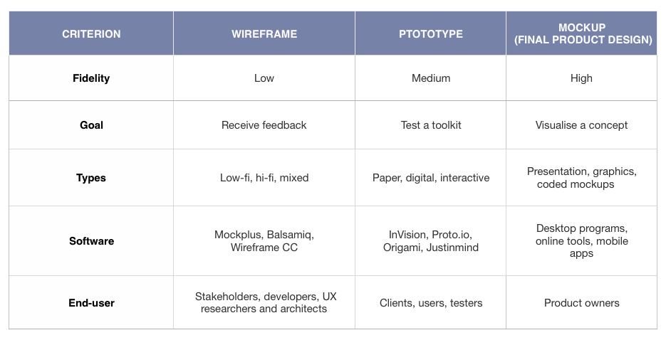
The difference between mockup and wireframe is the audience they’re intended for.
Since wireframes are designed to demonstrate the overall behaviour of the product, they might be reviewed by anyone involved in a creative process – a stakeholder, a UX researcher, developer, the end-user.
Being the final version of the product design, mockups, as a rule, are demonstrated to clients and product owners. Although, other team members may give their feedback to the presentation as well.
Types of mockups
Conditionally mockups can be divided into 3 groups, which we will consider below.
Applications
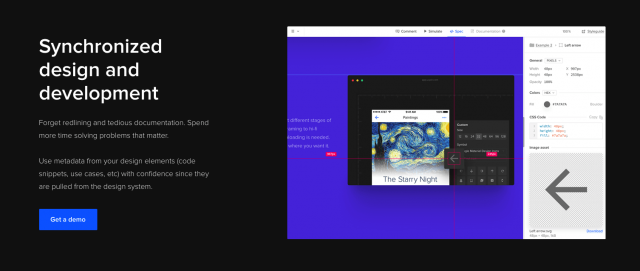
Narrowly focused applications like UXPin, Angle (Sketch plugin), and Axure work greatly for high-fidelity mockups.
They can be used by any team member – designer, business analyst, project manager and a great fit for large-scale projects.
Graphic design solutions
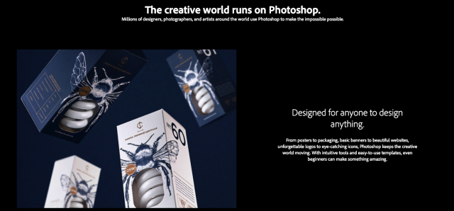
Alongside design purposes, such software as Photoshop can be used for prototyping mockups.
However, users may face the challenge of a steep learning curve that accompanies the software mastering process.
Coded visuals
If you have experience with coding, programming demos is a godsend for you.
However, it might be a daunting task for those who are designers only.
Coded visuals are a perfect solution for designers practising markup or for front-end programmers interested in web design.
What tools are used for creating mockups
We can divide the tools into several categories:
- Desktop software — Axure, Mockuuups Studio, Mockplus.
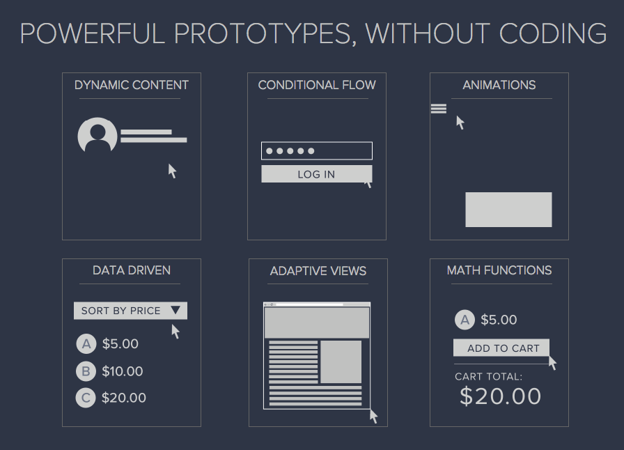
All the solutions are available for Mac & Win and let users create mockups, test them instantly, and share the output with team members.
- Web tools — Threed.io, Artboard.Studio, Shotsnapp.
Online apps provide clients with the opportunity to create visuals at the snap of a finger.
Normally, they come with a basic set of features, but the beauty of online mockuping tools is that they don’t require any solid design or coding skills.
- Mobile apps — Marvelapp, Mockup Builder.
They are good for building mobile sketches on iOS and Android devices.
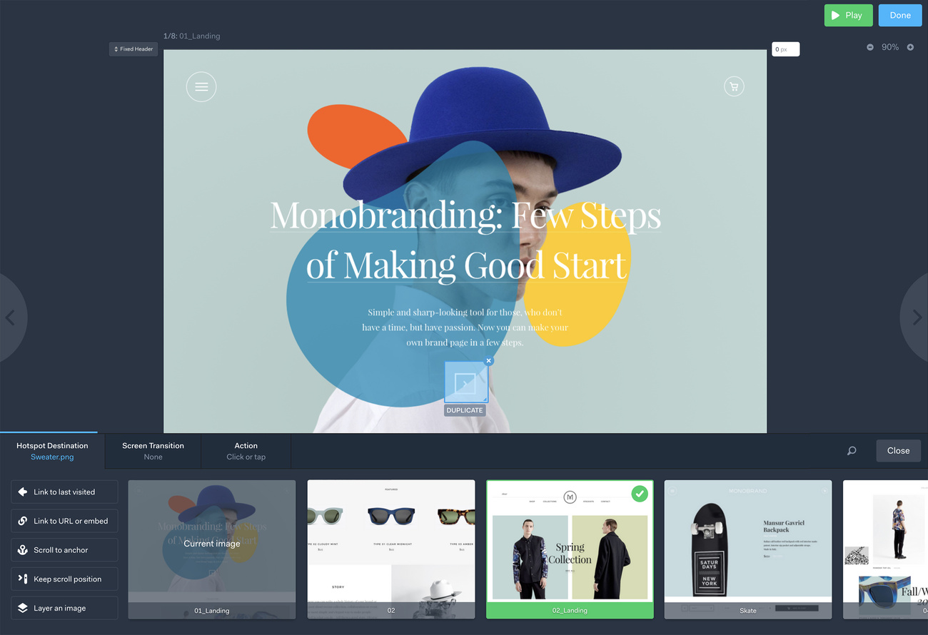
These mobile solutions are indispensable helpers for those who need an instant product presentation.
How to choose the right tool for crafting wireframes and mockups?
It’s so easy to get lost in the plethora of prototyping tools as each one seems to be powerful, user-friendly, and cater to your needs.
- But how to choose the toolkit that will be ideal just for your project?
- Identify the end goal of a prototype and decide if you need it at all. Sometimes, a handmade sketch is enough to demonstrate the overall design concept.
- Ask yourself what level of fidelity and objective your prototype should have.
- Discuss the timeline and budget for the prototyping stage with the team.
- Consider the learning curve if you’re going to shift from one tool to another.
- Make sure that the software you chose is compatible with other tools used in the design process.
- Take time and test different software to understand the pros and cons of each piece.
Comparison
Now when the nature of wireframes, mockups and prototypes is more or less clear, let’s sum up.
Wireframe vs Mockup vs Prototype
Wrap up
Sketch, wireframe, mockup, prototype are the pillars of the UX design. The role of each is usually mistaken and very much depends on the terminology agreed in a given company.
Sadly, IT specialists tend to jump from the idea brainstorming right to the developing without testing the intended concept as they consider it as a sheer waste of money. As a result, smart yet non-user-friendly products appear on the market, we try using them and dump as quickly as they were built.
Starting with a wireframe, good research phase and finishing with an interactive clickable prototype is not a long way. It’s a smart way.
I hope this article helped you understand the difference, however, we’ll be glad to explain the whole process in more detail if you are looking to design your product or website – feel free to reach out to us!


