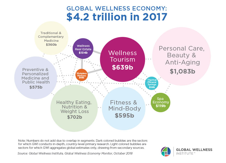
Being healthy and well is a hot trend now.
In the past, when searching for an ideal sports facility or coach, we tried an intro class or asked around for recommendations.
Things changed: thanks to the power of the Internet we can buy gym subscriptions, watch online classes, and find personal diets in a few clicks.
If you’re reading this article, then, probably, you’re willing to create a fitness website or improve your current online presence, but don’t know where to start.
Today we’ll talk about the reasons to build a personal fitness website, its must-haves, and essential development steps.
What you will learn:
Why start fitness website development?
If you’re in the health&wellness business, you need a website to promote your business or create a personal brand.
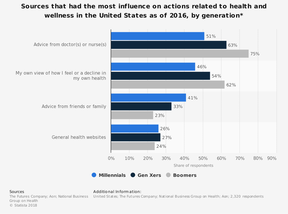
A powerful online presence will help you achieve several goals:
- demonstrate your services and expertise;
- boost online subscriptions and tutorials sales;
- reach out to new clients and get in touch with regulars;
- build an active community and educate;
- be accessible;
- give bonuses;
- set new business goals grounding on website analytics.
Indeed, you can succeed even without a platform, but this critical element considerably increases your chances for success.
How to build a fitness website
You’ve finally decided to develop a fitness website, and you’re hesitating where to start.
Why not begin with mapping out a toolkit?
We’ve looked at many sites with excellent fitness website design and know what features your platform should have.
Essential features
1. User area
Not all fitness websites have personal accounts; however, those who do have this feature gain lots of benefits.
Having contact and personal details of clients, you can better promote your services and send notifications to them.
What’s more, user accounts give a more personalised experience as people can tweak the settings, customise their portfolio, keep details about their physical condition, track their progress in sports.
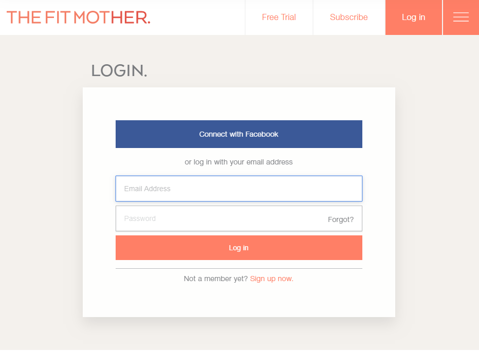
Let visitors sign up via socials as it will save their time and efforts.
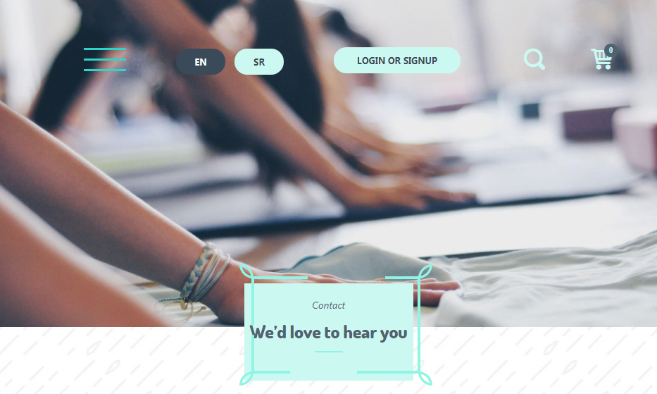
2. Instant support
Nothing could be better than quick and professional assistance when it comes to doing business online.
Your clients want to be sure that you’re here to provide a helping hand.
Make sure that your Contact us page is easy to find. It’s a great idea to embed contact details into the header or footer or integrate a live chat.
To take some load off your support specialists (if you have any), add a FAQs area or Help desk.
If you’re planning to sell something online or register clients, then every users’ step should be accompanied with clear instructions.
3. Encouraging photos and videos
A few facts about visual content:
Fact #1. By 2021, videos will make up 82% of all web traffic.
Fact #2. Relevant images increase the chances that people will retain 65% of important information.
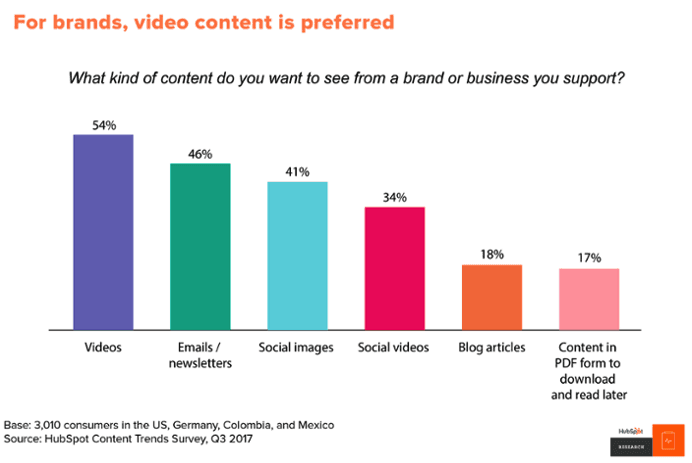
Visual content preparation is an integral part of fitness website development. Images and videos should spur people to action, demonstrate the end goal, and give hope.
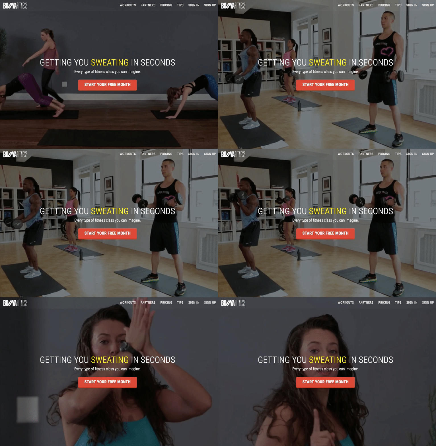
It’s a good idea to add a short video to the main block on your home or landing page so that clients can feel the spirit of sport and a healthy lifestyle from the first seconds.
All the images and photos should be professional and unique. If you’re on a budget, consider free photo banks.
Keep in mind that visuals affect the loading speed; that’s why it’s better to use them aptly.
4. Schedule
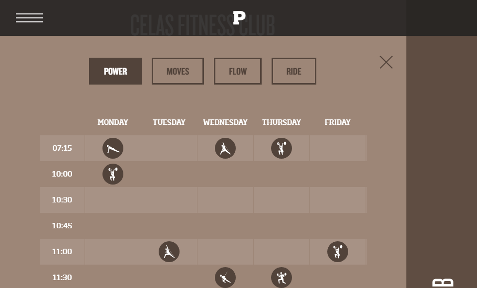
Another feature for you to keep in mind when creating a fitness website is a class schedule section.
Your clients want to know what types of classes you offer, attendance times, and coaches who teach a particular class.
To integrate a class schedule into your site, you can use special tools or software for client management.
Among the best-known solutions are Picktime, SimplyBook.me, and ClassPass.
With such tools, you can sell passes, track workouts attendance, email your clients and send notifications to them.
5. Offer a free trial
It’s a sneak peek into your app with no strings attached. People can see all the features in action and get a first-hand experience.
What’s interesting here is that all of us tend to develop that feeling of possession quickly. So if your app rocks, a person will be much likely to subscribe after the free trial expires.
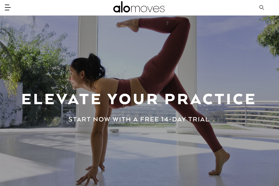
Free trials also help your sales long-term. Even if a user didn’t sign up, you could craft marketing campaigns by offering discounts, informing of new features and gently educating. Mind the data protection rules in your country when collecting emails by providing free trials.
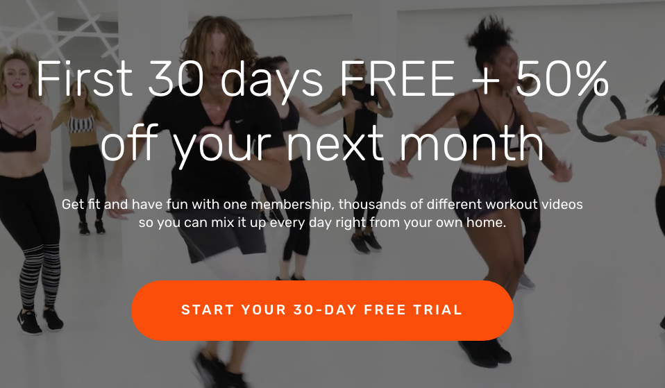
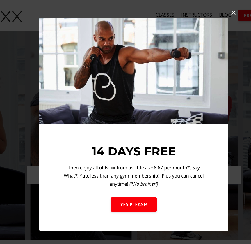
You can offer a free trial in a pop-up screen when a visitor is about to leave your website. It will catch their attention, and maybe they’ll reconsider.
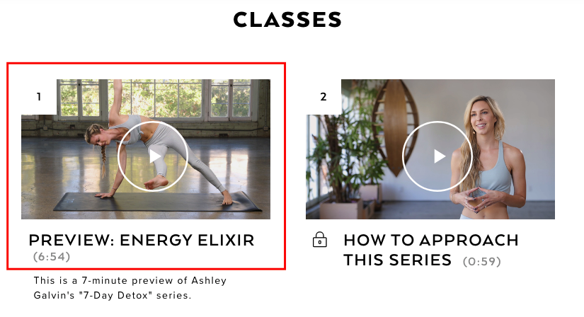
A variation of a free trial is a short preview of a class or a course that may get a visitor interested.
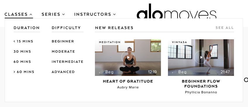
6. Easy filters
If you run many classes by many instructors on your platform, make it easier for your users to pick the right type.
Allow filtering by popular parameters:
- duration
- intensity
- level
- style
- difficulty
- instructor
7. Introduce gamification
If your app is going to be subscription-based, you’re interested in keeping your users interested motivated and engaged.
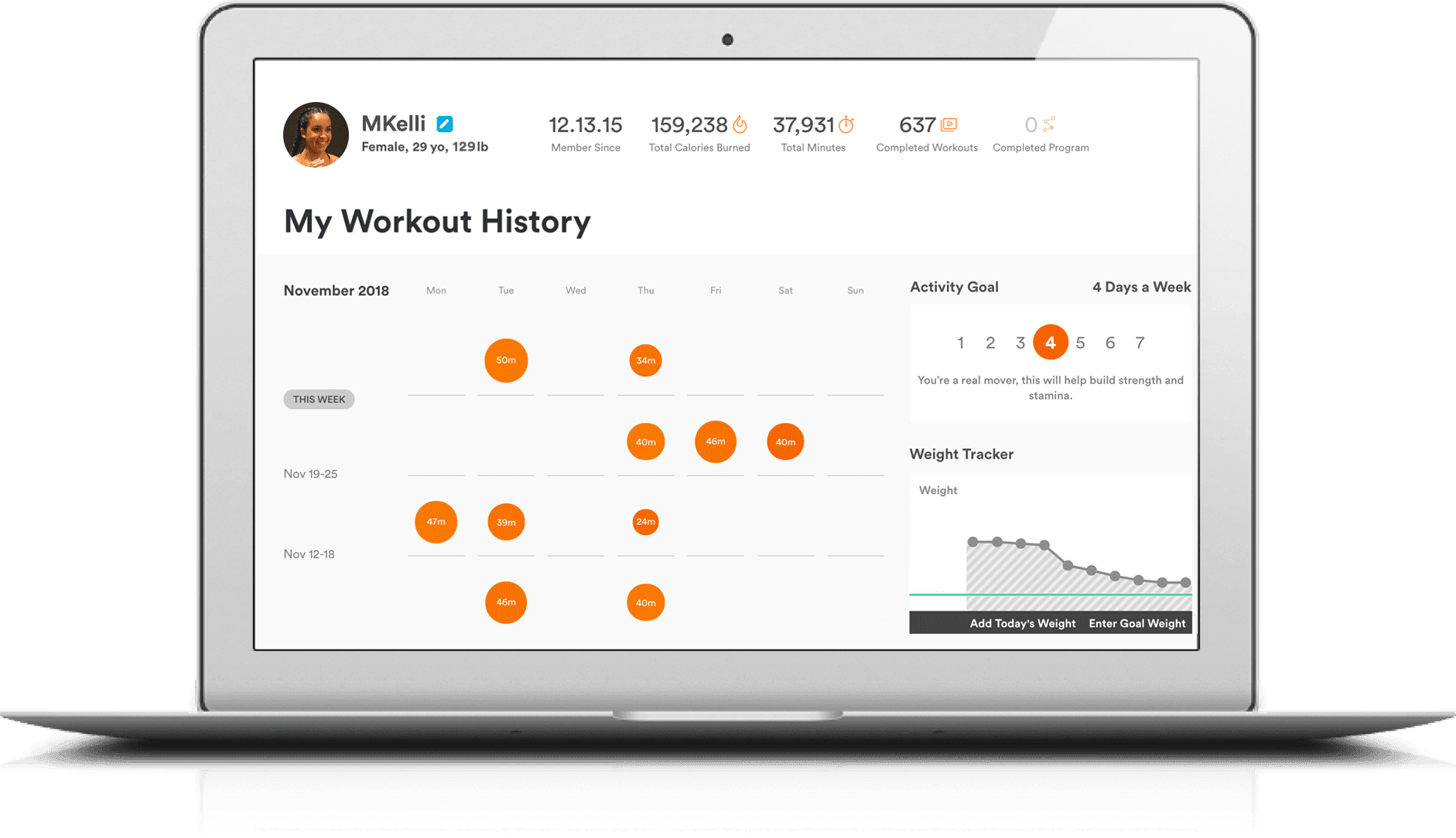
Send daily notifications about upcoming workouts, offer to set goals and show progress bars to demonstrate how they are doing.
Some people hate fitness but want to keep fit anyway – gamification will help them succeed!
8. Clear pricing
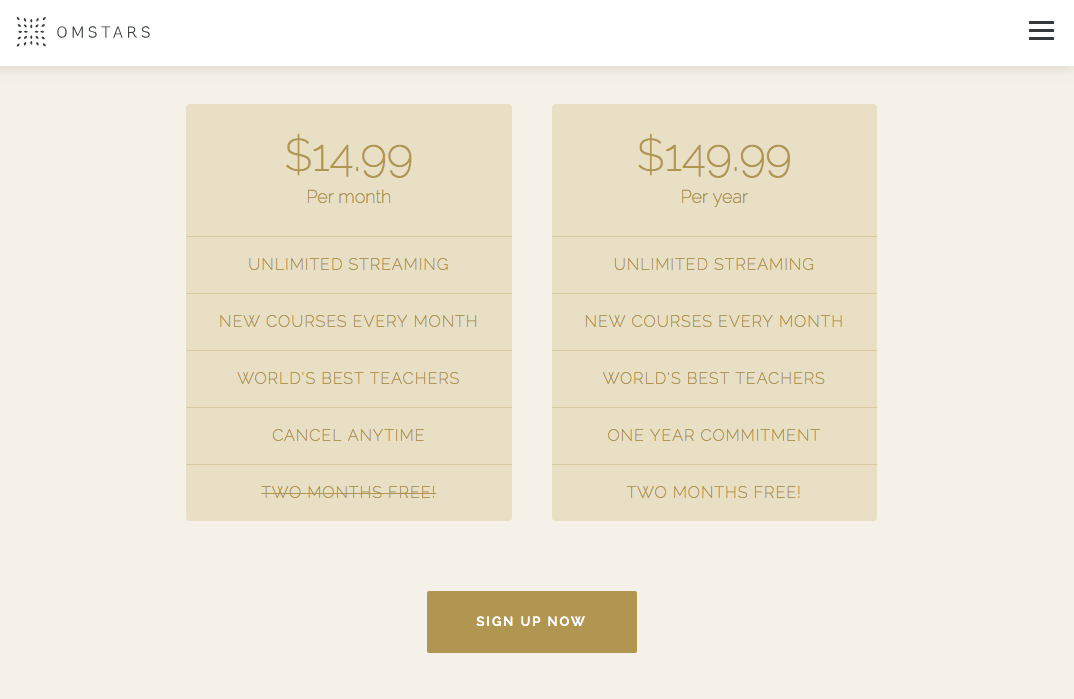
When you plan the content for a fitness platform, remember about the Pricing page.
Clients always appreciate it if they get a full picture or your services and bonuses or can compare them with what your competitors offer.
To top it off, it would be great if you let visitors buy a package or book a class online.
Use pricing tables to organise the info conveniently and make clear call-to-actions approaching people to buy, purchase or sign up.
Once you’ve created a list of core features, proceed with planning extra functionality.
Even if these features don’t exist in your minimum viable product (MVP) aka the first release of your site, you can add them later.
Nice-to-have features
- testimonials;
- clients or partners section;
- blog;
- sign up for newsletter forms;
- social sharing buttons;
- meet the team page;
- video tutorials.
Making a fitness website: best practices
Before we immerse you into the process and cost of fitness website development, let us show the examples of successful fitness sites with a large audience.
The Fit Mother
The Fit Mother is an educational and training platform helping young mothers and mothers-to-be stay keep in shape and become the best version of themselves.
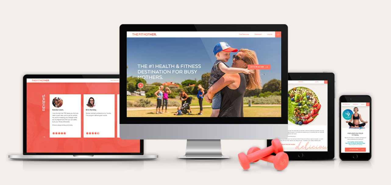
Key features:
- simple navigation and menu;
- login with socials;
- bright design with animation, button and hover effects;
- video backgrounds;
- sliders with client reviews;
- lots of video content;
- social communities;
- a subscribe form;
- custom professional photography;
- an informative FAQs page.
FitnessBodyStar
FitnessBodyStar is a fitness and nutrition platform promoting a healthy lifestyle and body-positive philosophy.
Users can sign up to the FitnessBodyStar portal, purchase nutrition plans, and upgrade their fitness level.
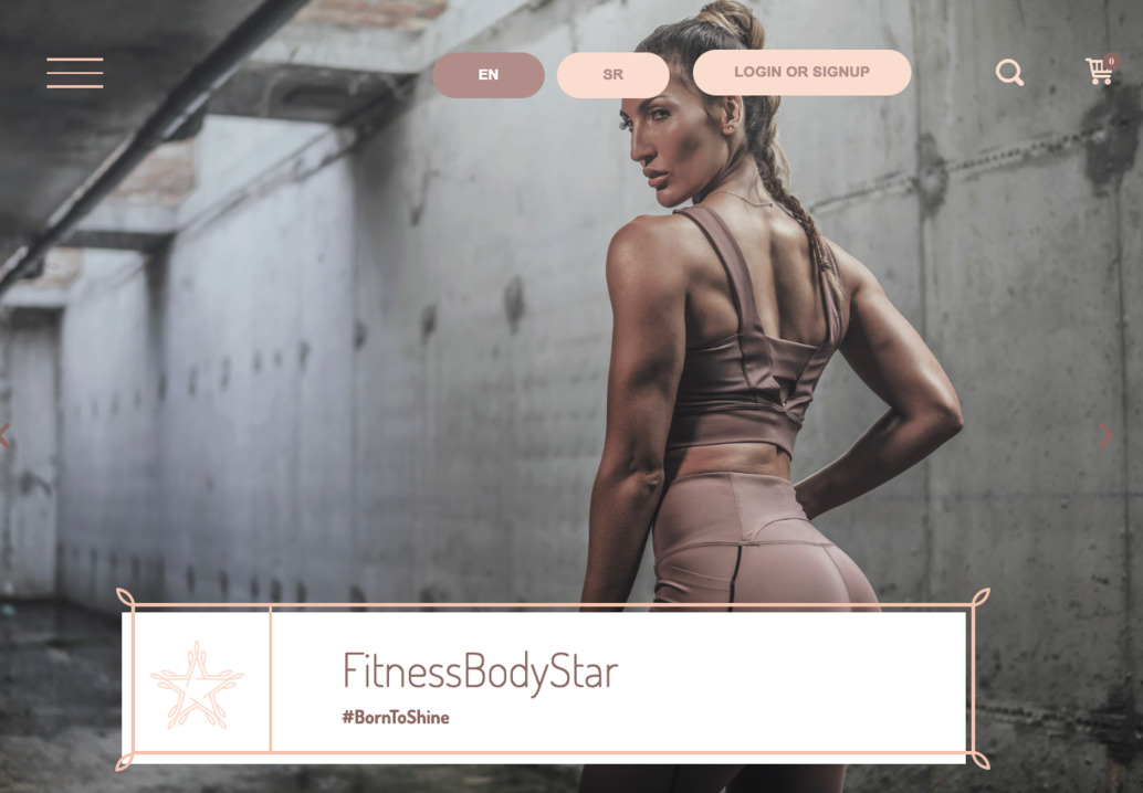
Key features:
- light and minimal design in nude colours;
- an online store;
- a search feature;
- a personal area for users;
- relevant content;
- video tutorials and the Blog page;
- connection to social communities option;
- inspiring photos and images;
- fast registration.
Booya Fitness
Booya Fitness is a place where everyone can make an online reservation of an ideal fitness class.
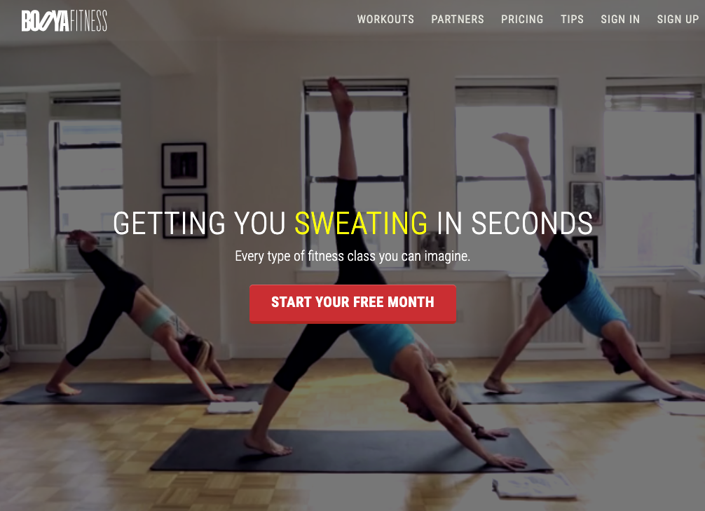
Key features:
- encouraging call-to-actions;
- a fitness classes section;
- a separate Blog page;
- an interactive calendar with personal workout plans;
- filter for workout plans;
- a live chat;
- a sign-up through socials;
- a Coaches and Partners page;
- a pricing page.
Alo Moves
Alo Moves – a destination for all yogis and fitness lovers, an online system where you can pick a series of classes which will perfectly match your health and mental state.
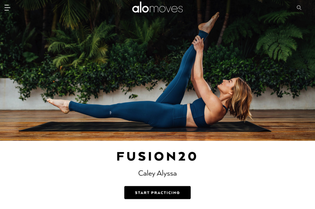
Key features:
- a stylish minimal design;
- super-simple navigation and menu;
- a Careers page;
- various hover effects;
- filter for instructors and yoga classes pages;
- a separate Blog;
- Knowledgebase with a search feature;
- a Contact us form with advanced options.
Phive
Phive website design is about creativity and custom approach. It’s a powerful online system helping users find, schedule and sign up for sports classes.
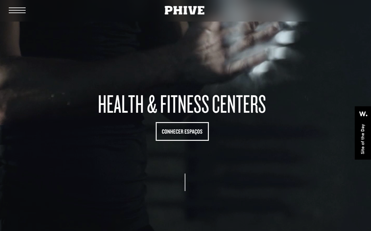
Key features:
- a featured design with bespoke animation and effects;
- bold typography;
- immersive video backgrounds;
- a built-in live chat;
- an online timetable;
- bespoke navigation with smooth transitions;
- creative CTAs.
Key steps of creating a fitness website
We’ve written a lot on web design and development in our blog, and today we’d like to focus on how to make a fitness website.
Nothing is new under the moon and building a website for the health&wellness business is similar to developing any other one.
You will inevitably take specific steps to solve many tasks during the development process.
Stage 1. Research and discovery
It’s the most critical stage in web development that contributes to your success online:
- portraying the end-user and determining their pain points;
- collecting info and establishing tech requirements;
- identifying a platform goal;
- analysing web resources of competitors
- planning content.
Stage 2. Sitemap and wireframe creation
Once all the content is gathered, and the overall objective is determined, it’s time to think about the tech aspect.
Tasks to solve at this stage:
- creating a navigation system, menu, and sitemap;
- making a low or high-fidelity wireframe;
- choosing a tech stack.
As a rule, this stage includes project planning, in particular, defining resources, a timeline, and deliverables.
Stage 3. Design and development
Let’s move into action! Design and development usually come hand in hand as any alternations in a website design influence the development process and vice versa.
What should be done at this step:
- creating several detailed mockups of a website;
- designing layouts for desktops, laptops, and mobiles;
- filling in a site prototype with content;
- discussing the advantages and disadvantages of the end product and making changes;
- developing the front-end and back-end of a website;
- incorporating core and extra features.
Stage 4. Review and launch
When all the hard work is done, it’s time to review the outcome.
It may be the most time-consuming stage as both visual and technical aspects of a website should be thoroughly checked.
What to add to your to-do list:
- usability and compatibility testing;
- validating the code;
- fixing bugs;
- proofreading;
- choosing a hosting provider and uploading a site;
- running the final check;
- popping the champagne to celebrate the launch 🙂
Stage 5. Post-launch
When there’s no champagne left, it’s time to get back to work.
Once you go live, you should continue monitoring your online business performance, make updates and improvements.
Tasks to solve (these are the last ones, we promise):
- website maintenance;
- content updates;
- gathering users’ feedback and improving;
- testing and reviewing;
- fixing bugs and solving security issues;
- extending functionality.
As usual, the cost of building a fitness website depends on the design complexity and platform functionality.
In addition to developing websites from scratch, we offer audit services to help you improve the current look of your online presence, deliver more leads and generate more profits.
How much does it cost to create a gym & fitness website?
An app you want to build can be a more or less simple WordPress website with an eCommerce component.
However, if you want to launch a robust platform with modern and efficient UX design, the prices below will help you get an idea of what it may cost.
Fitness website development price
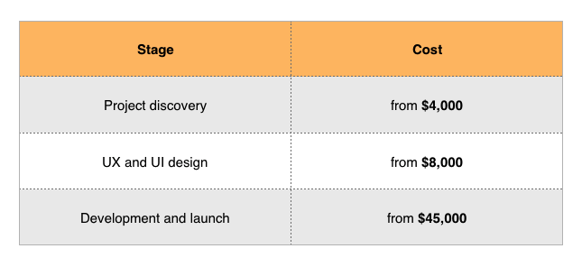
The total fitness website cost, including proper business analysis, bespoke design, and custom development starts at $57,000.
On a final note
No matter who you’re: a yoga teacher, sports centre owner, a personal coach or a healthy lifestyle geek, you can’t do without an online presence in today’s world.
How to make your fitness website efficient and easy to use:
- Provide a login option, offer history and progress tracking.
- Include encouraging photos and videos.
- Offer free trials.
- Make it easy to pick the right class.
- Provide clear pricing details.
Either you’re going to do all the work on your own or enlist the help of professionals, follow our recommendations.
Go and make the world healthier!
If you want more tips on web development or have an inquiry, drop us a line to discuss your business requirements.
