

The world of mobile devices, historically, has two camps – lovers of Apple and supporters of Android. While they try to justify their reasons to hate this or that phone, there’s one thing they have in common: they’ll hate it equally when a website doesn’t work well on their smartphones.
We see those lame websites every day when we have to search for a navbar, fill out unnecessarily long forms, or wait forever until the site loads.
Sadly, neither innovative Google algorithms nor the increase in mobile traffic can persuade site owners and web studios that a mobile-friendly UX design is a must-have.
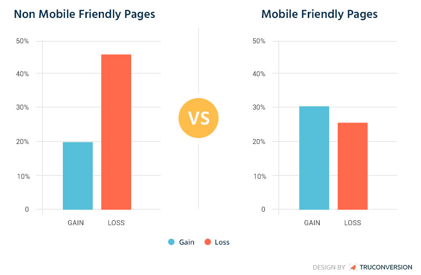
According to TruConversion, websites with non-mobile-first designs are likely to experience only 20% of gains while mobile-friendly pages can generate up to 30%.
So, a high number of web pages that collapse on mobile screens lead to huge losses for businesses and make users frustrated. This frustration has a direct impact on your sales and business performance.
In this tutorial, we’ll tell you how to design for mobile and establish a strong relationship with your smartphone visitors.
What is a mobile-first design, and why does your website need one?
If you haven’t heard about the mobile-first approach or you think that it’s the same as responsive design, we’re here to clear things up.
Responsive design means that a website automatically adjusts to the screen size on any device.
Responsiveness is a feature of a web page and an outcome of specific web development techniques. We achieve it by deploying media queries that change the default CSS styles and modify the layout.
In the past, designers would start with a desktop version first as a significant part of web traffic came from these devices.
Mobile-first is a concept when website design is upgrading from a smartphone level to desktop and laptop versions.
The adaptive design shouldn’t be confused with responsiveness or mobile-first as it adapts a website only to certain screen specifications.
So, why is it vital to design for mobile-first?
There are many merits mobile-first promises to its supporters:
- If you’re dreaming about top ratings in Google, then go for mobile-first.
- Web pages optimised for smartphones boost conversions and generate leads.
- If you’re worried about your web image, then you can’t do without designing for mobile.
- The core of mobile-first is simplicity and minimalism. Your clients will thank you for relevant content.
- It is always easier to progress from more straightforward outline and functionality to complex solutions.
- Being mobile-first means being modern, useful and straightforward.
What about the disadvantages?
Nothing is perfect, and mobile-first responsive web design has a few cons as well:
- Optimising for mobile may be very expensive and time-consuming.
- Not all the designers fancy this approach as it can’t give a clear picture of the end product.
- The space on mobile screens is limited, and you have to work with tap touches rather than mouse clicks.
Designing for mobile first: tips and tricks
If you’ve finally included mobile-first design to your to-do list, follow the tips below to get the desired outcome.
Choose the right tools
A perfect mobile design starts with the rights tools.
When choosing a framework or builder, consider Bootstrap, Skeleton, Foundation or other solutions packed with mobile-first essentials.
- Bootstrap is a one-size-fits-all when it comes to mobile front-end development. Under Bootstrap’s hood, there is a default grid system, JavaScript plugins, plenty of components, and typography.
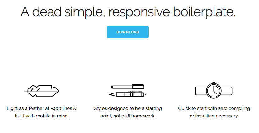
- If your project refers to a small-scale cohort, opt for Skeleton. It is super easy-to-use and comes in a bundle with basic features: a 12-column fluid grid, typography, buttons and forms, media queries, etc. By the way, no compiling or installing is required to get started with Skeleton.
- Foundation suits any project: be it a responsive website, mobile app or email. The Foundation’s team continues advancing the framework by adding new resources and code snippets.
Make elements mobile-first
When you decide on building from the ground up, you should adopt the main design elements to mobile-first and then adjust them to tablet or laptop.
Let’s consider the navbar, for instance.
The right way would be to hide it under the burger button. However, if you want to stand out, you can go further.
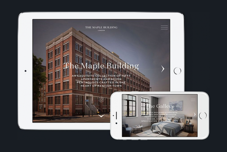
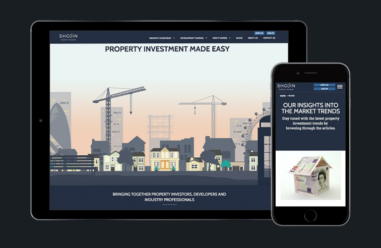
You can prioritise the menu items and show the user only the most important ones as we did in the Shojin mobile site.
Also, you can put the core call-to-action in the navigation to make them eye-catching and easy to find.
All the links and buttons that are to attract users’ attention should be clear and tappable.
For instance, according to the Android Material Design principles touch targets should be at least 48 x 48 dp, which results in the physical size of about 9 mm.
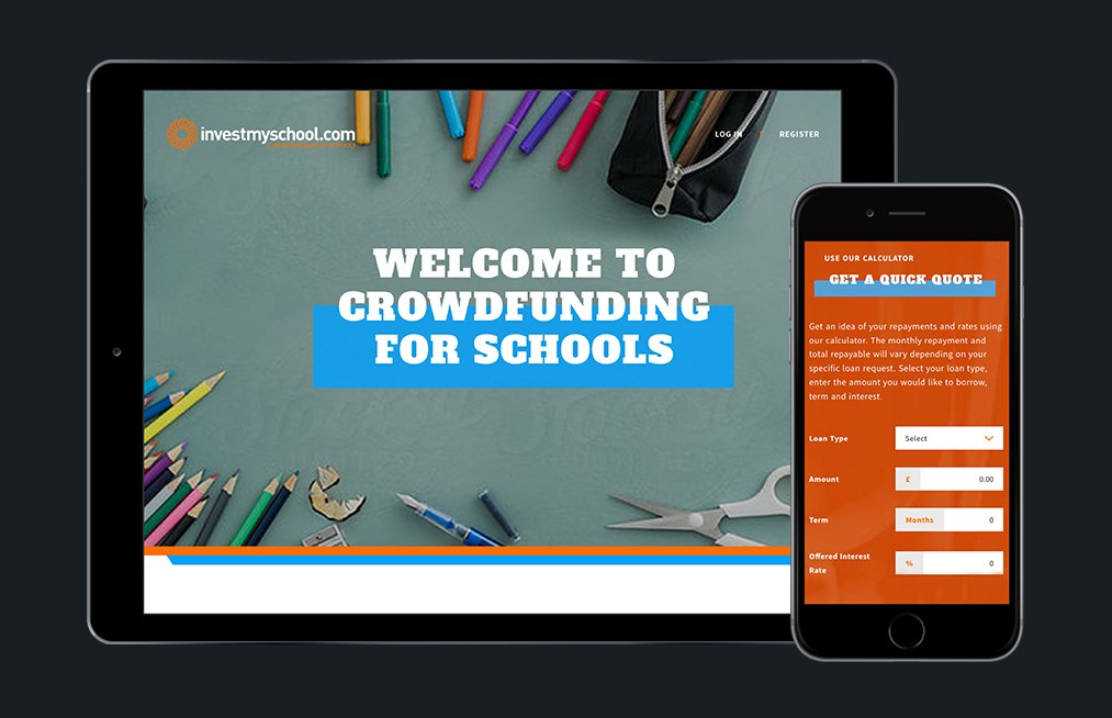
As for input forms, the main idea here is to make them as short as possible to minimise users’ efforts like we did for the InvestMySchool website.
However, you likely have specific business requirements for the signup process as it usually happens on crowdfunding platforms, for example. Try to balance between necessity and usability.
Put the user in the spotlight
No matter what article on the mobile-first web design you find, all of them mention the most important tip:
begin your design process by identifying the pain points of your target user.
Each page of your website should help users complete a task or solve a problem.
If a page is not helpful, it is not worth adding it to your mobile website.
Another critical step is to figure out what user flows and journeys can work around your website. Use flow diagrams showing different scenarios of user behaviour on each page or its section.
Think about all possible interactions between a person and a website interface to make it more intuitive and user-friendly.
Optimise your content
Content optimisation simplifies user interaction and improves website performance.
If you’re planning to optimise your content for mobile, take into account several points:
- make sure that your website only has relevant content that people can scan on the go;
- videos should display flawlessly across different devices;
- it is better to allow users to scroll down your content rather than click on it;
- long copies should be divided into multiple paragraphs to let users skim them;
- think what content your web audience is looking for and make it possible to find it quickly.
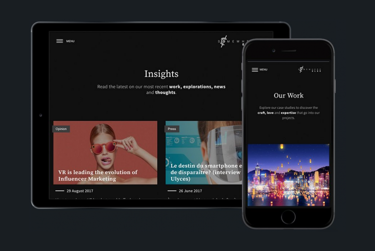
When working on the SomewhereElse project, we did our best to make the content on its mobile version digestible on any device regardless of its screen size or resolution.
For this purpose, we used:
- mobile fonts,
- professional photography,
- animated graphic elements.
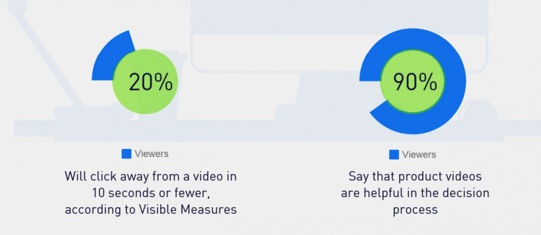
Benefits from videos
According to statistics, 90% ? of users rely on videos in the decision-making process.
Videos are great for every industry, business, and task.
You can use them for demonstrating products, introducing the team, telling a business story, and a whole lot of other things.
Moreover, videos are great troubleshooters when it comes to optimising the content and keeping visitors engaged.
Despite affecting the loading speed, videos remain a hot trend in both web and mobile-first design.
That’s why we added this tip into our mobile-first design principles.
Upgrade to a PWA
Once your mobile website is successfully up and running, you may turn it into a progressive web app.
A progressive web application is somewhere between a fully functioning website and a mobile app.
It inherits the advantages of both products:
- it is very fast since it saves a website’s layout from reproducing it when a user launches a PWA;
- an app has a responsive design;
- users can launch it offline;
- a PWA is easy to build and maintain;
- it is SEO-friendly;
- users can add a PWA on their home screens.
Best practices of mobile-first web design
It’s time to see how you can implement the above tips when crafting mobile-first responsive design.
We’ve highlighted the best examples of great mobile-first design that you can use their features in the future.
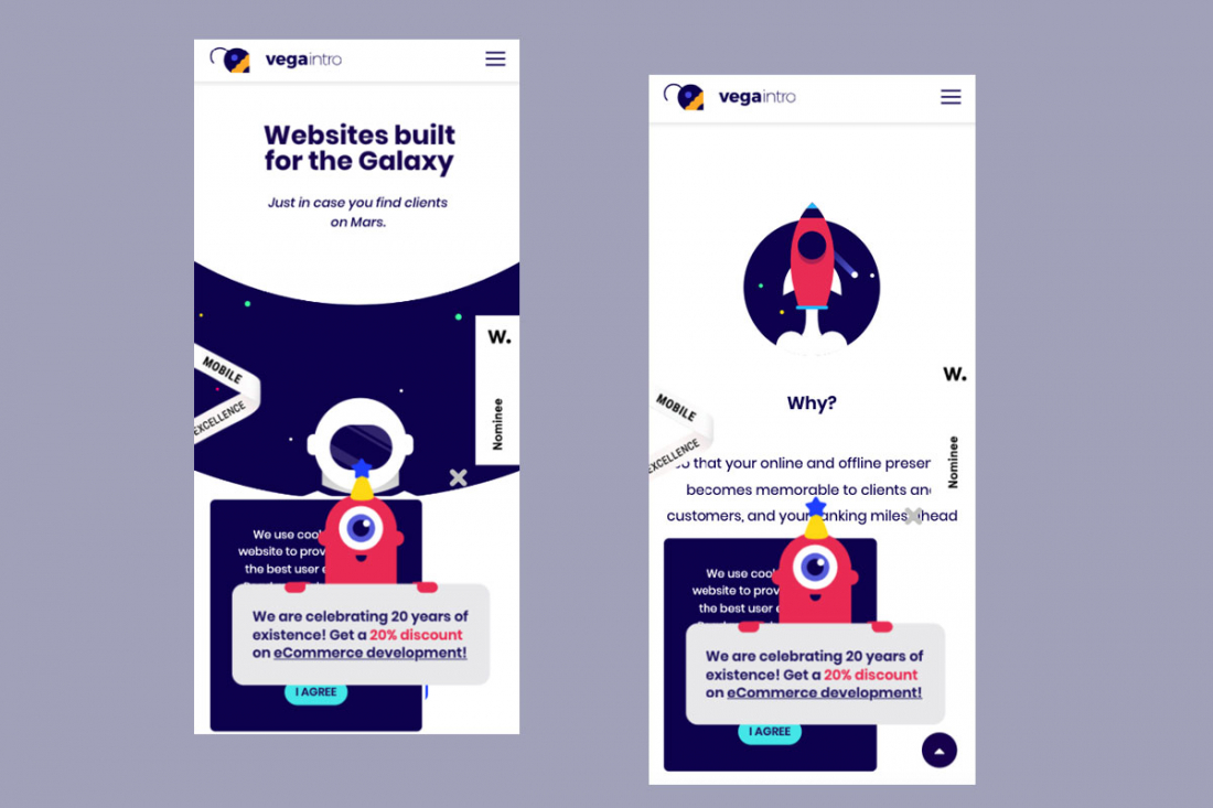
Vega Intro
What we like:
- interface illustration;
- an accessible contact us;
- clear CTAs;
- design with natural shapes;
- quick loading.
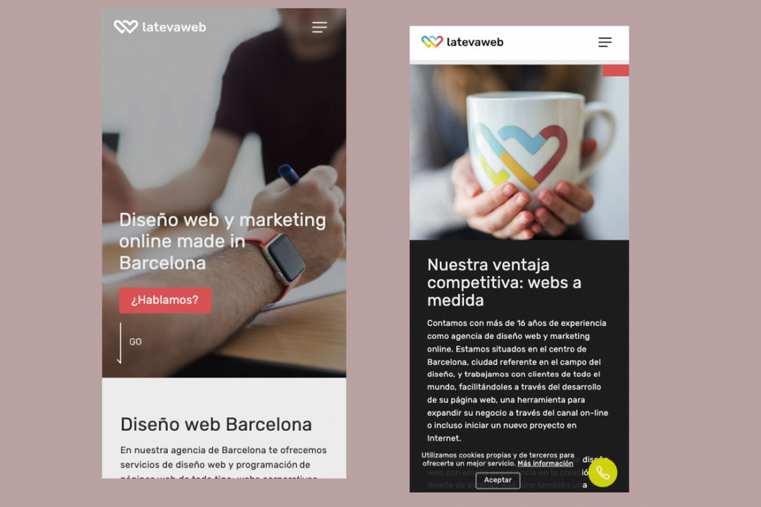
La Tewa Web
What we like:
- scrollable content on the Home page;
- mobile typography;
- a short contact us form;
- intuitive navigation;
- cute animation.
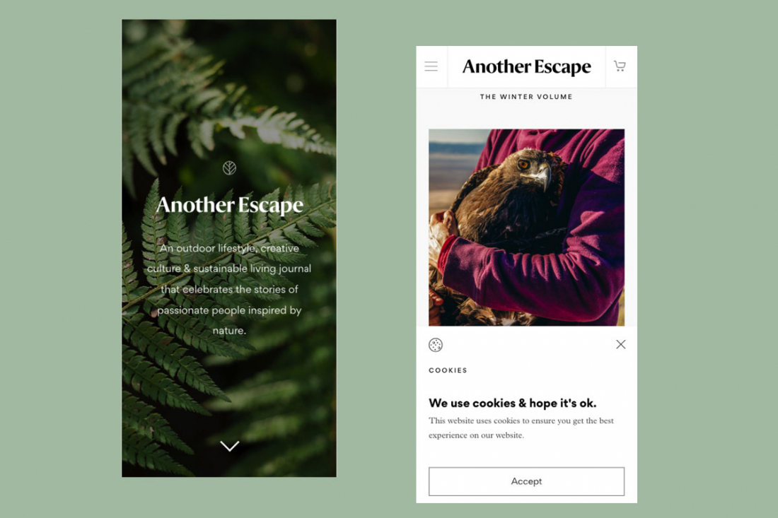
Another Escape
What we like:
- professional photography;
- a drop-down menu;
- an easy check-out process;
- mobile-friendly content.
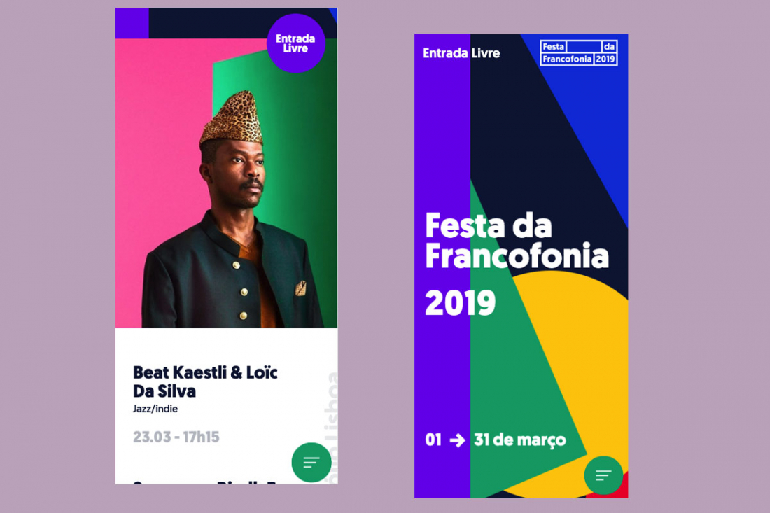
Festa da Francofonia
What we like:
- custom animation;
- geometry in design;
- a simple menu;
- a parallax effect;
- fast loading.
Randstad – Human Forward
What we like:
- the mobile-only website;
- an embedded video;
- a search feature;
- custom animation;
- strong CTAs.
Our mobile-first design projects
We do not prioritise a mobile-first design; our designers determine customer’s needs and then propose a solution.
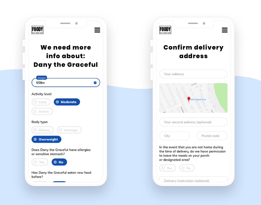
Dog food delivery
It’s a website for a subscription-based dog food delivery service.
The app gives users a better way to manage the food supply for their animals. A user provides some necessary information about the dog, the app calculates the amount of food needed per day, and then a user can pick a recipe and schedule delivery.
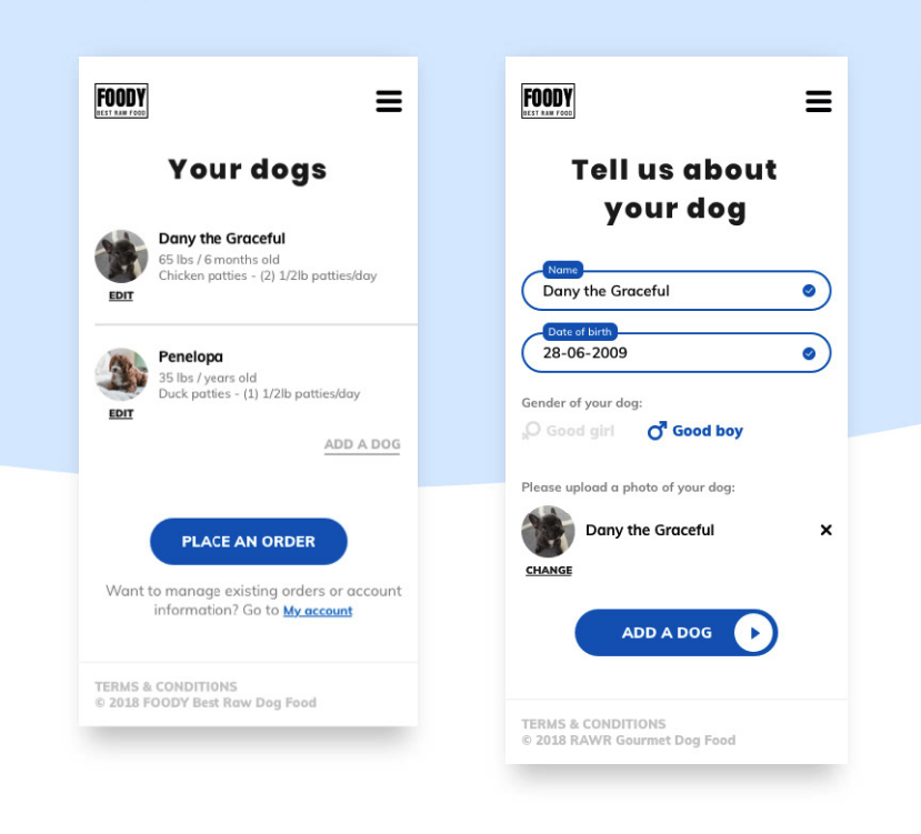
Factual info:
- clean design with fluid shapes;
- user-friendly input forms;
- the design based on low-fidelity wireframing;
- linear user flows;
- two-steps check-out procedure.
To bottom line
Mobile-first designs are challenging with many pitfalls and headaches, but it promises incredible benefits for those who dare to choose it.
There are a lot of recommendations on how to craft an excellent mobile-first design, although not all of them are universal.
Your design solutions should depend on the end-user and their pain points rather than trends and creativity.
If you have any ideas about creating a design for a mobile app, give us a shout. We are always pleased to share our experience with you.