When we receive a website redesign request, the first question we ask is “Why did you decide to change something?”.
Sometimes, it can be a simple navigation improvement, whereas in other cases a full redesign is better.
What you will learn:
Why improve website design at all
What makes web design good?
Quick loading, cool animation, or, maybe, unicity?
None of the above. The right answer is the user-oriented approach.
With constantly evolving technologies, keeping a website user-friendly is not that easy. What is modern and engaging today can become obsolete and inconvenient tomorrow. The web audience is very demanding.
If they find that your website lacks loading speed, responsiveness or a user-friendly interface, there is a 9 out of 10 chance they will leave it once they open it.
We will give you several website design tips and suggestions on how to keep your site current, maintain customer loyalty, and increase conversions. But before we do that, let’s clarify why you should improve web design.
Have you recently noticed that your website doesn’t generate enough leads? Let’s see why.
Reason #1. Complex navigation
After overall design, the navigation is the second thing evaluated by visitors: it tells people where to find what they’re searching for.
When a user drops by a website, they expect to be guided intuitively. No one wants to do any strenuous thinking when looking for the “Contact us” section or a gallery with recent projects.
Imagine that you’re a first-time visitor on your website – will you be able to find the necessary info or site area instinctively?
If the answer is no, consider simplifying your website structure.
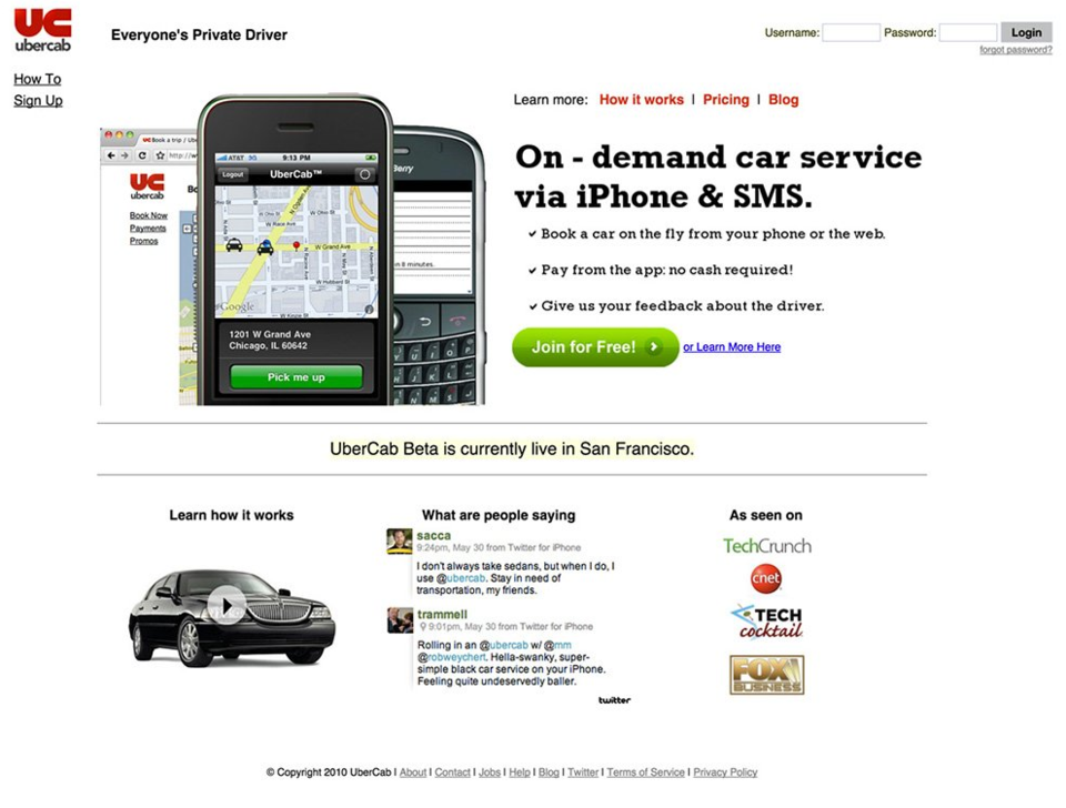
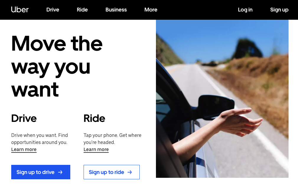
Take a look at what the Uber website looked like when it started and what it gradually turned into.
Reason #2. Inconsistent design
In the hunt for uniqueness, we often forget the first rule of web design. No matter how many pages your website has, all of them should be consistent regarding all design elements – fonts, colours, spaces, column numbers, grid styles, etc.
Carefully check every page of your online business card, blog or portfolio.
Do you use the same fonts for headlines and texts? Do all the buttons and links have a similar look?
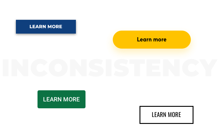
If you have found some imbalances, unify every tiny detail of your website.
Messy websites with a mix of styles are not about creativity at all. They tend to make users confused and irritated instead of communicating your message.
Reason #3. Poor user engagement
Look at your bounce and conversion rates – are you satisfied with the dynamics of your website performance metrics?
If you’re hesitating to answer, then maybe your website is not as engaging and appealing to visitors as you’d thought. Website traffic is not enough; you have to make visitors do something desirable like clicking, subscribing or buying.
And this is what user engagement is about.
User engagement is the cornerstone of any online business.
If you want to expand your clientele and boost sales, then improving user engagement is the only way to achieve success.
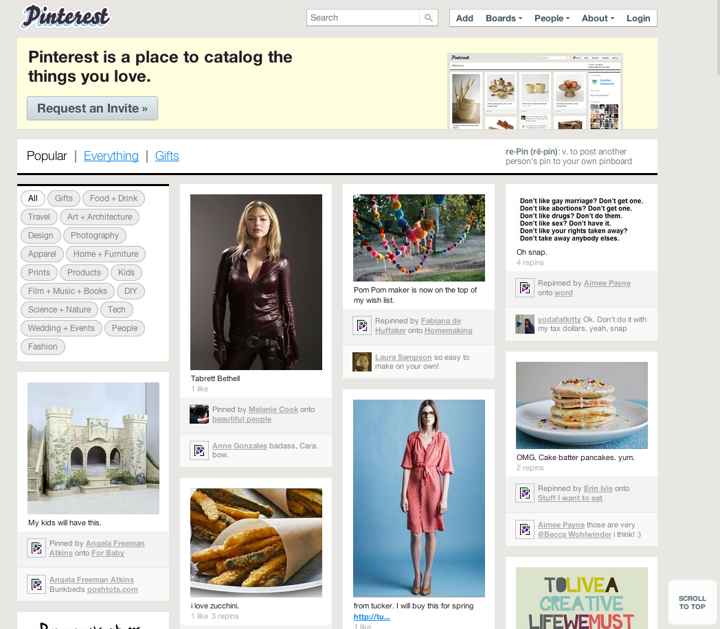
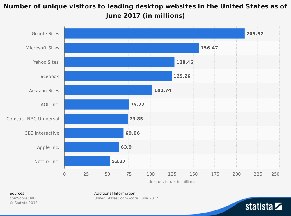
Improving website design is not optional, but rather a necessity. Look at some of the well-known brands – their corporate websites have changed a lot over the last years.
Such giants as Apple, Facebook, Amazon, and Google are the frontrunners in developing user-centred designs. They consider user satisfaction as the highest priority and do their best to maintain a high level of it.
Reason #4. Slow speed
How much time does your website have to impress a random visitor?
Half a minute? 10 seconds?
The right answer is less than 5 seconds.
Only a few seconds is needed to decide whether or not a website is worth someone’s attention. A multitude of studies has been carried out to discover how the loading time influences the website performance.
An interesting fact: if the Google page load speed were +500 ms, it would lose 25% of searches. Likewise, 500 ms slower Facebook pages would lead to a 3% decrease in web traffic.
Another survey shows that poor results of page loading have a more significant impact on website performance at present in comparison with the effect they had several years ago.
If it takes more than 6 seconds for a page to load, the conversion rate is likely to drop as much as 50%. Earlier it would’ve declined by 40%.
All this proves the fact that website speed comes first and foremost. If your website appears to take more than 5 seconds to load, then it’s high time you started improving something.
Reason #5. Responsiveness
Does your website design look perfect in any environment and on any screen size – a desktop, laptop or mobile?
If you’re not sure, then you might be losing potential clients on a daily basis.
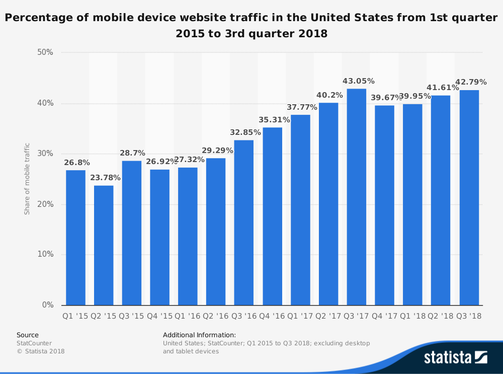
Responsiveness is one of the critical requirements modern websites must comply with. With more and more web traffic coming from smartphones, the mobile-first approach in web design should be applied without question.
The percentage of mobile device website traffic is nearly 43%.
Earlier the creation of desktop web design took place before the design of mobile web pages.
However, the reality of today makes designers do everything vice versa.
Flexible and retina-ready sites look great, leave a pleasant experience and boost online business.
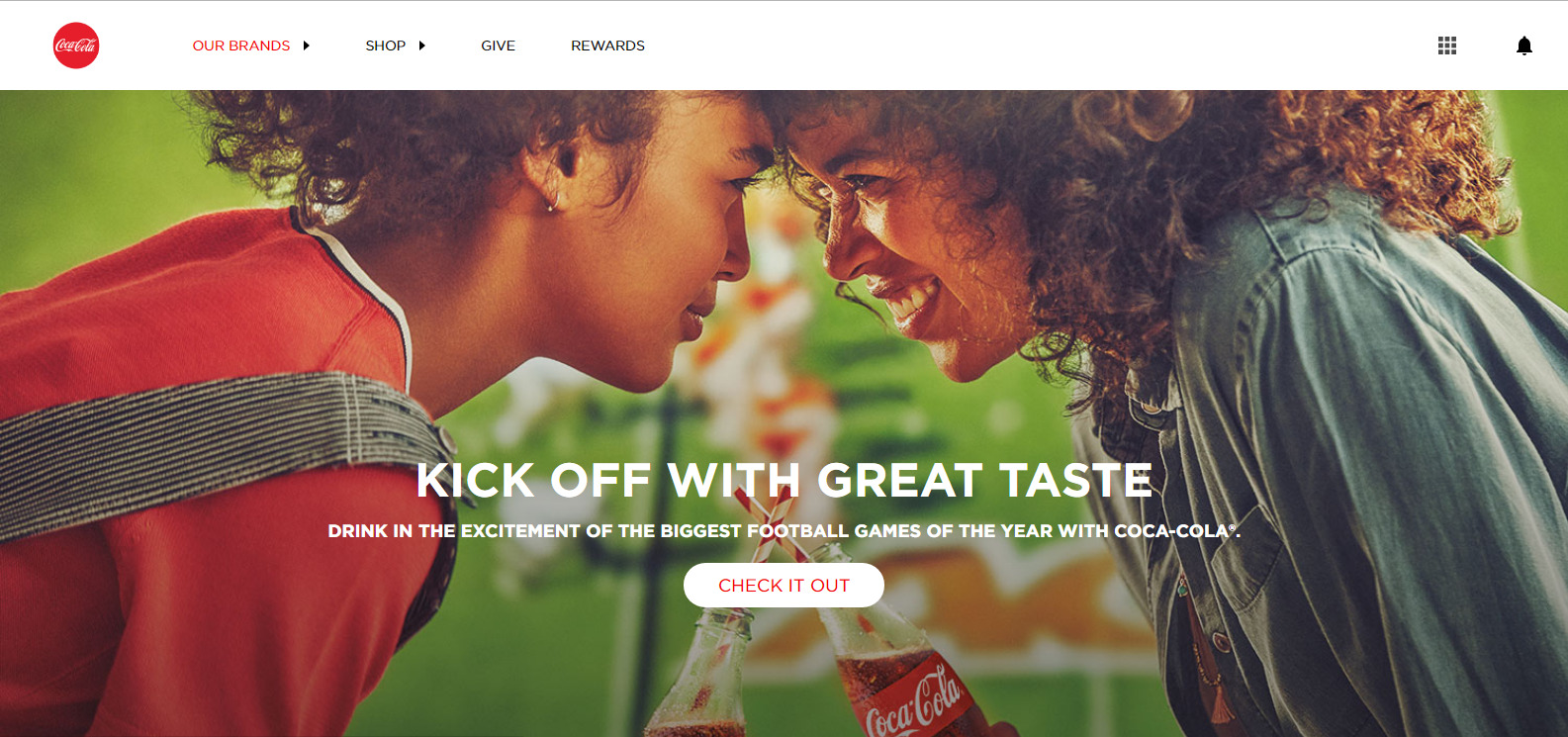
10 tips for website design that will boost your conversions
There are hundreds of posts, abstracts, and articles providing advice on how to get better at web design.
However, not all these tips may be suitable for your website due to its specific nature. In today’s article, we’ve collected the core principles within the user-centred design which will help you create the best version of your online presence.
Tip #1. Make navigation more intuitive
Simplifying website navigation is the first trick in our set of web design tips.
Advanced web technologies and cutting-edge trends let you create an effective navigation mechanism that will please even the most fastidious user.
Carefully plan the sitemap, page layouts, and content to build the hierarchy of the menu. Simplify everything as much as possible so that even a child can find your “About us” page, Blog or “Features” area.
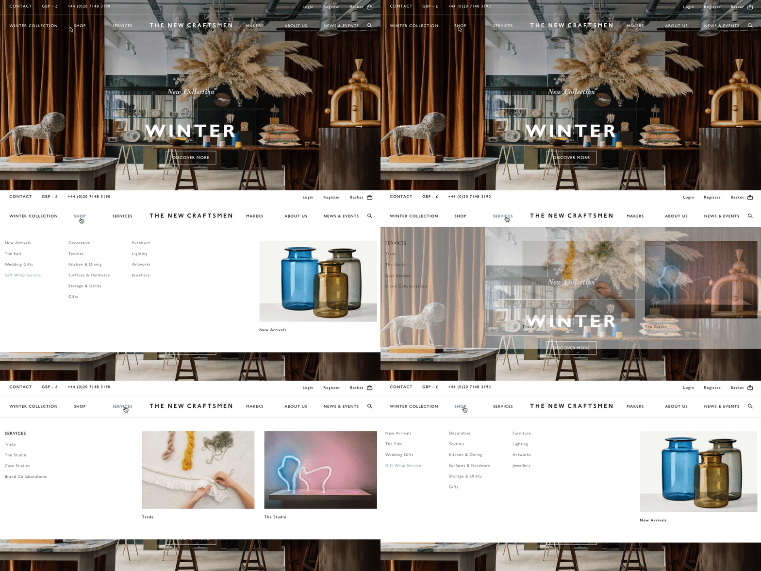
Remember that the way your site is set up depends on the type of your business and the goal of your website.
If you’re an online retailer, you should enable your buyers to find the right product or service easily. Online business cards and portfolio should be geared toward showcasing projects or presenting services.
50% of web users admit that if they have a negative experience with a website, they will share it with others.
Clear, visually attractive and comprehensive menus easily guide visitors around a website delivering a joyful experience. Use page fading and swiping effects, cool animation, 3D slideshows and live tours around your website.
To get inspired, check out the best practices of using the navigation below.


Tip#2. Change the website structure
Cleaning up is always tedious even when it comes to web design.
One day you built a website with a simple menu and several pages. However, with the lapse of time the number of pages has increased, and now your website looks monstrous.
Sound familiar? If yes, it’s high time you did some spring cleaning.
First of all, consider the structure of your menu.
Multi-level menus are trendy in the digital world because they allow you to keep all the website info in one place. However, for users, they look scary and kill any desire to browse your website.
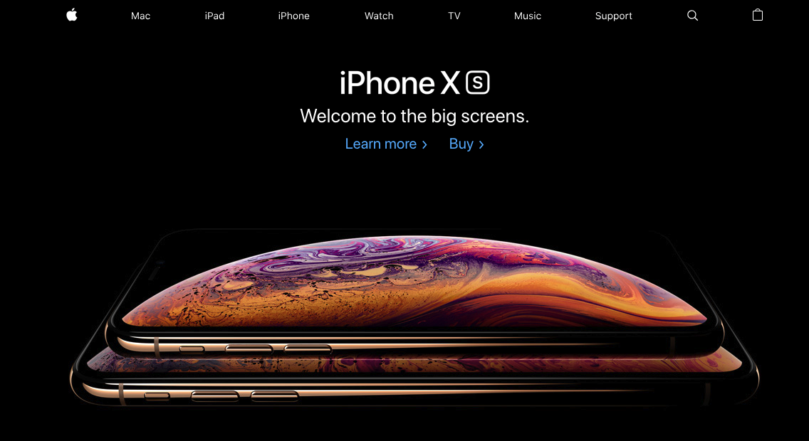
Put all the menu items related to important site sections between the “Home” and “Contact us” areas.
It seems to be very conservative, although most people are used to this very type of menu. To let users quickly find a page on your website, insert links into your content – blog posts and text.
Keep your menu natural and up-to-date. Include only relevant areas of your interest in its structure; all the additional info can go to the blog.
Website structure optimisation is a big deal. To make your site appealing both for web audience and search engines, you need to review your sitemap regularly.
Tip #3. Improve your call-to-action
Optimizing call-to-actions (CTAs) is critical for improving website design.
By making your CTAs appealing and eye-catching, you’re increasing the chances that your next visitor will become a paying client.
CTAs vary from contact forms to trigger buttons.
With the help of contact forms, you can easily collect users’ info like emails and phone numbers with the purpose of sending them a newsletter and making call-backs.
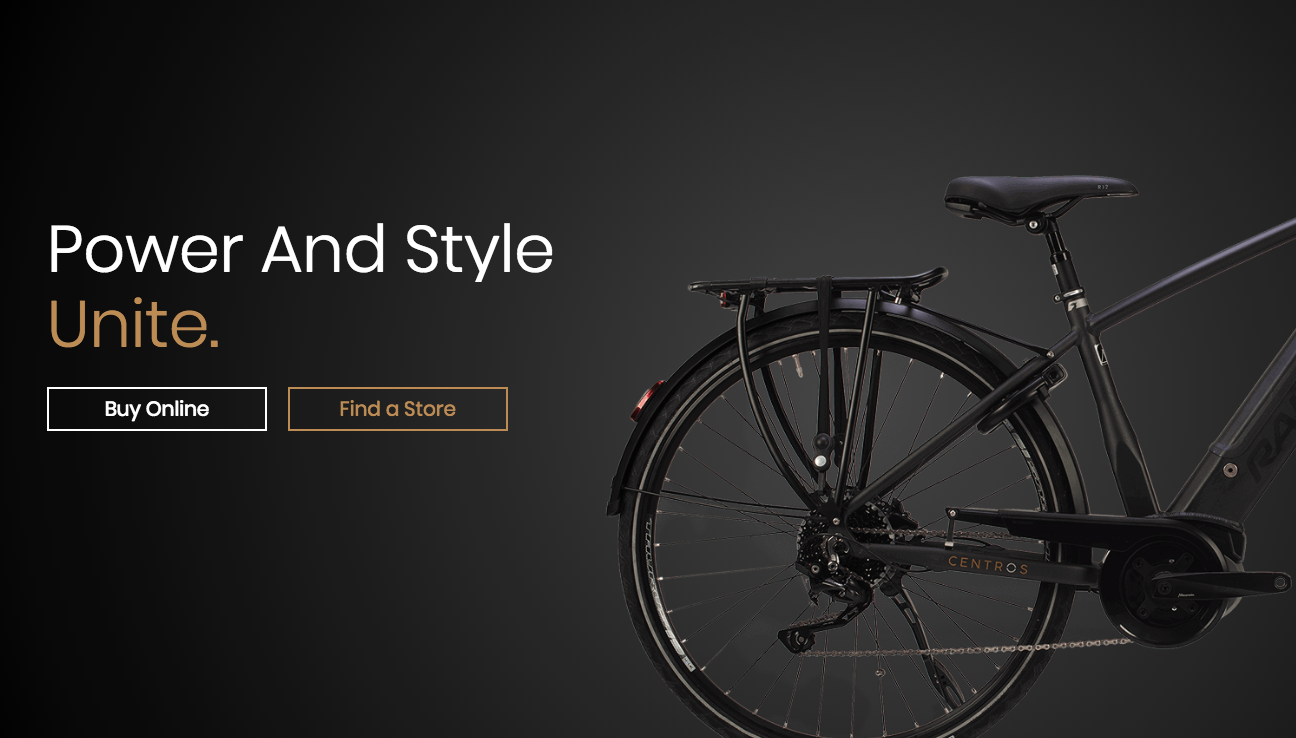
Make your CTAs visually attractive (sometimes even bold) and provide comprehensive instructions allowing clients to make an action in one click.
By doing so, you will allow users to focus on searching, buying or ordering instead of wondering how to interact with your website.
Tip #4. Let users get in touch with you
It sounds a bit silly, but let your users contact you.
There are hundreds of thousands of websites with buried “Contact us” areas. Often, users happen to be in the quest for ways of getting in touch with site owners. Not having found contact info, disappointed they go away.
In the era of ubiquitous communication, it seems to be frustrating and non-professional.
Make your “get in touch available, simply add it to your header or footer so that customers can find it with little efforts.
Also, you can implement your “get in touch in a separate block, add a map to give users directions, create a contact us form or offer a call-back.
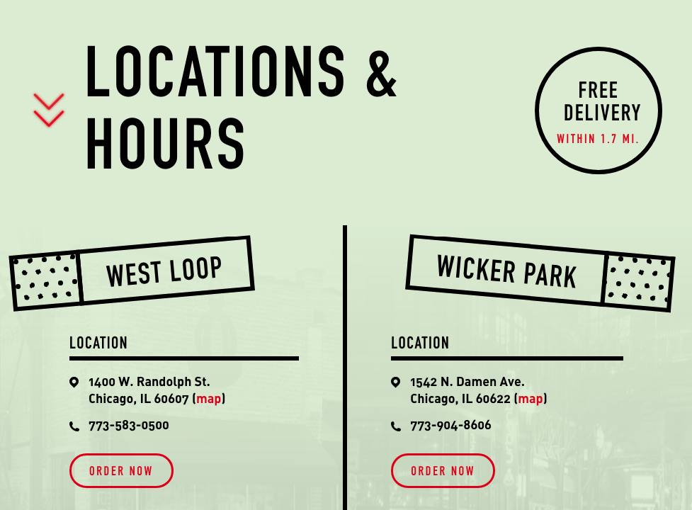
And don’t forget to reply as soon as possible – clients don’t like to wait.
Tip #5. Use socials
The impact of social networks on society is huge. It is another universe where people meet, establish relationships, do business and share whatever with the world.
Let your users tell the world how amazing you are. Add social share buttons and follow links to your web design.
As a result, you will get more traffic coming from social nets, and achieve a greater level of recognition for your brand.
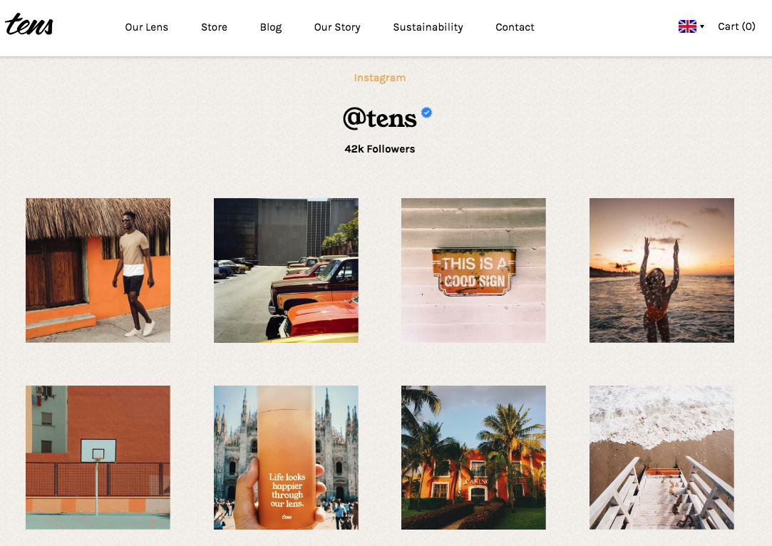
One more web design tip from our team is to avoid posting any social news feeds on your site.
They tend to distract users from the main content. And we’re sure – this is not what you strive for.
Tip #6. Increase the loading speed
We’ve already emphasised the importance of website loading speed for any online business.
Customer satisfaction is directly related to your landing page load speed. If you look at your competitors’ websites and find out that 95% of them are much quicker than yours, then you should improve your loading time asap.
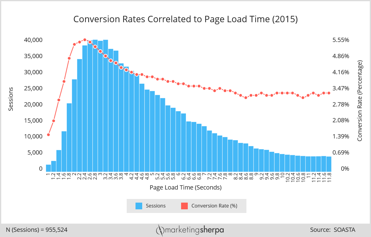
How to do that?
First of all, a website with a clean and bug-free code loads in a blink of an eye.
Check your website code for bugs and minimise the number of JS and CSS files as they can considerably slow down the process.
Another reason may be heavy images and videos. Reconsider the usage of media elements – sometimes one short pro video is better than several long ones of poor quality.
Also, loading issues can steam from your hosting provider, third-party plugins, non-optimized CMS databases, heavy website files, browser cache, etc. To speed up your website loading, identify the possible problem first and only then find the right solution.
Tip #7. Make it mobile-friendly
Although everyone knows about the importance of adaptive design, there are still websites that look horrible on smartphones.
The statistics demonstrate that your mobile website is likely to be abandoned if it doesn’t meet users’ expectations. It sounds frustrating, doesn’t it?
3% of mobile shoppers are likely to go to a competitor’s website if they get negative user experience.
Not so long ago Google made website owners take notice by changing its search algorithm. As of today, responsive and quick-loading mobile websites receive a higher ranking and appear on top positions in search results.
This call-to-action has forced companies all over the globe to reconsider their attitude towards the improvement of mobile web design.
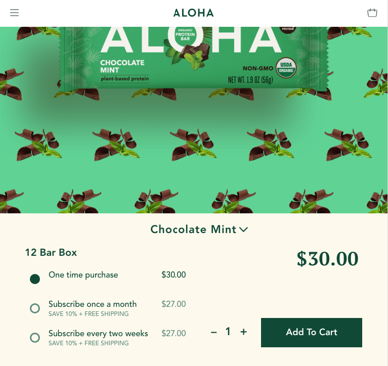
To start the improvement process, ask yourself these questions:
- Why do people want to have access to my website on their smartphones?
- If I were a mobile user, what things would I do on my website from a mobile?
- Does my mobile website currently allow users to do these things?
- Having answered these questions, you will know the weak and strong points of your mobile website.
And the right solution will be forthcoming.
Tip #8. Improve the hierarchy and colours
It’s not a secret that particular colour combinations can help you convert random visitors into regular clients.
Red, green and yellow colour palettes work better for call-to-action buttons as they are associated with pleasant emotions like excitement, calmness, and happiness.
When people feel relaxed and happy they’re more inclined to order, buy or subscribe. So, let your users experience these feelings.
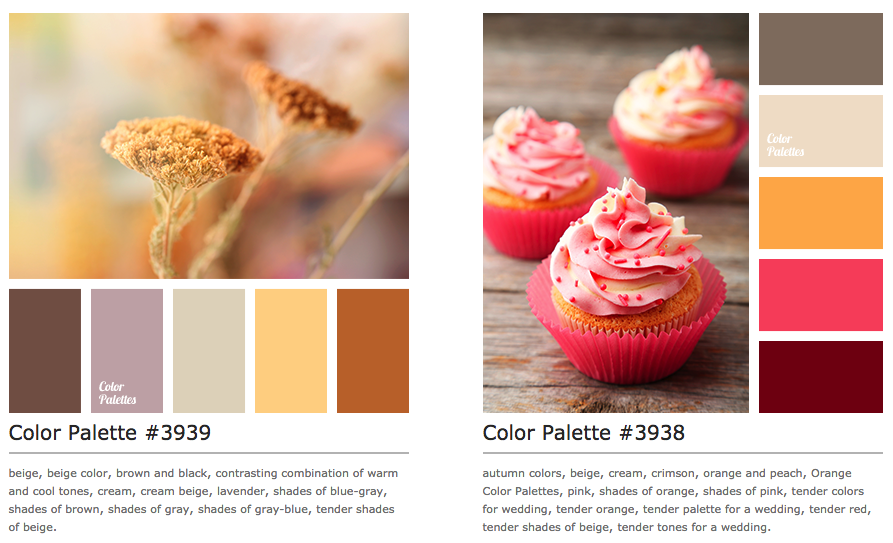
However, there is no rule of thumb regarding the right and wrong colours in web design.
The good idea is to do A/B split tests when choosing new colours and tones. The results you get will be helpful for sure.
Another webpage design tip is to improve your website hierarchy – the combination of font sizes, shades, colours, and spaces. Based on the psychological peculiarities of human beings, the hierarchy can be a great tool for increasing conversions. The simplest method for enhancing your hierarchy may be placing the most important content on the left side of the first two blocks on your front page.
It is called the F-pattern, and it is natural for people as most of us tend to scan web pages from the top-down and from left to right.
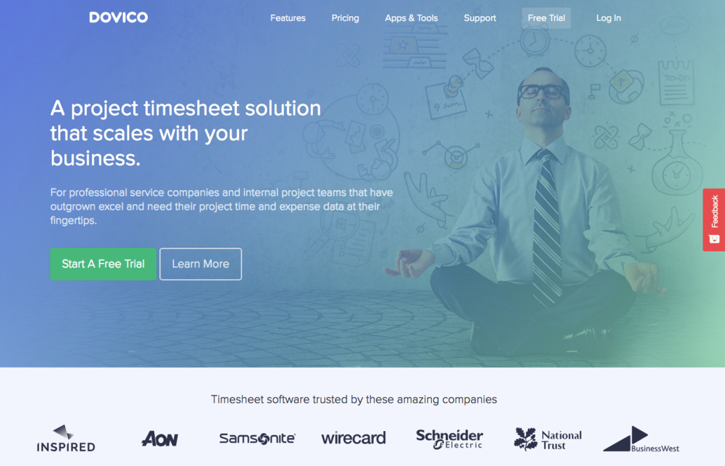
Playing with white space and flows, using repetition and scanning models can be of much help when it comes to attracting the attention of your web audience.
Tip #9 – Insert media elements
Despite decreasing the website speed, images and videos remain a hot trend in web design.
Your written content can tell a lot about your company and services, but statistics show that users prefer viewing more than reading. Moreover, copies are not so captivating as media elements.
To add more intrigue to your online presence, invest in making professional photos or videos.
Free stock images are ok, but they’re already utilised by thousands of websites. If you want to stand out, it’s better to go the extra mile and shell the extra buck.
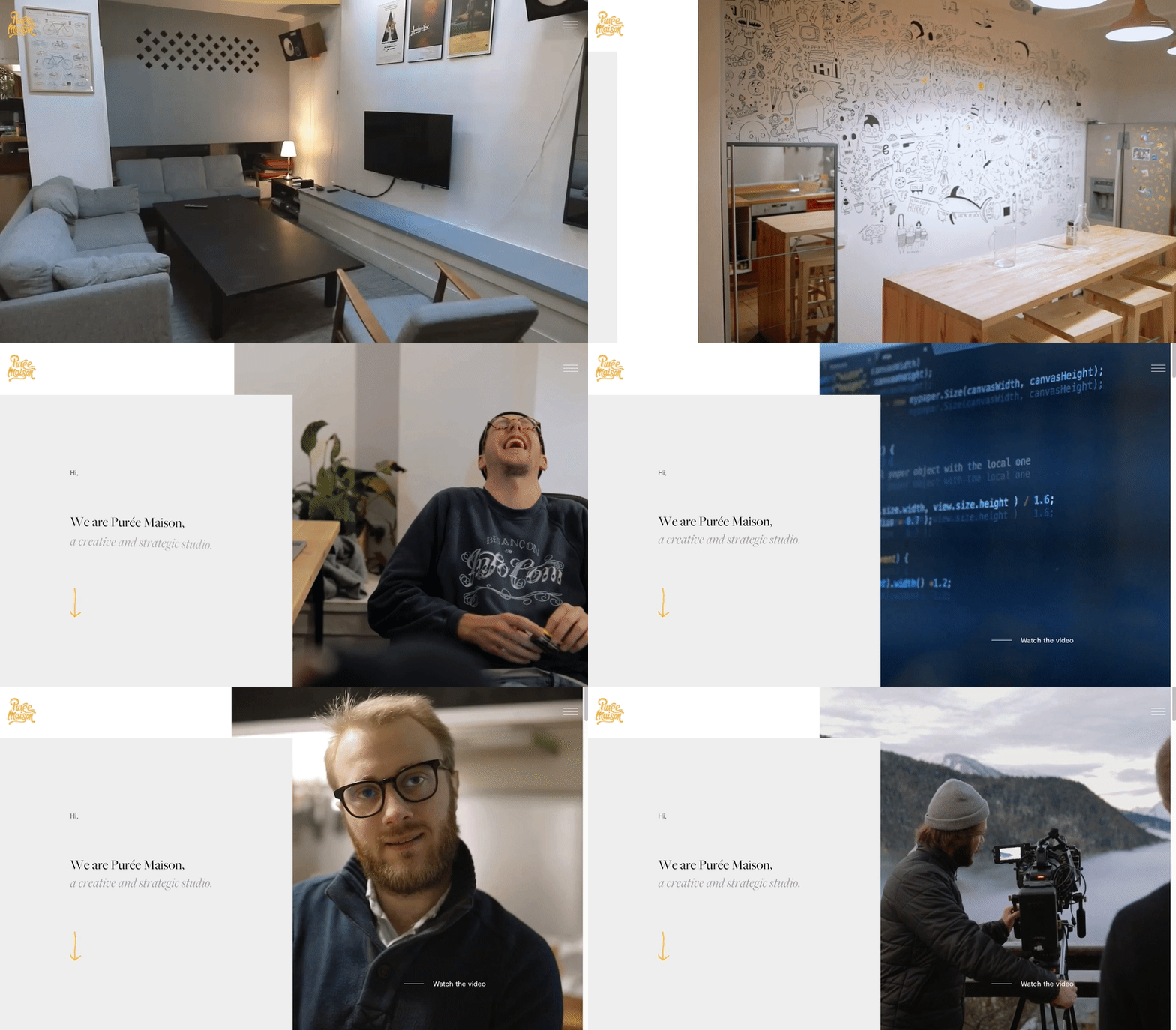
Natural pics of your team, a short pro video about your company on the landing page can greatly contribute to boosting your conversions.
Tip #10. Apply animation effects
Utilize animation to good effect. It should play a supportive role on your website and in no way overload it.
When users come across a website with incredible animation they feel excited until the moment the website stops loading and the browser crashes. To avoid confusion and embarrassment, add animated effects very carefully.
Don’t animate every single area of the layout.
Instead of enjoying the magic, your visitors will be distracted from the key message that you’re going to communicate.

Flavourless sites look dull and sad.
Apply parallax, flip cards, carousel sliders or other light visual design techniques – they will make your website fresh and vibrant without slowing it down.
The takeaway
Congrats, you’ve got through this long piece!
Honestly, we can talk about ways to improve website design for hours.
Those were only a few tips out of a ton of recommendations on how to make your site better, user-friendlier, get more hits and clients, achieve marketing and commercial goals, and eventually be successful.
And a bonus track
A few more things for you to bear in mind:
- Review your web design on a regular basis.
- Be critical to yourself and remember that there is always room for improvement.
- Test your web design on the focus group – even the most beautiful idea may appear to be strange for the crowd.
If you think your website could perform better, a UX design audit might be a good start.
Meanwhile, feel free to find us on DesignRush to see what other clients say about our design and development work. Stay tuned!


