If we asked you to describe a stock trading company twenty years ago, you’d probably imagine a big room with dozens of people lively talking on their phones and looking at the computer screen.

Today most of the brokers operate in the digital realm as the automation of trading activities has reached its peak.
It allows traders to deliver bespoke investment solutions and gives clients the ability to manage portfolios on their own easily.
Today we’re going to tell you the secret recipe of trading website design development that will make your platform the next rock star.
What you will learn:
What you should know about a trading web design
Web design for trading platforms isn’t only about creeping lines with currency pairs, dynamic charts, and lengthy news feeds.
The overall concept should target the core audience and their pain points.
So that you can better understand the target market, we’ve gathered some statistics describing the Forex market:
- even though the global FX market operates 170 currencies, only seven currency pairs are top;
- comparing with other markets, Forex is much larger and more liquid;
- Forex operates around-the-clock;
- the US dollar is the most traded currency, as it makes up 90% of all the deals;
- one-third of traders use smartphones and tablets to search for a retail trading firm;
- the majority of online trading platforms (90%) have built-in robo-advisors;
- more and more female clients are taking up trading activities;
- almost half of the traders aged 25-34;
- IG is the industry leader.
Web design for trading platforms should meet specific criteria:
Swift execution. Unlike bricks-and-mortar business, e-trading platforms process transactions immediately.
Robustness and security. Your website should be 147% secure to protect clients’ personal records, funds, and financial info.
Availability and 24/7 support. Traders should have permanent access to the Forex market, and there mustn’t be any delays in customer support.
Rich in features. Some cool things set the e-trading industry from its ancestor, traditional business, – smart portfolio management, automated investment advisors, limitless investment options and tools.
Cost-effective and time-saving. Thanks to the automated elements, you can cut administrative costs and optimise the time needed for each transaction.
Accessibility. Your online trading portal should be accessible from any electronic device and operate well in any browser.
User-friendliness. A website that’s easy to use, pleasant to browse and engaging to read, helps build trust.
Powerful admin area. Trading platform design should come with a powerful admin dashboard where you can manage the functionality of your website and track the performance of your business.
Uniqueness. In a very competitive world, you just have to stand out. Make a trading website design that will be modern and go beyond the ordinary in terms of architecture, navigation, design effects, user histories and flows.
So how to design a trading website that will have the characteristics mentioned above?
We’d say that it’s not that easy, although, if you know all the ins and outs, you’re up to this complex task.
5 tips on how to design a trading website
Let’s move to the anatomy of good web design for trading platform. Here a few techniques that will help you craft a platform any FX trader will love.
1. Create an intuitive navigation scheme
If a website were a human body, the navigation would be its blood.
When a user drops by for the first time, they want to understand where to find the FAQs section or how to reach you out in a matter of seconds.
Our brains are used to familiar patterns: e.g. when a visitor sees a burger button, they know that there’s a menu behind it or they recognise a live chat in a sticky pop-up. That’s why, when it comes to designing the navigation, it’s vital to do it for the sake of simplicity rather than creativity.
You may opt for mega menus as trading layouts have complex structures.
Although, remember to keep the sitemap relevant and up-to-date.
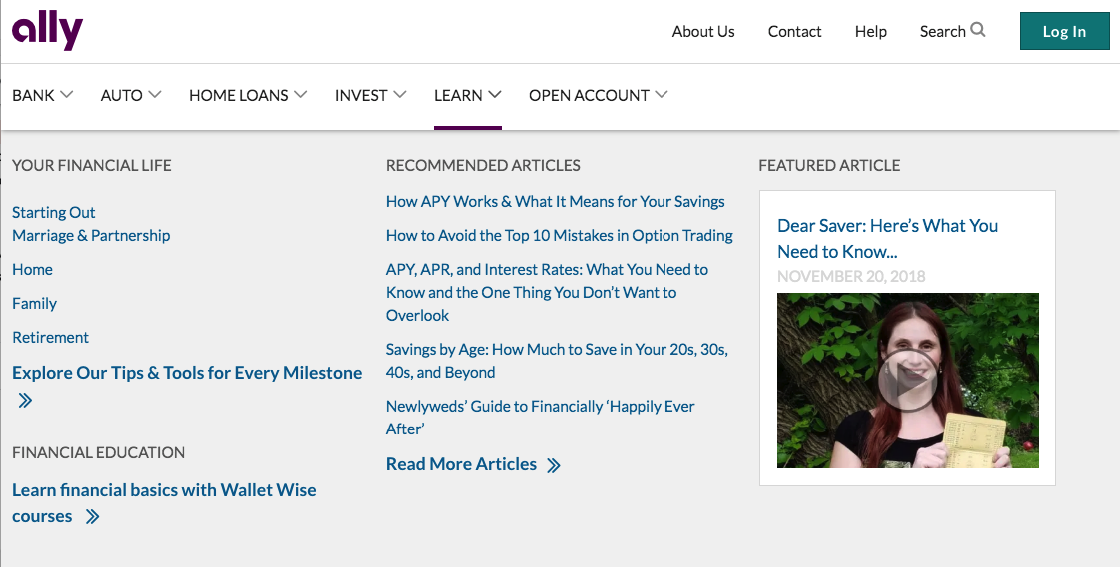
Add only the most essential elements to the menu in the header, the rest of the pages can go in the footer.
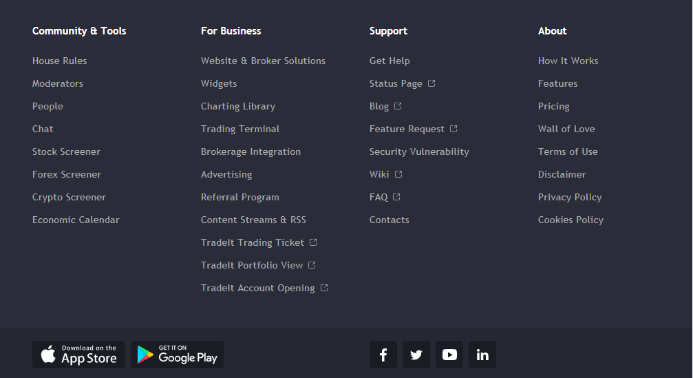
The contact form and social buttons should be easy to find. You can integrate them in the footer or add a floating social media bar.
Make sure that transitions between pages are smooth.
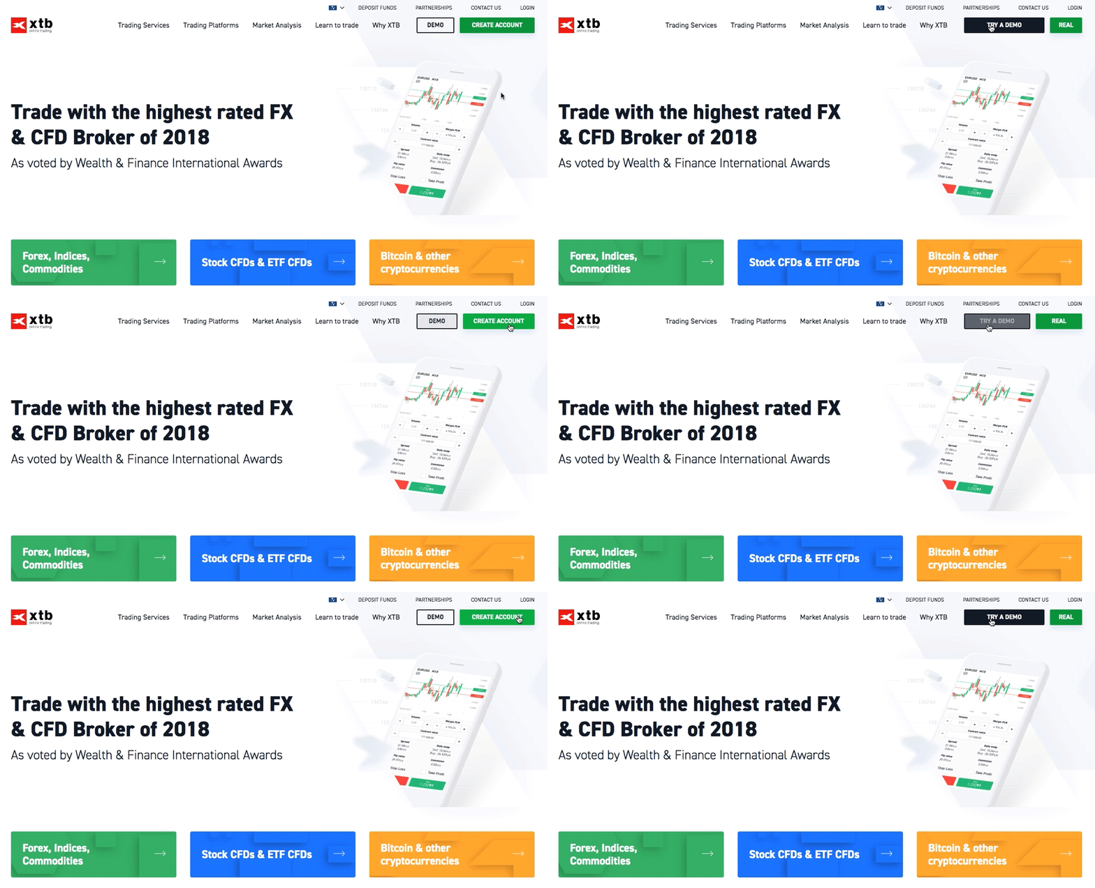
To make your site more engaging, you can add some animated effects that mark each interaction.
2. The sign-up procedure should be simple
All the best-known trading services providers allow users to create personal accounts as it’s one of the essential features of custom trading website design.
However, clients’ decision whether or not to stick around depends on sign up methods.
A common practice is to let users sign up with social accounts. Along with Google+ and Facebook, you can use professional networks such as StockTwits and LinkedIn.
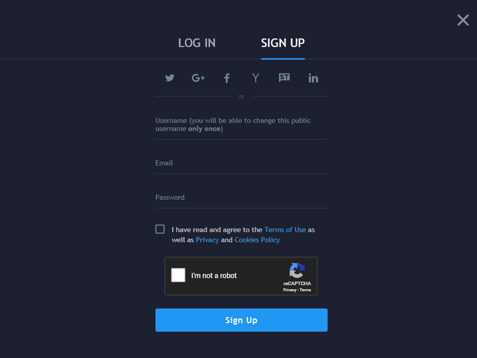
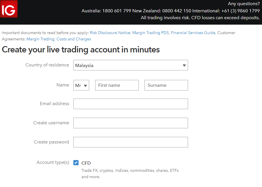
To make the signup experience a real breeze, avoid long forms; you can ask your client to add additional details later.
As financial regulatory bodies such as FCA and SEC call on financial companies to protect investors against underlying risks, you can ask prospects to read certain documents before they apply.
A useful trick is to prepare short instructions for each step of the signup process or provide immediate help.
3. Develop a powerful trading platform
A financial platform is what leads your business to success and sets your company apart from the competition.
It’s without question that a trading solution must be compatible with different OS, devices, and browsers.
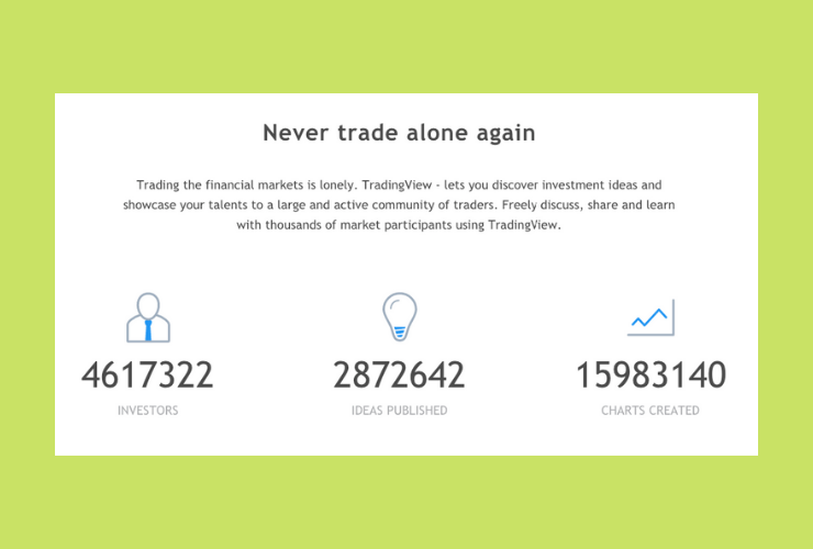
To gain a competitive edge, you can mix the financial software with a social network. Check out how TradingView fulfilled this task.
How does it benefit you?
People are social beings who like sharing experience and getting feedback. FX traders will appreciate the opportunity of socialising for sure.
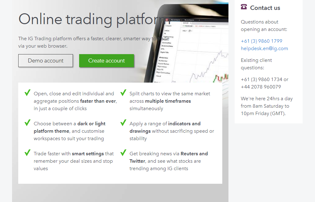
If you aim to satisfy even the most demanding clients, add extra customisation to your trading tools.
The IG trading platform is just great in terms of personalisation: here you can tweak smart settings, apply various indicators and drawings, and choose appropriate wireframes.
If your goal is to reach out to different markets, then try the way XTB uses.
They’ve crafted several online solutions, each for a specific category of clients.
xStation 5 is a desktop app that comes in a bundle with multiple features: trading calculator, advanced tech analysis and chart trading, built-in stat and trader’s talk.
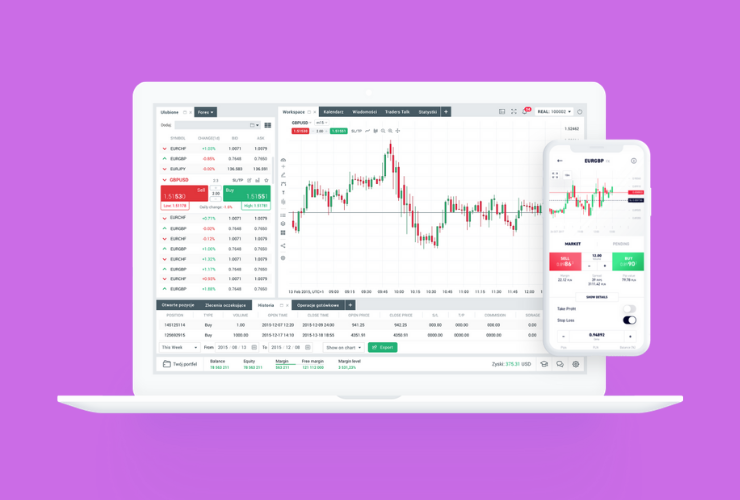
The xStation mobile app is for those who prefer making deals on the go.
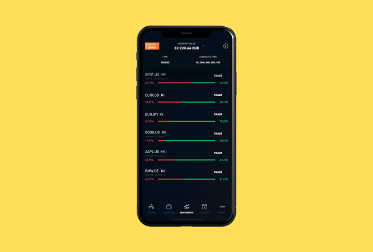
MetaTrader 4 has unique features like strategy testers, expert advisors, automated portfolios.
4. Add special features
Website designs for trading platforms are entirely different from those for e-commerce sites or travel directories.
Before you outline the list of features for your future trading system, we advise you to analyse the websites of your competitors.
Having done our research, we’ve made a list of features any e-trading portal must have:
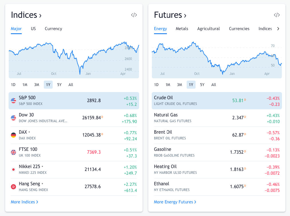
- Visual market analytics. There are plenty of options to embed this feature into your web design: use dynamic bars and charts, integrate market calendars or currency pairs tables.
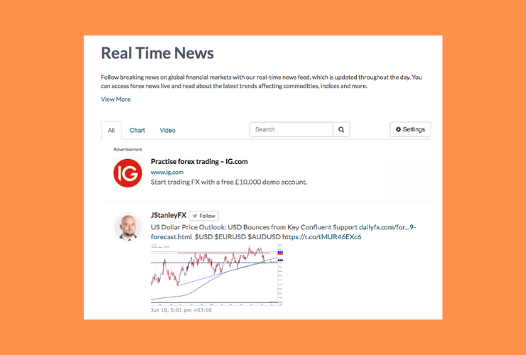
- Real-time news feed. Traders much rely on what’s happening at the moment, that’s why you have to provide them with relevant information on an ongoing basis;
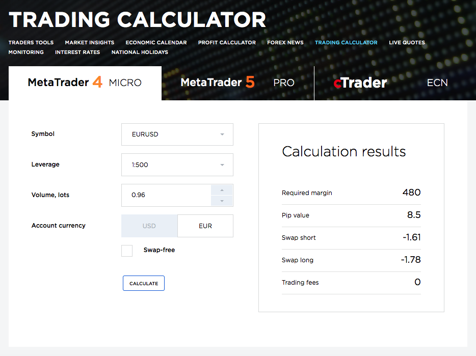
- Financial calculators. It’s a standard feature to implement in every web design for trading. Help investors realise what gain or loss they can obtain from every trade. For instance, at OctaFX, there are several calculators, each for a particular purpose.
- Automated FX trading advisors. It’s an optimisation that will help you attract even more clients. Forex robo-advisors automatically fulfil trading strategies according to the conditions set by clients.
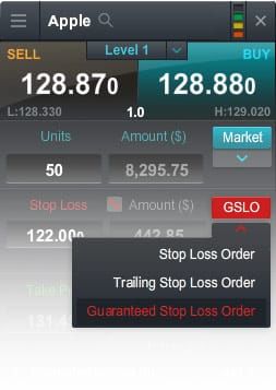
- Different order types. This feature in the design for trading website promises more safety to users who want to protect themselves from financial risks. Alongside conventional stop-losses and take-profits, you can use limit and stop entry orders, partially close trades and trailing stop-losses. Each order type helps users eliminate risks connected with market fluctuations.
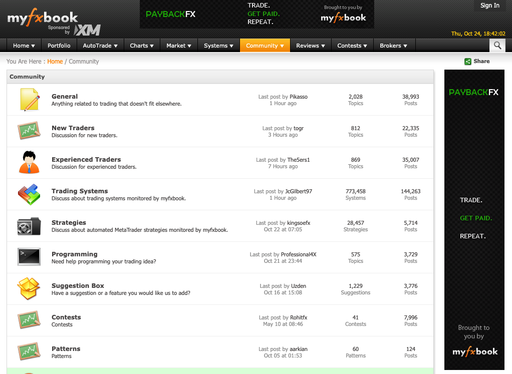
- Community and forums. We are social beings and we always need someone to have a word with. Chat rooms, forums, and communities integrated into a trading company website design are places where traders can share their strategies, discuss news, make forecasts or just have fun. In doing so, they support each other and make the community around your platform even stronger.
5. Power personal accounts with advanced functionality
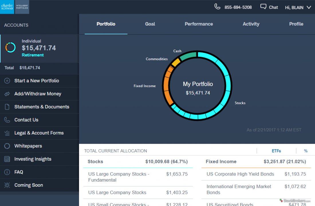
We’ve already mentioned that you can’t do without user accounts to build a trading website design.
It’s one thing to develop a user area, but how to make it useful?
Let’s look at how leading trading companies do it.
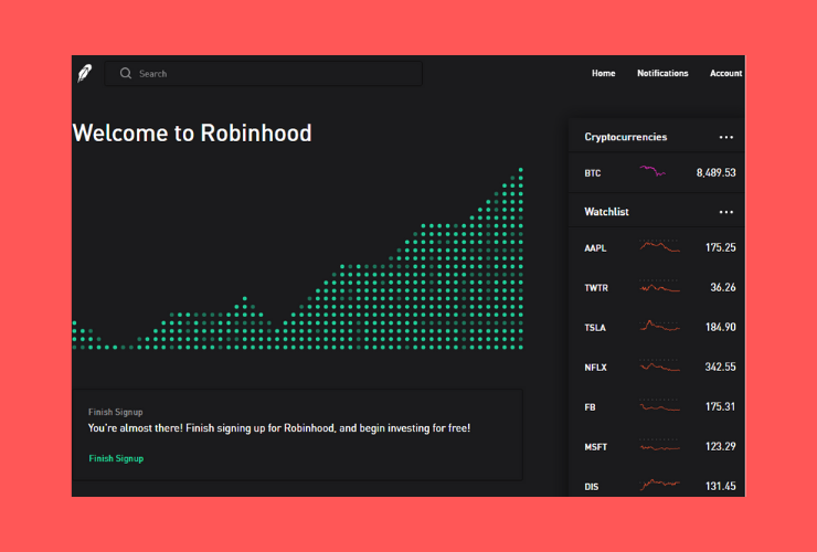
Robinhood allows users to set custom notifications, invest in selected stock collections, and gives a detailed analysis of top movers.
Although Robinhood mostly deals with stock trading, you can mimic some of their features.
Besides, clients can look through recent news and check prices for cryptocurrencies right in their dashboards.
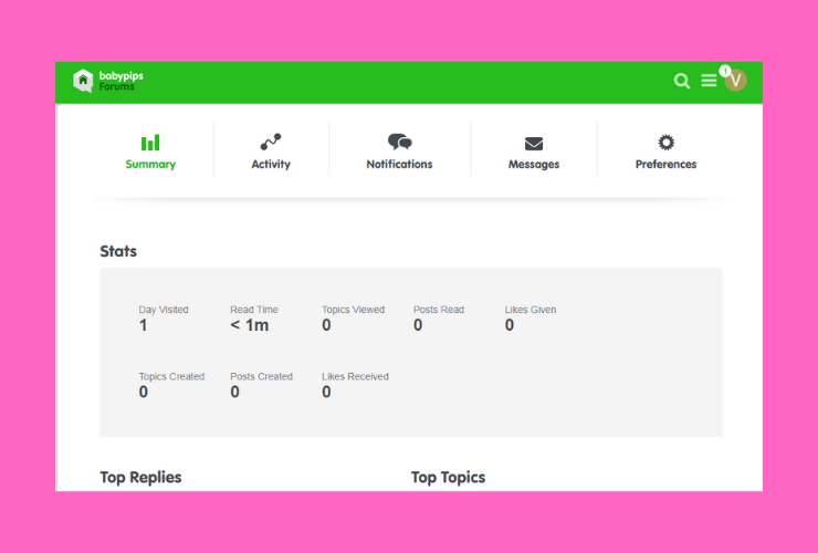
When you log in your BabyPips account, you see a visual report of your activity.
Since the platform is an educational web resource for FX beginners, they’ve tried to make the learning curve as engaging as possible.
What you can do within your Babypip account: configure personal settings, send and receive messages, view the stats of your activity on the forum.
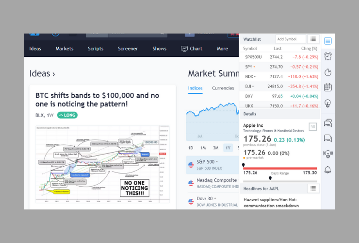
Tradingview is a brilliant example of integrating a powerful toolkit into a trader’s account.
The sidebar includes various settings that can be easily customised: alerts and notifications, trading ideas, and calendar.
Here’s a watchlist where you can find a detailed analysis of any index with recent market news.
If you need assistance, you can get it immediately right from your dashboard.
Best trading website design examples
We like advising on how to build ideal websites for any business, be it a travel directory, crowdfunding platform or an FX trading website.
What’s more, we like drawing readers’ attention to the best-in-class case studies.
If there were a reward for the best web design for a trading platform, these websites would receive it for sure.
TradingView
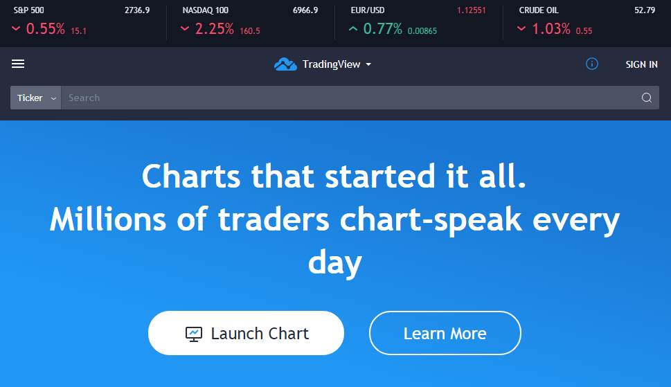
What we like:
- clean and modern design;
- encouraging call-to-action;
- mega menu;
- simple sign-up procedure;
- live search;
- numerous options for customisation;
- the advanced chart features;
- stock and currency screeners.
BabyPips
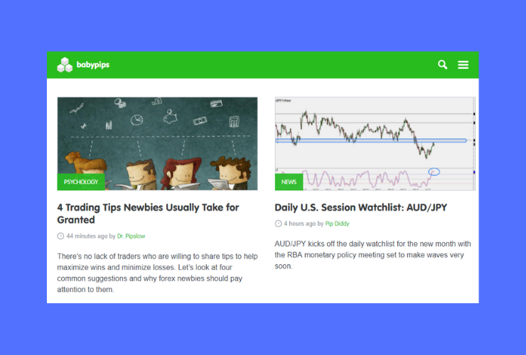
What we like:
- a clean menu and intuitive navigation;
- the overall colour scheme and typography;
- multiple calculators;
- an economic calendar with filters;
- Babypips forums and videos;
- a mobile-friendly design.
IG.com
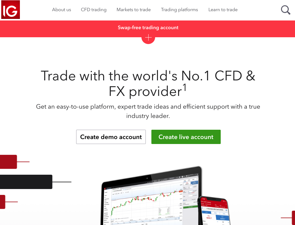
IG.comWhat we like:
- demo and live accounts;
- a built-in live chat;
- relevant content;
- a multi-level drop-down menu;
- multiple trading platforms and apps;
- fat footer;
- the IG Academy with online trading courses.
XTB
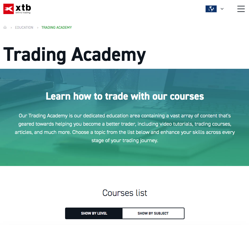
What we like:
- light animated details;
- the language switcher;
- compatibility with different devices;
- expert charting tools;
- live market trends discussion;
- a professional trader performance stat;
- an XTB roadmap.
Ally
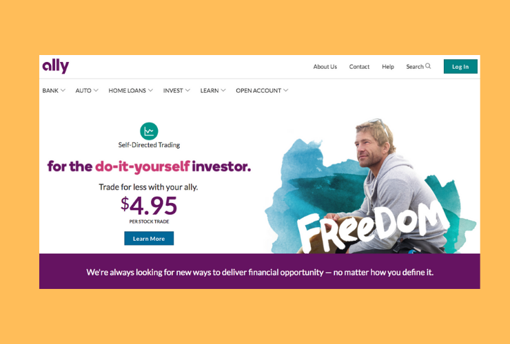
What we like:
- a clean minimal design;
- automated account management solutions;
- a sticky menu;
- a sitemap page;
- social sharing icons;
- contact page;
- user-friendly navigation;
- Ally Mobile.
Robinhood
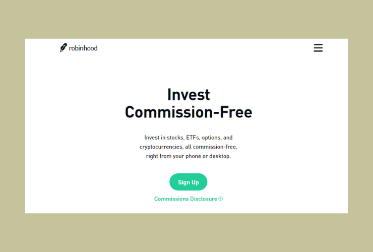
What we like:
- a flat design with natural shapes;
- the login page;
- custom iconography and fonts;
- a super simple menu;
- the signup procedure;
- Robinhood’s blog;
- the FAQs page.
CMC Markets
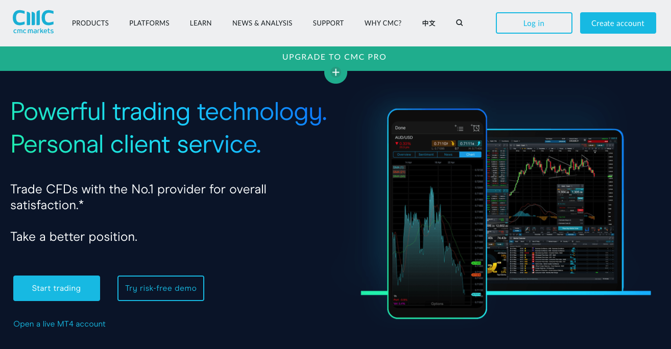
What we like:
- a fresh design with custom effects;
- webinars and videos;
- demo accounts;
- an advanced trading platform;
- an interactive glossary;
- animated navigation;
- extensive FAQs.
Plus500
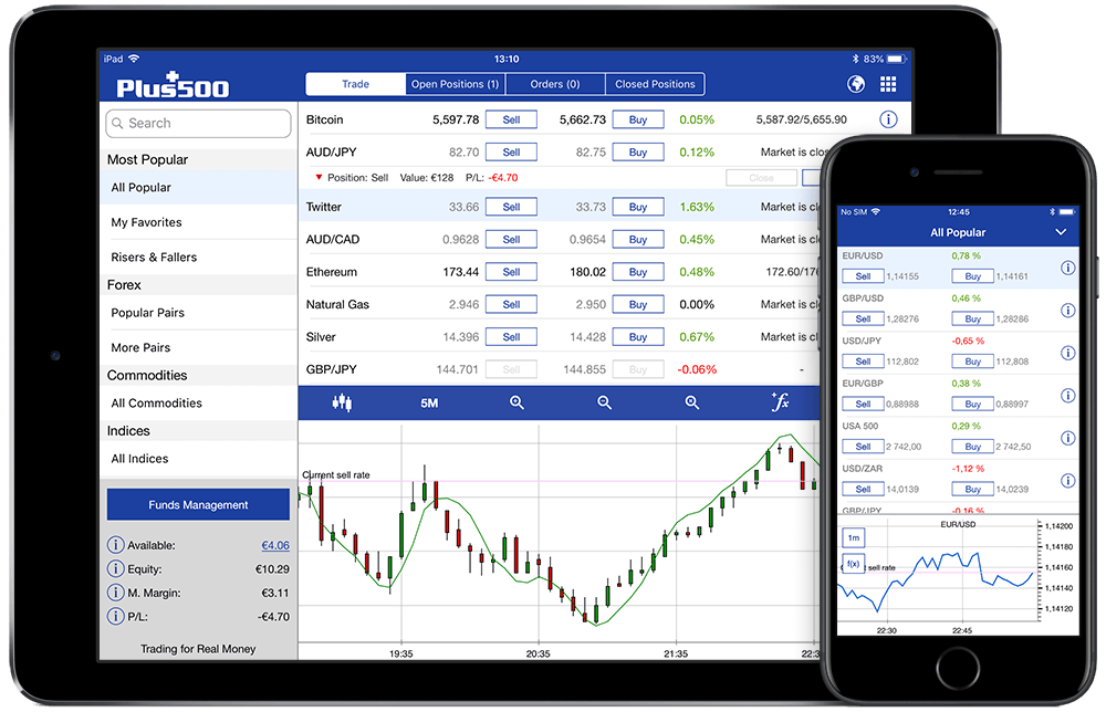
What we like:
- a search instrument feature;
- support of multiple languages;
- various payment methods;
- an easy-to-use economic calendar;
- custom alerts and push notifications;
- how-to-use video content.
Commercial trading websites made by JustCoded
We’re proud to add a few cases of FX trading websites developed by our dedicated team to the above-mentioned best practices.
We were lucky to once work with one of the most recognisable names in the online trading industry – FxPro.
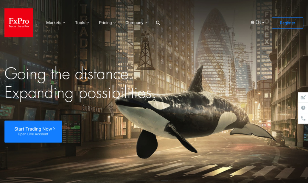
FxPro is a genuinely global broker serving both retail and institutional clients all over the world. The company deals with Contracts for Difference (CFDs) and several asset classes, including Forex.
FxPro follows high standards of transparency and security: traders’ funds are kept on the accounts of major international banks.
FxPro has a fantastic track record: 15+ years in the industry, 60+ international awards, 4 trading platforms, etc.
Among other clients of JustCoded, there are several brokers from UAE. These companies offer Forex and CFD trading services for institutional investors and individuals.
ADS Investments is one of our top clients, a financial company with headquarters in Abu Dhabi, UAE.
ADS Investments is a subsidiary of ADSS Group offering FX and commodities brokerage for the international community.
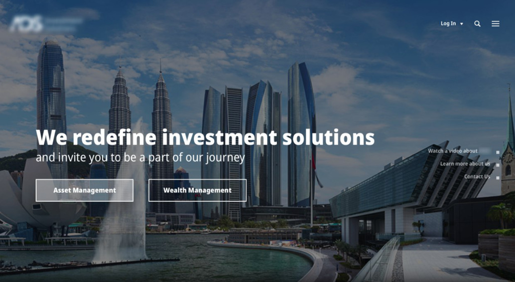
When working on this project, we were partnering with BLEND digital agency whose task was to create a trading website design.
The overall design is light and clean with several design effects (carousels, back-to-the-top button, hover effects and animation).
The website has a well-organised structure, simple menu and intuitive navigation.
Other features include a search bar, Blog page, video content, an integrated Google map, a dynamic budget chart, etc.
Our goal was to redesign their sites so that users can execute trading on mobiles and desktops fast and efficiently.
Both platforms focus on providing high-quality training and education to those who are making their first steps in Forex trading.

Bottomline
It was a pretty long piece as it’s always hard to grasp nuts and bolts of trading sites creation in haste.
A few tips before you rush to developing the next TD Ameritrade (didn’t include it into our list as they’re tough by default)
1. Think well about your business concept and marketing strategy and translate it into your platform.
2. Look at competitors and frontrunners to discover the basic and advanced functionality their sites have.
3. Design bearing in mind the pain points of your core audience.
4. Make sure that your web design is responsive and mobile-friendly.
5. Put the security at the top: this is the case when more is better.
Did we miss anything? Tell us in the comments section.
By the way, if you’re ready to build a platform for your FX trading business, drop us a line and get a free quote together with basic business analysis.
