Travels! We love visiting unexplored countries and continents, but people don’t take trips, trips take people.
The adventure starts long before a wanderer hits the road, on some travel website where people can choose a destination, book a hotel or a buy a package tour.
Everyone in the travel business wants their portal to be the starting point for each wanderer planning the next voyage.
How to turn a travel website into one successful project?
The answer to this and other questions in this article. Enjoy reading!
What you will learn:
Why build a travel agency website?
A decade ago it was okay if a travel company didn’t exist on the web and only worked offline.
Travel consultants, agencies and vendors ran brick-and-mortar businesses and didn’t bother with the pros and cons of moving to the digital realm.
If newlyweds wanted to book a honeymoon trip, they would do it in face-to-face communication.
But everything has changed.
Instead of making room for meetings and negotiations in their busy schedules, customers prefer to arrange everything in a few clicks.
The high demand for online travel services has forced millions of vendors to create resources that engage users, serve as educational facilities, and boost sales.
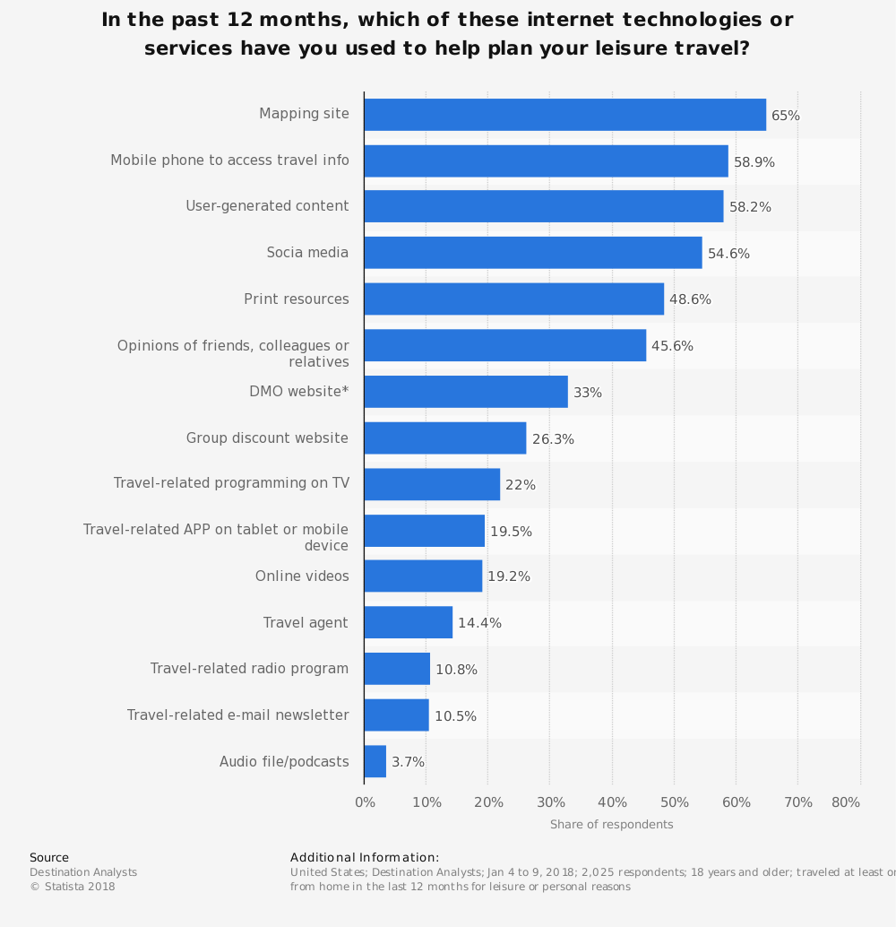
Here are the main benefits you get if you decide to build a platform for tourists and travellers.
More clients
Word of mouth will always be an effective channel to attract new clients, however, a powerful website beats it.
Millennials and the digital generation choose reliable companies who can live out their travel dreams fast and easy.
A stunning website with good SEO-optimisation, attractive design and layout will help you increase the number of potential clients looking to spend their holidays at someplace nice.
Loyal community
They say that the probability to sell to a returning customer is around 80%, and a website is a good way to keep in touch with your existing clients.
Spread your online presence to social networks where people can share information about your brand, provide their feedback, and recommend your services.
Of course, a website only won’t just drive that interaction. You’ll need to hire a marketing and a community manager to inform your regulars about discounts, special offers, and hot deals. Try to remind about your company regularly through email newsletters, Facebook and Instagram posts, ads, and other digital marketing channels.
A loyal community of online readers will help you know your clientele better, identify and work on your weak points, create a unique selling point.
Self-promotion
A well-thought-out landing page tells visitors who you are and what you do instantly.
You can present all your services right on the front page of your website, make a landing page or create a separate internal web page to showcase them.
A how-to guide on travel website development
When people think about going on vacation, they paint it in the brightest colours and dream about every tiny detail.
Your travel website should mirror the image of an ideal holiday or vacation and inspire travellers to explore new destinations and hotels.
It’s never only one photo or element that does the trick. Prepare a pen and paper and start ticking off the must-have features of a travel website.
Immersive photography and VR
We buy with our eyes, especially when it’s something as desirable as a vacation.
Let your visitors customers immerse into the picturesque landscapes and magic views right from the first scroll on your travel website. If you can make them if as if they were already travelling, consider it nailed because we are all driven by emotions.
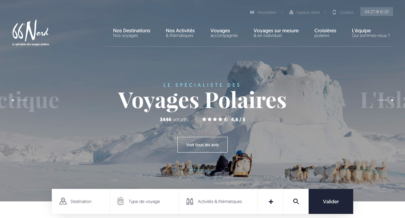
High-res photography and professional videos are perfect helpers when it comes to users’ engagement.
Bear in mind that heavy photography and videos impact the overall loading time of your site. Optimise and compress wisely to balance between quality and speed.
AR/VR elements will make your travel website more interactive and encourage visitors to stay longer. The longer they stay – the higher are the chances to convert them in your clients.
(Play and rotate the video with your mouse)
A compass for users
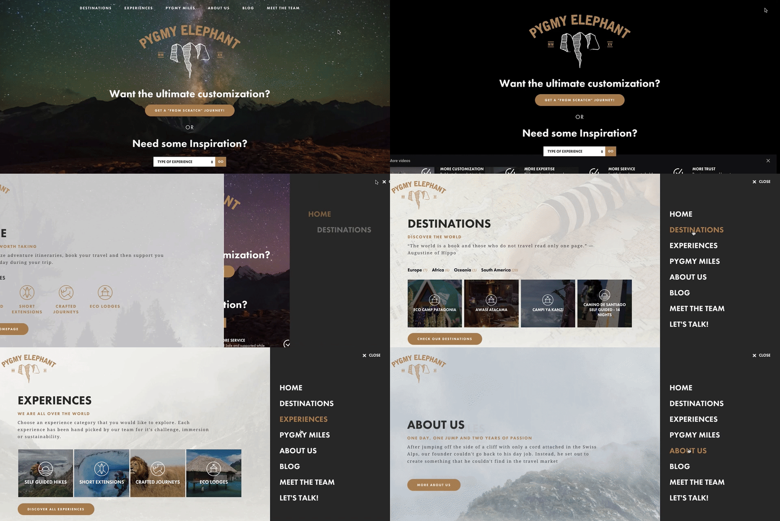
A clear navigation scheme helps random visitors find the info about a particular location, view available destinations, find your blog with useful information, and contact a travel vendor in a matter of minutes.
How to create a perfect navigation bar:
- choose the best location for the main navigation bar;
- make your CTAs clear and encouraging;
- create an engaging landing page and link it to internal pages;
- add micro-interactions to properly guide users;
- keep your menu brief and relevant.
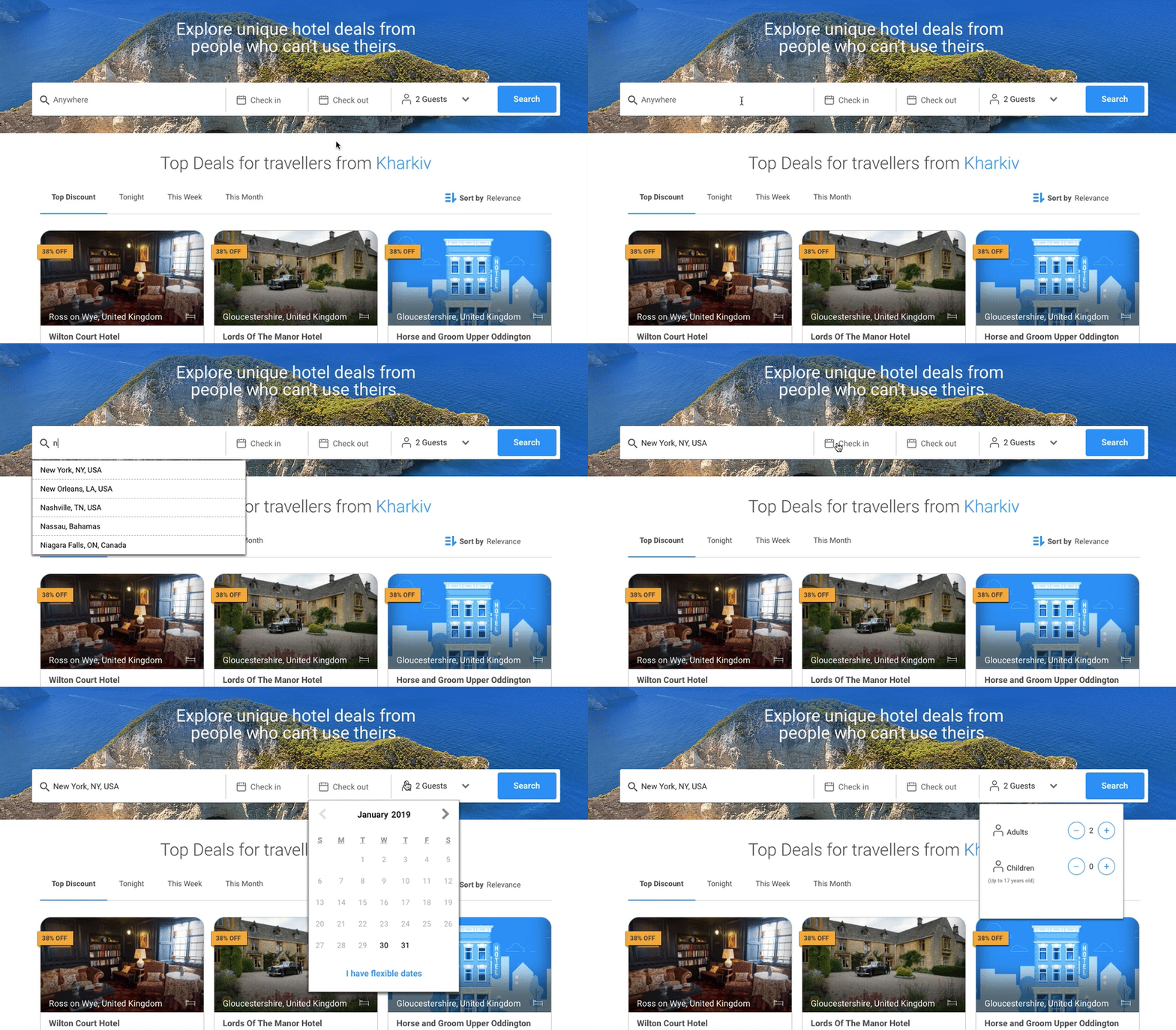
Fast search tool
The key point one should keep in mind when building a travel website is an advanced search with useful filters and predictive results.
Even if your search feature is going to save users a few seconds, they will appreciate it for sure and will come back later.
A voice search will score you a couple more points and help you stand out from the competitors. It’s the latest technology which gains popularity among people really fast.
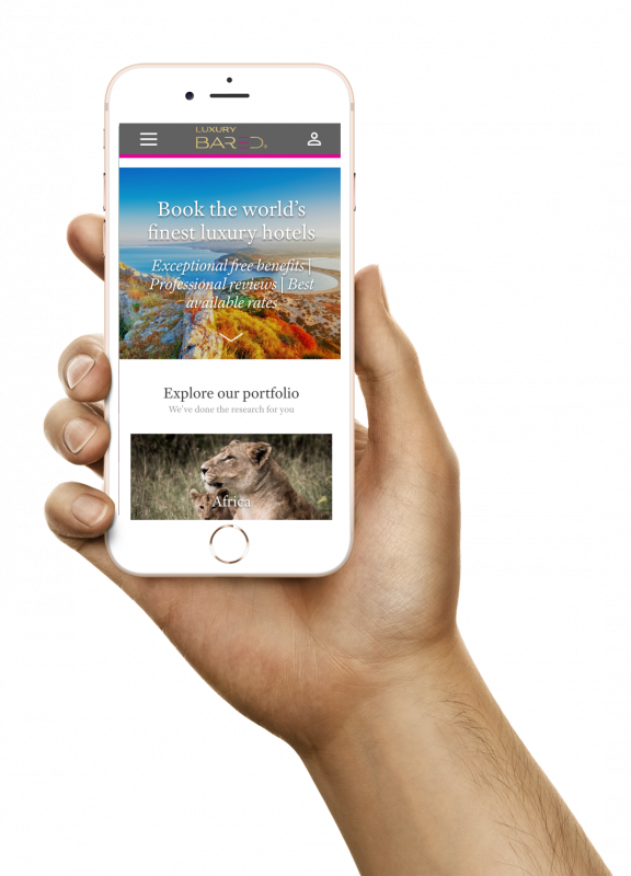
Mobile experience
A recent survey by Cisco reports that business mobile traffic is going to grow 5.6-fold in a few years to come.
It means that most would-be travellers and bookers will make all arrangements for journeys on the go.
When creating a mobile-friendly design for a tour company site, it is essential to:
- make navigation as simple as possible;
- create large CTAs that enable one-tap actions for booking and purchasing;
- ensure that the page load time is as high as on a desktop version;
- insert responsive and retina-ready media elements with the zoom feature;
- make sure that all the links and buttons are clickable.
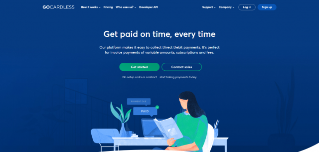
Secure payment gateway
If you worry about the reputation of your travel facility, you should carefully consider a payment gateway provider you’re going to integrate into your service.
With the right payment provider, your customers will never risk losing both their money and confidence in your business.
How to choose a reliable payment provider:
- check a potential vendor for security standards;
- discover what reputation your vendor has;
- consider whether you need a hosted or a built-in payment gateway;
- review the contractual terms and fees.
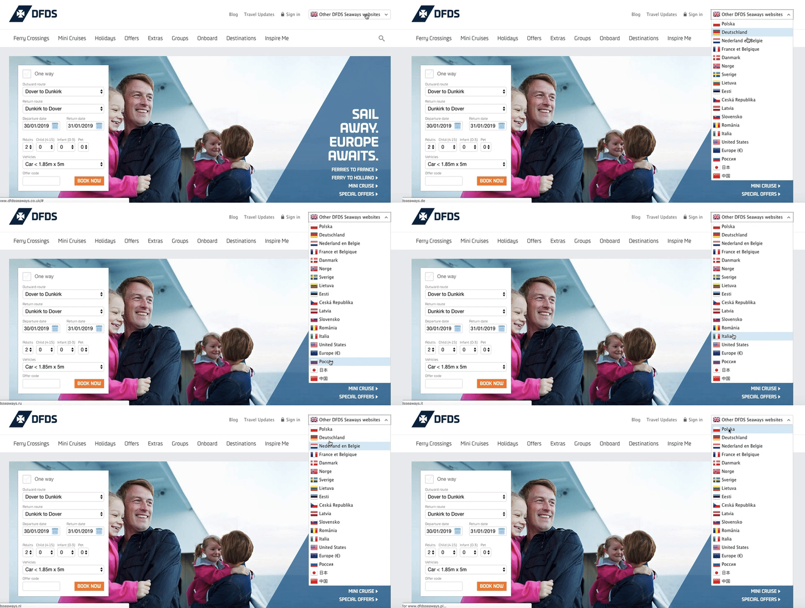
Multilingual interface
Most of the platforms with travel website design offer the content in English and a couple of local languages.
For those travel agents, companies, and operators who are planning to expand globally it’s essential to be multilingual.
Users may find the absence of their mother tongue on a website very depressing and go away without saying goodbye.
To have a professional image from the start, make it easy to change the language on your platform and hire real interpreters to translate all the content in different languages. Let’s face it, machine translation is not perfect yet, especially with a creative copy.
Instant reservations
When people drop by a tourist portal, they expect to book a tour or a hotel easily.
Everything from check-in and check-out calendars to payment methods should work smoothly and require little to zero efforts to be placed.
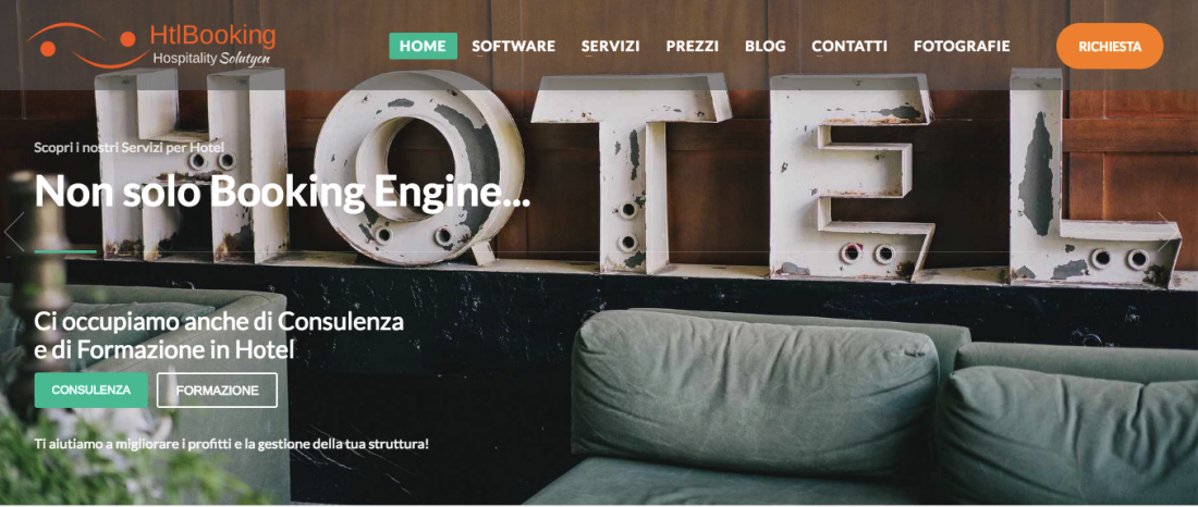
You can use booking engines such as HtlBooking or HotelRunner. In fact, using API you can integrate any booking system on your website be it Skyscanner or Kayak.
The beauty of booking engines is that you can get instant updates of available rooms and rates by integrating a plugin into your site.
Moreover, you can customise the design elements of a booking engine such as buttons, forms, shapes, etc.
How to build a travel website: step-by-step
Of course, it’s not the ultimate full list of core features that you’ll need to create a travel website.
Add more functionality and engagement according to your specific ideas and need, see what your competitors are implementing and try to imagine what you as a traveller would like to see on a travel website.
If it’s your first experience in travel website development, study the essential questions you should answer to make a powerful platform of your dream.
1.What to do and for who?
Begin with identifying your client.
If you have some regular customers, it will be easier than analysing the target market for the first time.
You may decide to work globally or deal with particular locations, offer crafted journeys of hikes, provide travel consulting services or vacation packages.
Once you understand who is your core audience, think about their pain points and possible ways to solve them.
This is exactly what your website goal is.
2. How to make a statement?
Plan your marketing campaign. The aim of your marketing campaign should correspond to the global mission of your platform.
Think about the metrics and KPIs you should achieve to hit the marketing goal.
It is also a good idea to look at how your rivals promote their business and learn from their experience.
Then think about the resources, means, and channels you will need to launch your campaign.
It will help you identify your marketing budget and stick to it.
3. What should my site look like?
An effective sitemap helps visitors easily navigate around your source, improves your rank in search engines, and allows you to expand a site structure more accurately in the future.
When mapping out a site think about your client personas, their user flows, and journeys, the desired content and your unique selling point.
Start with planning main pages, then add internal pages and plan some space for extra pages.
Also, remember that well-thought-out internal linking is to enhance SEO, increase engagement and improve usability.
Once you’re done with a site structure, consider what functionality your platform requires to fulfill its main task.
4. How to engage clients?
Proceed with preparing content and creating a web design.
To make your portal engaging, think about the info people search for when developing travel itineraries.
It is vital to sound comprehensive, so use the language that is clear to your clients.
Don’t focus on texts alone, season your copy with cute iconography, images, clips, and infographics.
If you’re not a professional designer, hire a designer or choose from the variety of WordPress themes for example.
5. How to make a travel website?
How to make a travel agency website if you don’t have coding skills?
There are several options for you:
If you are geared toward a “quick-win, then a site builder like Wix or Weebly is just what you need.
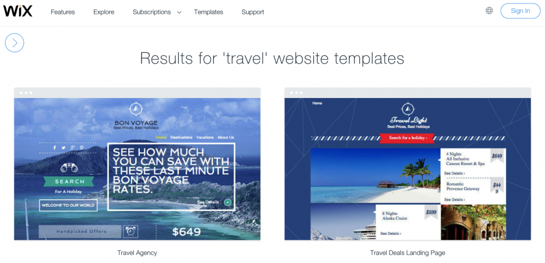
The biggest advantage of site builders is a range of travel SEO-optimized templates with predefined functionality and available hosting.
If you know something about web design and coding, then you may choose to build a travel site on a ready-made template or theme.
What is good is that you can fully customize it and adjust to your business needs.
For those who have big intentions, there is no better way than hiring an outsourced team with solid expertise and creative approach.
6. Does everything work as it should?
Now it’s time to check if everything works smoothly.
Create a detailed checklist of things you need to verify before launching a platform.
It should cover functionality, usability, compatibility, and security issues.
The efficient testing is to help you detect and solve existing issues and make sure that your source is super friendly for both people and engines.
When any tiny bug is fixed, you can go live. And don’t forget to make a launch party!
7. What to improve?
So, you gave a toy car to a little boy, but how to force him to play with it?
If you have an online presence, it doesn’t necessarily mean that people will rush to see it.
To get traffic and high ranks, you should continue optimising your travel source permanently.
Your design should always be customer-centred, content educational, and functionality supreme.
What’s the cost of building a travel website?
This is our favourite question 🙂
Ideally, we’d start asking potential client lots of questions in return:
- how big is the agency/company?
- what kind of/how many tours are you planning?
- will you handle reservations on your end or through a third-party?
- will you integrate any external booking systems?
And these are just to begin with.
If you answered “yes” to the questions above, it’s a relatively big project. The development will cost roughly from £45,000, and if you need a custom design, add at least £10,000 on top.
These numbers are a shot in the dark, of course.
Our projects
All these tips are based on our expertise in making travel sites.
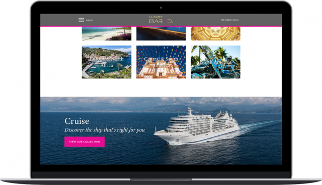
LuxuryBARED is one of our recent travel projects.
It’s a platform for travellers and bookers seeking luxury accommodation.
The website has plain and handy navigation, easy-to-use calendars and search bar, professional photography, and non-obtrusive CTAs.
We helped LuxuryBARED expand their sales channels by integrating the platform with a number of hotel reservation systems: Synxis, Google Hotels API, and Travelport.
Also, there is a corporate blog that is rich in topics like adventures, featured places, live stories, and interviews.
On a final note
We can talk for hours on how to create a travel website that will be conversion-driven and profitable.
Today we’ve presented the basics of a successful travel site – its core features, best practices, and development process.
No matter how you’re going to build your platform – by yourself of with the external help – you should concentrate on the audience and their needs.
Bear in mind that you, as a facility provider, play a huge role in exploring the world.
If you’re planning to start a travel website and need an awesome result, we’re just an email away!


