Wondering how to make a website for real estate agents? Stay tuned and will walk you through this adventurous process.
What you will learn:
Benefits of creating a website for real estate agents
First, let’s try and persuade you that a powerful website is your meal ticket.
If you asked us what benefits it brings to you, we’d name these:
- Wider clients base. According to a survey by the National Association of Realtors, 50% of home buyers purchased their homes online.
- Higher business value. Alongside with displaying property listings, your platform can educate and deliver additional value.
- More powerful personal brand. Your real estate website is your face: it’s to share your business philosophy, introduce yourself to the crowd, and show off your expertise.
- 24/7 availability. There are no time zones and geographical boundaries on the Internet. Clients can leave messages whenever they want without hesitation.
- Digital marketing opportunities. From email marketing to social nets – you can try each method or all together.
- Better vibes and sales. Cutting-edge technologies let buyers look around a property without leaving their homes. Beautiful photography creates mood and provokes a desire to buy.
Great examples for creating a real estate website
It’s always a great idea to do your homework before jumping into a new project.
We’ve gathered amazing examples of real estate websites from different parts of the world. Enjoy the real estate website features and design style.
1. Berdan Real Estate
Berdan Real Estate is a young team of real estate professionals helping people buy and sell property in the Chicagoland area.

Key features of their website:
- laconic stylish design with clean typography;
- slider sections with high-res property photography;
- engaging copy with creative CTAs;
- separate property cards;
- video sections;
- out-of-the-box navigation with a sidebar submenu.
SW Property & Agents
It’s another example of real estate website development honored by Awwwards for its feel and look. SW Property & Agents are a group of commercial property experts offering consultancy services for all the participants of the real estate development process.
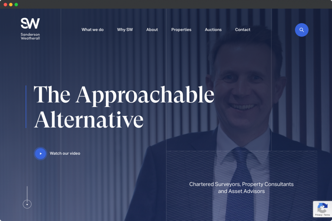
The functionality you may like:
- the search option in the top nav bar;
- custom navigation with an animated menu;
- design elements and effects: parallax, carousels, hover animation effects;
- property cards with integrated Google maps;
- the filter option on the Auction page;
- user profiles.
Property Vision
Private clients and family trusts looking to own property in the UK can turn to Property Vision to get advice or help in buying and investing into real estate projects in the UK.
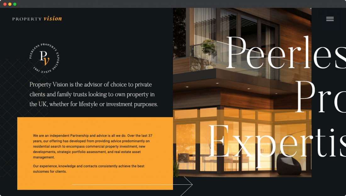
Features to note:
- modern stylish design;
- custom horizontal navigation with smooth transitions;
- numerous hover effects and light animation;
- the creative Team page;
- bespoke fonts with a clean hierarchy;
- the Insights page with blog posts and recent news.
Three Sixty
Three Sixty Property Group is a highly skilled team of real estate professionals delivering a full range of sales & marketing agency services.
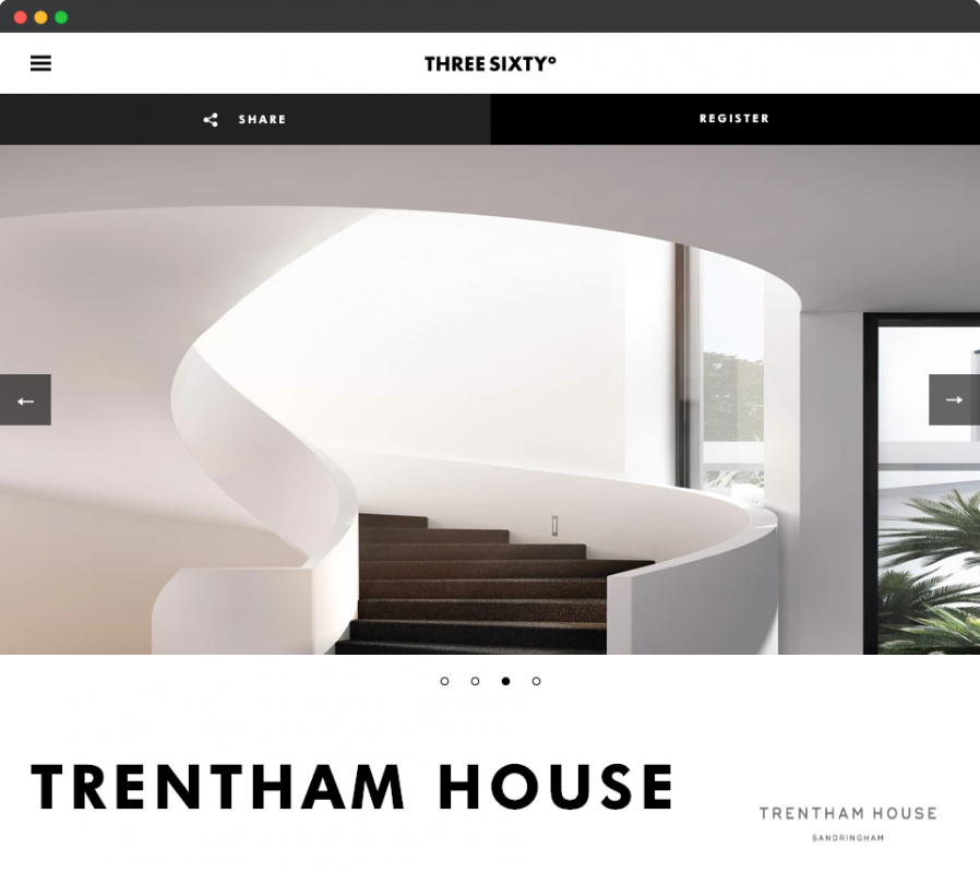
What we like about Three Sixty:
- engaging video backgrounds;
- multilingual functionality;
- masonry-style grid layout;
- design effects: parallax, hover animation, sliders;
- investment interest registration form;
- sticky social sharing buttons and the enquiry form.
Core features to build a website for real estate agents
So, we got closer to tricks on how to make a marketplace for real estate agents that will lead your business to success.
We’ve analysed websites of popular realtors and made a list of core features each of them has.
And before we give you some advice, let us point out that there are several principles of effective web design you should follow no matter what: customer-centred approach, responsiveness, and mobile-friendliness.
Let’s get started.
1. Property listings
Without this feature, your platform won’t be different from other websites.
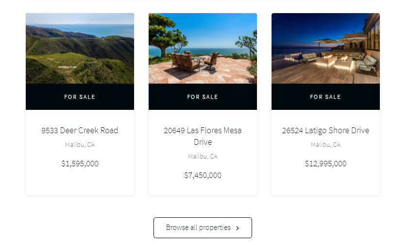
In order to allow clients to check available offers once they visit your site, you can embed listing on your homepage layout just like in the example below.
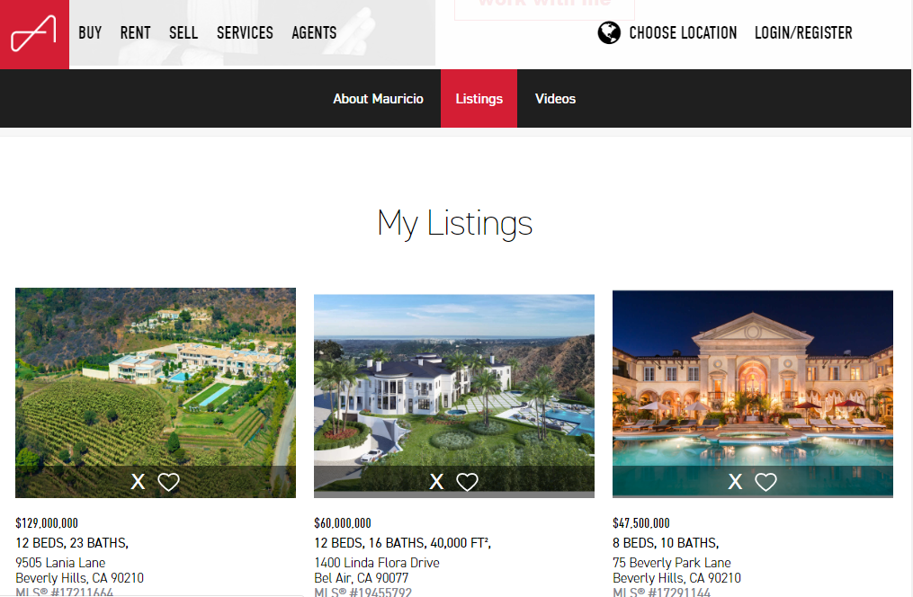
To show off your expertise, it’s nice to include the information about closed deals.
Also, develop a section with featured offers where you will place the cream of all proposals.
Another great idea is to add some features enabling users to save properties they like as favourites or hide homes they don’t like.
2. Visuals
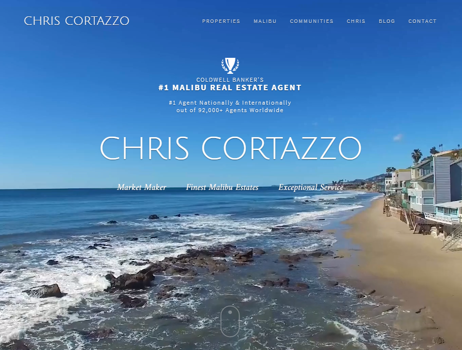
Eye-catching photography is what creates the overall atmosphere and encourages prospects to buy.
Have you ever been in the quest of your ideal home? Remember the feelings you had when you finally found it?
As usual, the first impression is everything and you will never get the second chance to make it.
That’s why it’s critical that your real estate platform has professional high-res photos of properties for sale and lease.
What’s more, you can opt for video content and add it to the main block of your Homepage.
3. Registration
Not all the website owners understand the importance of the registration feature, although, it can greatly influence prospects’ buying decisions.
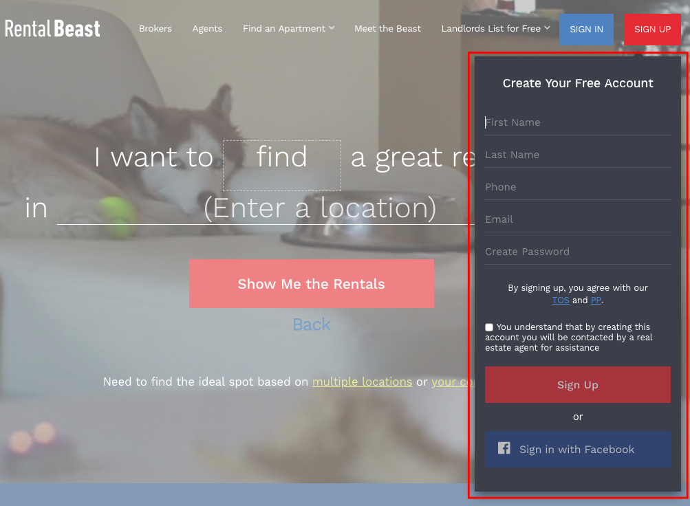
The opportunity of having a personal area is always appealing and demonstrates your care and desire to add value.
It’d be great if you implemented advanced functionality to user accounts such as saved search results, instant support or mortgage calculators.
Remember that users hate to fill out long signup forms and go through complicated steps.
To facilitate their efforts, you can let them register using their social accounts and ask for additional details later.
4. CTAs and lead capture forms
Another trick in our list of “How to build a real estate website for agents? is catching CTAs and enticing subscription forms.
The first element should be easy to find and clear to understand.
When designing the Home page and internal pages remember that there should be no more than two call-to-actions on each page.
All the links and buttons should be clickable and lead to proper pages.
To create a real estate website that will satisfy even the most demanding users, try to mimic such a hot web design trend as natural shapes and transparent buttons.
As for lead forms, make them as short as possible and add a promise encouraging users to fill them in.
It can be a free e-book, quote or newsletter in exchange for user emails.
5. Contact Us and follow us sections
No matter what you choose – a separate Contact Us page or a live chat with instant support – a user should be able to find a way to reach you easily.
Include the Contact Us page to the menu in your nav bar or use a sticky pop-up with a live chat. You can walk the extra mile and show your office location on the map together with addresses. All these tiny things show that you care.
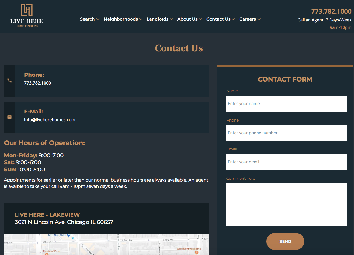
Another tip is to add a get-in-touch form in the footer, however, remember that not all the users scroll down to the very bottom of the page.
You will achieve the next level if you integrate a form into user dashboards.
6. Live search
You just can’t do without a live search if you have hundreds of offers, and we hope that you do 🙂
So, how to build a real estate website for a company with a live search?
You can develop a live search with predictable results or add advanced functionality (filters).
Usually, variables include a price range, property type, keywords, the number of bedrooms and bathrooms, etc.

Alternatively, you may diversify the options of data input.
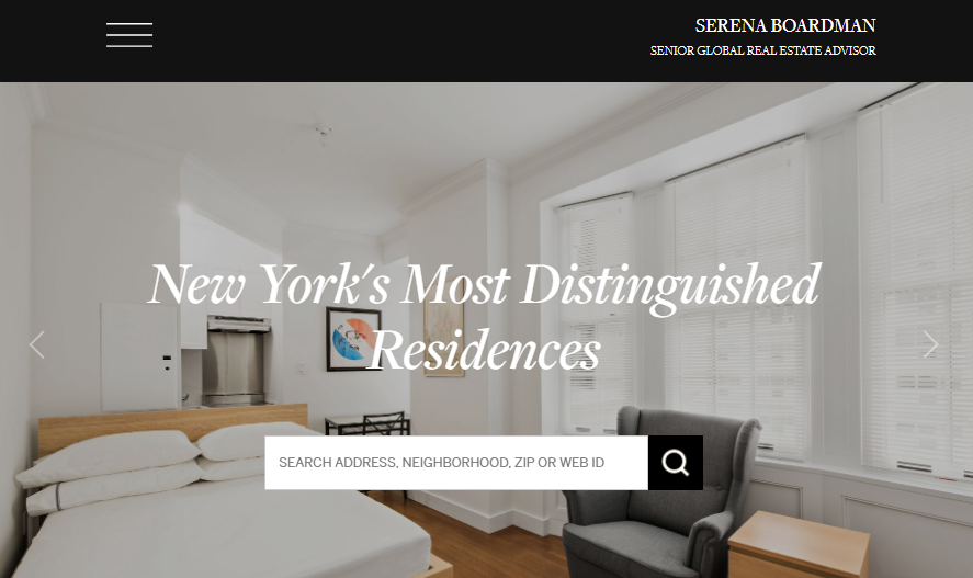
For instance, at Serena Boardman’s website, you can type in a search address, neighbourhood, zip or web ID to find a home.
7. Blog
We believe that integrating a blog must be in your to-do list when you’re building a real estate website for agents.
Does every site for buying and selling property need a blog? The answer is – no.
Before you rush to design a blog page, think well whether it would be helpful.
If you’re definite that your core audience is waiting when you start sharing content, then you do need a blog section.
Or, for instance, you’re going to attract new prospects with the help of content marketing.
Keep in mind that online readers really like when they can discuss something, so add a comments section below each post.

8. Fat footer
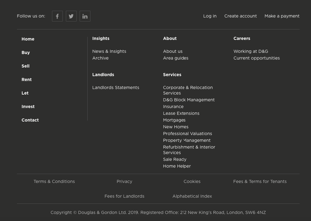
A fat footer is a designer’s solution to create a functional space at the bottom of the Home page where users can find the about us info, navigation, signups, social links, and other useful elements.
Fat footers are just great because they let users see where they are and where they should go to find what they’re looking for.
9. Simple menu
We believe that complex menus don’t work for agents’ online presences.
As you’re not aimed at creating a big real estate directory, then it’s not worth building multi-level drop-down menus.
All you need is to add several elements: Home, Lettings, Valuation, About us, Blog, Contact, and – voila – you’re done!

Certainly, you can customise the menu but bear in mind that you should always keep it updated.
10. Testimonials
Gone are those days when businesses relied on word of mouth; today you should generate trust with other techniques.
Clients’ reviews and testimonials are perfect examples of how easily you can tell the crowd that you’re doing a great job.

There are several solutions for integrating a module with customers’ feedback into your page:
- create a slider or carousel with several reviews from your regulars;
- combine testimonials with other blocks, e.g. contact us, counters or features;
- create a separate page where you’ll present detailed reviews.
11. AR/VR
The last but not the least, if you opt for AR/VR elements when elevating your RE website, we’ll bet all our money on your success.
Being a cutting-edge trend, virtual reality has interfered in almost every online business niche.
If e-stores are making crazy money on virtual changing rooms, why can’t you do the same?
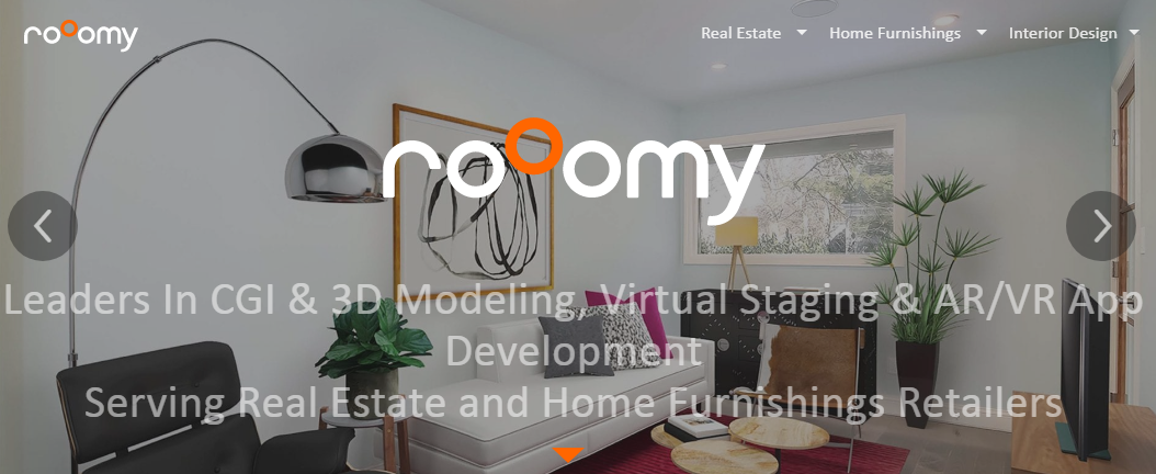
Just imagine tenants or buyers getting life-like experience when wandering around properties you offer on your site.
How to integrate AR/VR into your site?
Try 3d models of homes and apartments, 360-degree videos, virtual tours and staging.
How we at JustCoded build real estate websites for agents
There are two paths you can choose to elevate a property website – do it yourself or turn to professionals.
If you’re not tech-savvy enough, on a tight budget and not obsessed with uniqueness, then try your hand at free website builders.
If that’s not you, hire us and will be happy to do all the grunt work.
Off-the-shelf design and functionality for a real estate agent personal website
No matter what you choose – a free Wix theme or a premium Themeforest item, such ready-made templates have benefits and limitations.
So, what’s good about predefined design and features of a real estate website?
- you’re able to create a working website with little knowledge;
- you save time and money on custom development;
- they’re SEO-optimized and mobile-adaptive;
- you got help with setting up, hosting and marketing;
- works great for temporary purposes.
The bottlenecks:
- “cheap” non-unique look and basic functionality;
- bugs in the functionality;
- lots of time and resources needed for tweaking and adjusting to personal needs;
- issues in mobile versions;
- difficulties in customization and design update;
- inconvenient UI and pre-built page constructors;
- the code that is hard to change.
Every site builder has guides and recommendations on how to create a real estate website for you not to get lost halfway to your target.
Given the above, it becomes clear that quick sites are good only for small temporary projects. If you think bigger, you can’t do without a professional development team.
Pros and cons of custom real estate web development
Although the second way to make a real estate website can cost you an arm and a leg, the advantages of a bespoke online presence can hardly be overestimated.
- full fine-tuning to business needs and client requirements;
- a responsive layout and impeccable functionality;
- bug-free back-end code;
- post-launch maintenance and support for scaling up;
- a turn-key solution with high-end performance.
So, how do we work?
- Discovery phase
Everything starts with an introductory call. Our task is to know more about your creative idea whereas you can discover the way we work.
We’re eager to know about the concept of your real-estate business, core market, strategy and goals.
After the call, we’ll give you an approximate estimation of design and development costs. - BA
If you decided on working with us, you’ll get into the professional hands of our business analysts.
To create a sophisticated architecture, custom user flows, and powerful functionality for your property platform, we need to define its core and nice-to-have features, build a low-fidelity wireframe and user stories diagrams. - Design
Everything gained in the form of docs at the previous stage, start materialising within UX/UI design.
We base on the customer-centred approach where usability prevails over other components. Our designers will create hi-fi mockups for all the versions of your site: desktop, laptop, and mobiles. Something that started as a mockup in Balsamiq turned into a detailed presentation in Vision. - Development
We use the Agile approach, the dedicated team model, and the T&M contracts for delivering the best result in time.
Our front-end and back-end developers have strong expertise in building feature-rich responsive websites for real estate brokers that work flawlessly across all existing devices and browsers. We know that quality assurance is vital for each development stage that’s why our QA engineers are always involved in the process. They run the final check after the product is launched. - Post-launch maintenance
We know that nothing is perfect that’s why we provide 4 weeks free warranty support as post-launch maintenance to solve possible issues.
Being always intended for long-term cooperation, we don’t want to stop when a project is finished. Not sure if we’ll fit each other? Look through our clients’ reviews at Clutch.
Our goal is to provide affordable top-notch services. Check out the cost of each development stage below.
Costs to build a property realtor website with JustCoded
- Business analysis – from $5,000
- Design – from $10,000
- Development – from $30,000
Total – from $45,000
In closing
Undoubtedly, to appear in the list of top real estate agents, you should know the market well, be communicative, and … have a good website.
The features we discussed in this article are essential but it doesn’t mean that your platform must provide users with personal accounts or have 3d tours.
It’s up to you to decide what functional requirements your platform will have and our job is to translate them into action.


