It is health that is real wealth and not pieces of gold and silver. — Mahatma Gandhi
The healthcare industry is one of the largest economic sectors, with lots of medical organisations, private companies, and enthusiasts responsible for the well-being of the world’s population.
Despite this, until recently, the healthcare sector was among the late majority of the innovation adopters.
And even now, not every business entity or organisation providing human health activities has an excellent online presence.
Medical website design cost and complexity, the lack of personnel’s tech expertise and outdated equipment are possible reasons.
Today we’ll tell you how to create a web resource to turn your potential clients into regular patients and boost your business.
So, what does it take to create the best healthcare web design?
We’ll show you lots of examples and tips.
What you will learn:
Reasons to invest in healthcare web design
We’re living in changing times when people and businesses embrace new conditions created by the COVID-19 pandemic.
Despite the global collapse, some industries take advantage of the current situation, particularly online education portals, grocery delivery apps and telemedicine.
Online symptoms checking and remote consultation can help to cope with overcrowded health centres and prevent the spread of the infection.
The increased demand for telemedicine has forced mature companies to take up medical website development and equip online portals with new functionality.
For instance, Zava launched a messaging service to provide up-to-date information on the COVID-19 pandemic.
Kaiku Health enhanced the medical mobile website design to decrease the burden of check-ins initiated by patients receiving cancer treatment on their website. Now patients can check-up right from their phones to send their symptoms for screening.
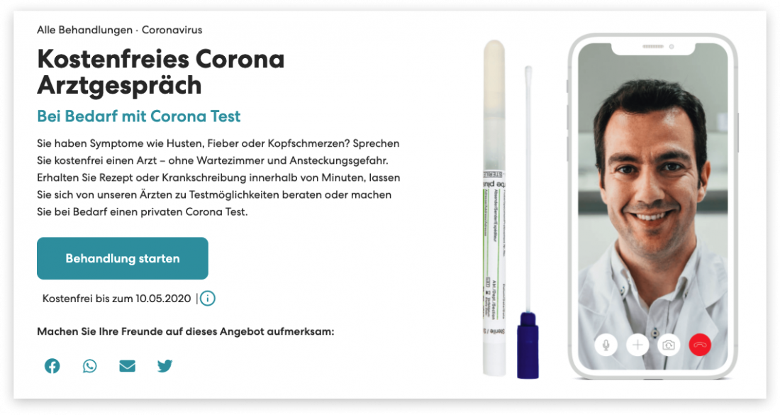
Teleclinic stepped in the fight with coronavirus and created a special questionnaire to assess the likelihood of clients’ chances to get infected with a new virus.
If you are still unsure that building an online treatment directory right now is a good business, let us show you some stats.
Doctor on Demand said that they saw a 50% increase in demand in the aftermath of the lockdown.
Teleclinic has also seen a 60% growth rate in its user base since the beginning of the coronavirus expansion.
Penn Medicine, the online health system, has reported about the number of daily visits has grown 300%.
Teledoc Health’s shares have risen dramatically (50%+) in the past three months.
If you aren’t sure that building an online treatment directory is a good business, let us show you some stats.

And even before the global crisis, the telemedicine niche was booming with many successful healthcare website design and app development projects.
Some of the facts about the online care and assistance market before the COVID-19 pandemic:
- 47% of online patients seek a doctor or other hospital staff on the Internet;
- 1–6 online reviews are needed for prospects to build the profile of a treatment services provider;
- 66% of sick people look up the info about a doctor or healthcare worker on the web;
- 32% of Americans share their treatment stories on social networks.
All this proves the idea that online presence is an integral part of the corporate brand and reputation of any healthcare services provider.
If you’re still hesitating whether or not you need a site for human health activities, consider the perks of going digital:
- new patients can easily find you while regulars can stay tuned;
- there’s no need to have a call centre or personal assistant for dealing with inquiries;
- testimonials, the About and the Team pages effectively present your expertise and achievements;
- the filling of your web resource educates people and works well for improving your Google rankings;
- by allowing clients to book appointments beforehand, you can easily manage your working routine;
- a powerful online presence contributes immensely to your brand and its recognition;
- all the tools of data-driven marketing are at your hand;
- with an online presence, you can receive instant feedback from customers and identify weak points.
Top tips on how to improve medical website design
Now it’s time to go ahead with practical advice on how to create a stellar web design for healthcare.
And to go beyond lips service, we’ve provided excellent examples for each tip.
Simplify navigation
Navigation is one of the crucial elements of UI/UX design which is overlooked time and again.
As a rule, medical aid directories are multi-page websites with a good deal of content, which is why optimising their navigation mechanism should be a priority.
Here’s what you can do:
- verify if there are only apparent and relevant categories in the navbar. The optimal number of menu elements is 7-8;
- remember that multi-level drop-down menus don’t work well for smartphones;
- use a sticky navbar so that users can see their current location;
- use standard titles for menu elements such as About, Services, Team, Contact;
- duplicate the navbar in the footer and add menu elements if necessary;
- use animation to make the transition between pages smoother;
- integrate a live search with predictive results;
- create user-friendly call-to-actions.
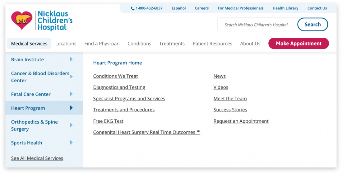
Note, under current conditions, a user-friendly experience is essential. Sick people don’t have the patience and time to get the hang of moving around your platform. Therefore, keep running user testing to find out whether or not you need a healthcare website redesign.
Create personal user areas
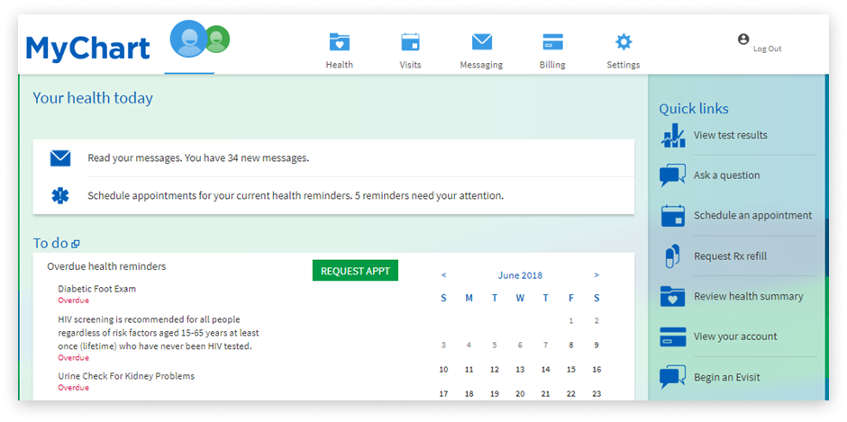
To make your medical or pharmaceutical directory more customer-focused, develop personal accounts where patients can view scheduling appointments, contact a doctor or check test results.
By providing people with such an opportunity, you add more convenience to their site scanning and let them feel more control over their lives.
To facilitate the signup process, let users register via socials.
For instance, the MyChart platform designed by Children’s Hospital Colorado allows you to sign up by only requesting an access code and entering a few personal details.
Integrate an online scheduling system
If you’ve ever searched for the best medical web design, you have probably noticed that some of them have a built-in online booking system.
It’s critical that a user can choose a doctor, an appropriate time within an available time slot, and a type of appointments.
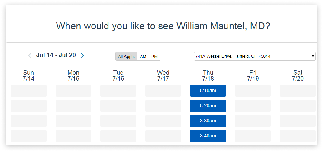
What’s more, you can send notifications to patients by email or in the SMS format to remind them about an upcoming event.
And remember to make adjustments to the schedule if a doctor is on vacation or busy visiting an industry event.
Introduce the team
No matter what you own – an online medical directory or a landing page for a non-profit startup – you should always be on a first-name basis with prospects.
It means you should introduce the team and make each profile public.
Create a short overview of each professional, add details about his/her education and experience, working hours and location.
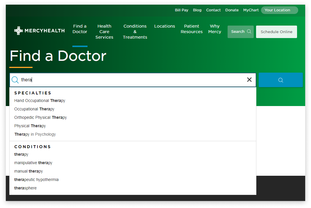
It’s always a good idea to embed a search function helping visitors to find doctors by their names, specialities or conditions.
Did you know that 94% of patients use online reviews to evaluate physicians? Your platform should display reviews and rating of each specialist to generate trust and establish honest relations with patients.
Even if there are negative comments, don’t remove them. The bad user experience should inspire you to take action and change the current situation.
The following examples of website design for healthcare will show you possible options to display patient feedback.
Add a pricing page
A page or section with treatment plans is a must-have for any healthcare services web design.
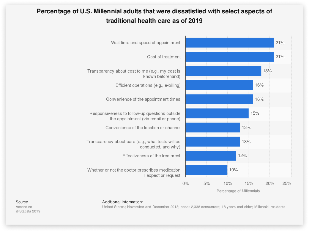
24% of adult Americans report in 2018 that low prices are essential for them when choosing a medical aid service provider.
It’s essential to present all the healthcare service packages, tests and pharmacy prices so that prospects can get the complete picture.
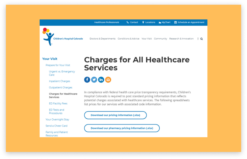
In case your entity delivers an abroad array of treatment&care services, you can convert them into the .xls or .pdf format.
Combine a map and contact details
When planning the space for your contact details, make sure that visitors instinctively understand how to get qualified consulting from you.
Typically, contact details go in the header or footer, on a separate page or in the last block on the Home page.
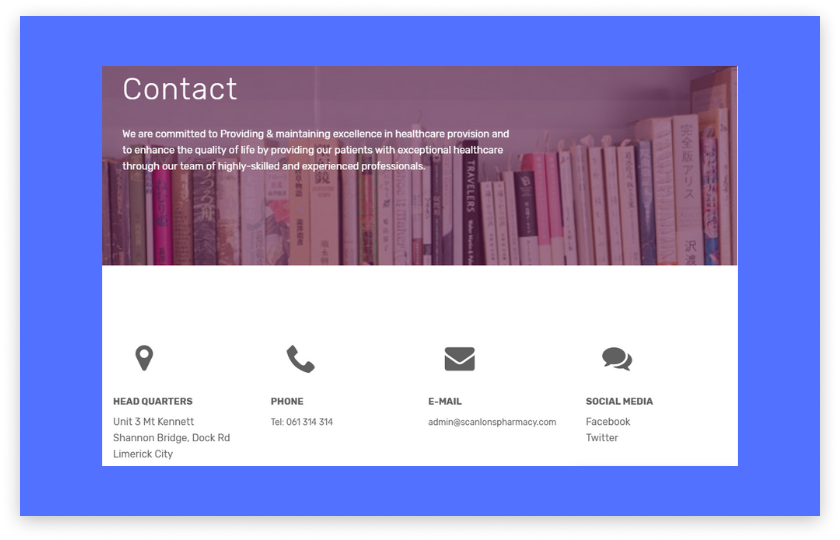
Add as many options for getting in touch with you as possible – headquarters, phone numbers, email, social media accounts.
Some websites have integrated google maps with contact us forms, which might be an excellent solution for you.
Share testimonials
We’ve already mentioned that several comments are enough for people to get ahold of healthcare service providers.
But how to show off customers’ feedback that would seem honest and non-obtrusive?
Ask your regulars to share real stories of their relations with your medical facility, including both positive moments and challenges.
Then devote a stand-alone page for showing off testimonials and add it to the menu.
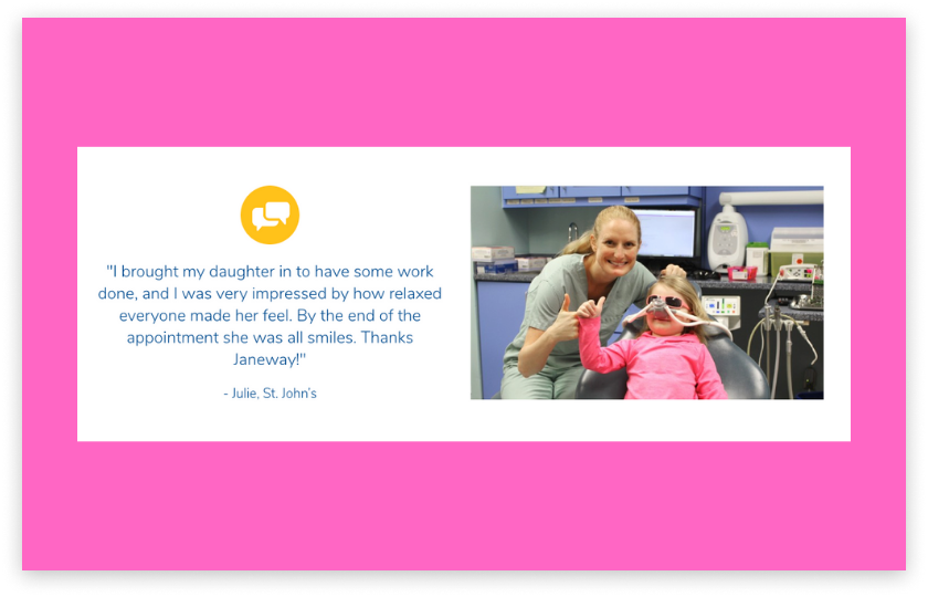
If you don’t have much space, it’s a good idea to combine reviews with other site blocks or sections.
The rule of thumb is not to boast how cool you’re but to prove that you take care of sick people.
Consider online payments
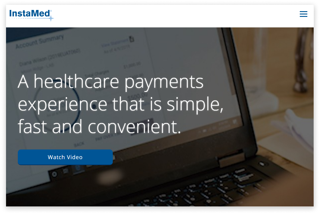
Want to upgrade your directory to the next level? Consider embedding online payments.
You need to find a secure payment processing software that will help you deliver an excellent user experience to achieve this goal.
When choosing a payment processor network, take into account the following things:
- omnichannel and payment methods support;
- advanced security and compliance;
- flexible payment options;
- one-touch and text-to-pay methods;
- smart admin area;
- a kit for developers.
Put security at the forefront
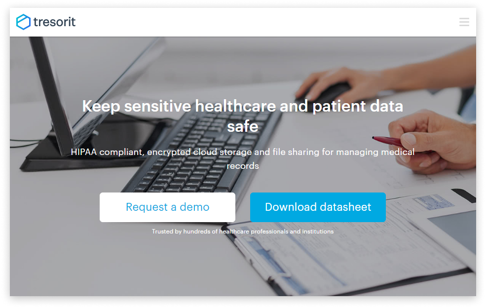
One of the pillars of best healthcare website designs is secure methods of storing customers’ records.
To comply with the HIPAA and HITECH rules, we advise medical service providers to:
- use the SSL technology for encrypting the data sent through contact forms;
- use cloud storages for keeping all the vulnerable data safe and sound;
- create a backup plan for protected health info (PHI);
- ensure that your hosting partner conforms to all the requirements of HIPPA;
- share file and folder links with test results safely and securely;
- tell your clients about how you secure the personal info on the Privacy Policy page.
Online consulting
Online medical advice has been gradually replacing physical appointments. A doctor can make a pre-diagnosis by text message, video conference, or image with symptoms and write a prescription.
This custom medical website design feature can be implemented via chat rooms, video calls, or public forums.
For instance, Vidscrip, a free tool for recording short videos on healthcare-related topics, lets physicians create videos with answers to FAQs about the new coronavirus and share them via their fav channels.
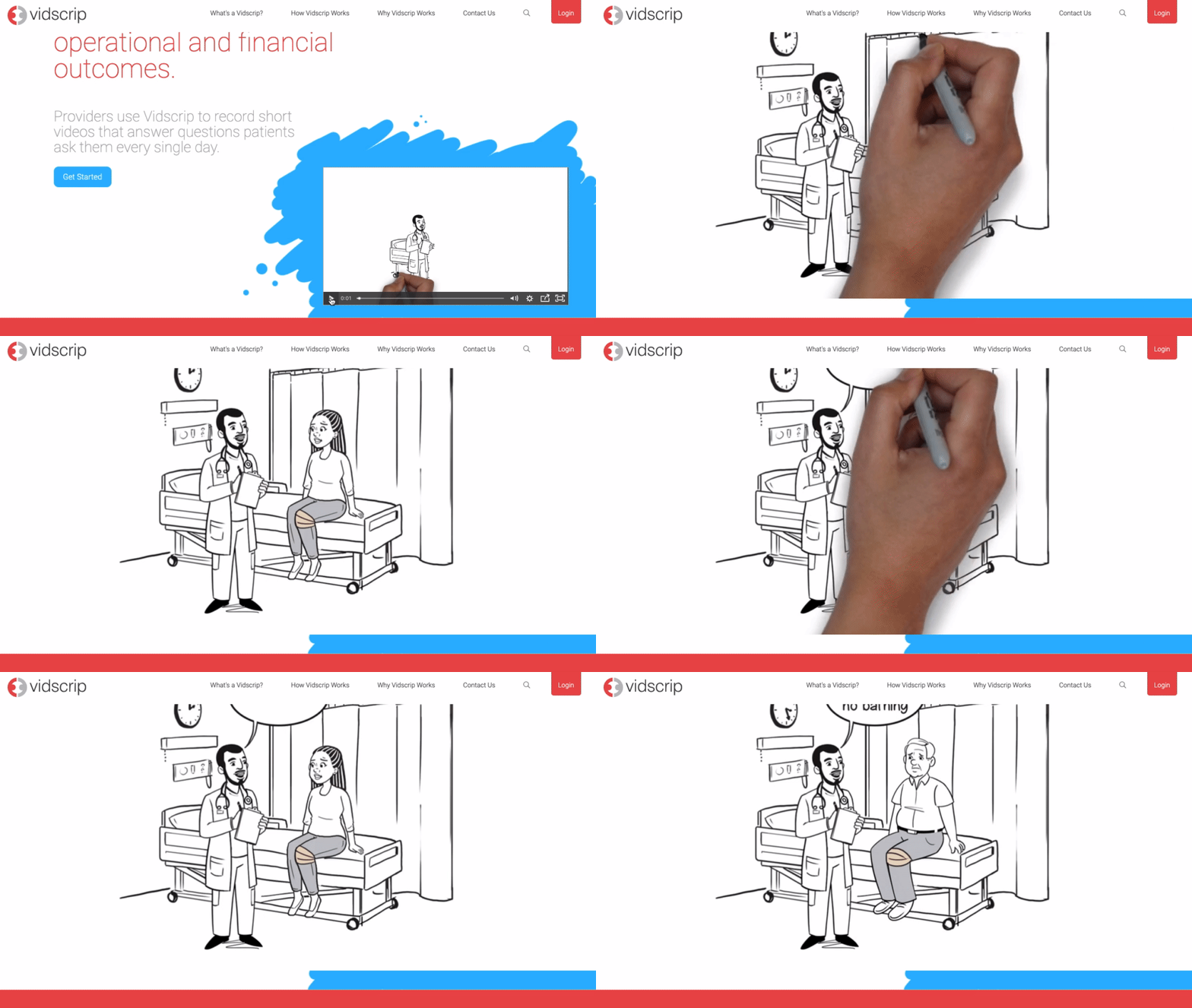
When making a roadmap for your medical website design and development, consider how you can keep patients informed on the novel coronavirus.
Every consultation should be wholly private & confidential. For instance, Practo, an online portal for finding online medical help, ensures user data security through compliance with industry standards like ISO 27001 and 256-bit encryption deployment.

Disability-friendly
The best medical website design is disability-friendly by default. About 20% of your traffic may come from users with certain physical limitations.
And to make sure that they don’t experience any discomfort when using your platform, you can make all the web pages accessible.
By meeting W3C standards for accessibility, you can make the interaction between users and your platform smooth and flawless.
Here are a few tips on how to build a fully accessible health treatment website:
- add ALT tags to all the images on your site;
- embed captions in all the video content;
- use colour contrast to make the content more visible;
- make links stand out and accessible on mobiles;
- develop keyboard accessibility navigation;
- carefully use flashy graphics and dynamic animation.
Extra elements of good web design for treatment sites include a powerful content management system, cutting-edge design, SEO-optimised web pages, blog, professional photography and videos, social sharing buttons, clean CTAs. etc.
PWA for a medical website for doctors
Want to take the online experience you provide to the next level? Consider transforming your web portal into a progressive web application.
PWAs are sites that look and behave like mobile apps, which means users can add them to the main screen and access them even offline.
PWAs come with numerous benefits:
- they work faster than ordinary sites;
- they’re lighter than native apps and easier to develop;
- they’re available even with no Internet access;
- PWAs come with push notifications informing users about updates and new features.
And one more thing, we save for last. Patient education has always been crucial, especially for those who suffer from chronic diseases. Today this problem has become even more acute as people can’t traditionally communicate with doctors.
Ensure the feature set you planned for healthcare website development provides patients with easy access to health information through educational videos, tutorials, self-service portals, chatbots, news pages and blogs.
Best healthcare web design examples
If we’ve succeeded in convincing you that your healthcare business can’t remain offline, check out our collection of inspiring top medical website designs.
Scanlons Health Services
Scanlons Health Services is a pharmaceutical service provider that offers automated solutions for packing medicine.
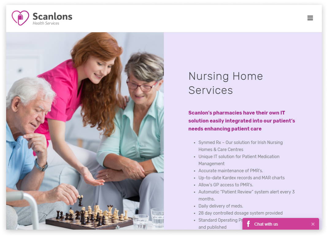
Top features:
- simple animated navigation;
- built-in live chat;
- custom graphics and icons;
- great typography;
- light animation distributed across the whole website;
- embedded videos introducing the company;
- the fat footer;
- clear CTAs;
- live keywords search;
- responsive design.
Mayday Healthcare
Mayday Healthcare is an online portal for hiring medical staff – nurses, doctors, and other professionals.
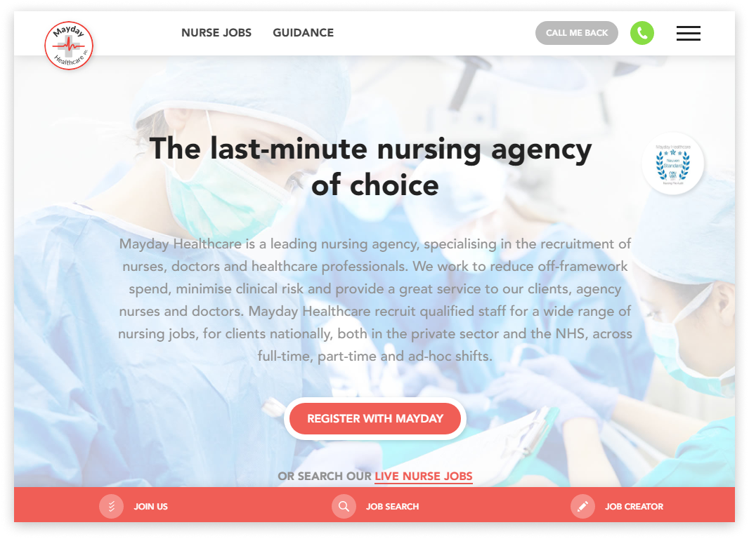
Top features:
- modern trendy design with a parallax effect and natural shapes;
- advanced job search;
- recent news section ;
- Contact us page with directions to locations;
- user-friendly joining up steps;
- intuitive navigation;
- call-me-back option;
- social profile buttons;
- Guidance page.
PeterMac
Peter Mac is a top research centre and hospital focused on treating cancer patients.
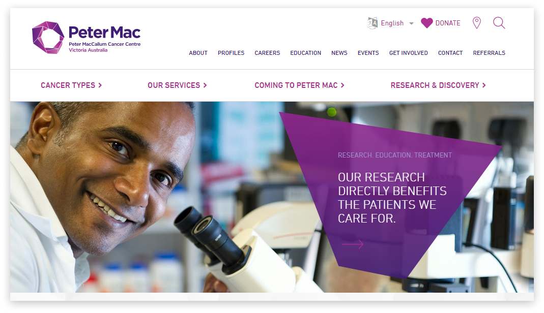
Top features:
- elaborate menu with categories and sub-categories;
- multiple languages support;
- automated online payments;
- Profiles page;
- integrated search feature;
- the mobile-friendly design;
- fast-loading pages.
Mercy Health
Mercy Health is an online directory allowing users to find a medical professional located nearby.
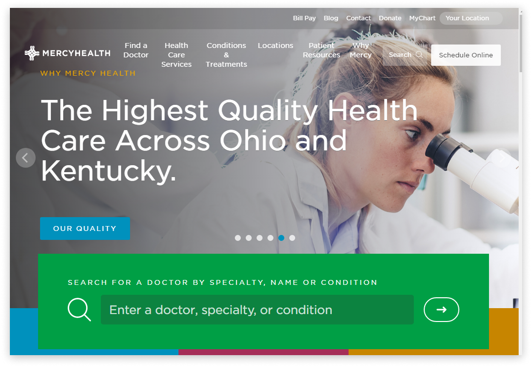
Top features:
- immersive visual content in sliders section;
- online booking;
- the MyChart solution for creating personal accounts;
- great Testimonials section;
- the integrated bill payments option;
- the SiteMap page;
- the signup for newsletter form;
- advanced search with filters.
Children’s Hospital Colorado
It’s an official website of Children’s Hospital Colorado where you can find a doctor, check symptoms or pay bills.
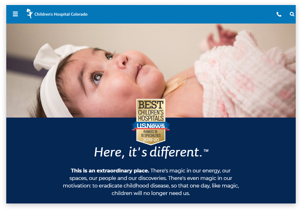
Top features:
- sticky navbar;
- online bill payments;
- users’ areas within MyChart;
- smart live search;
- online appointments scheduling;
- encouraging CTAs;
- relevant and up-to-date content;
- mobile application.
We’ve been servicing different industries — from real estate to health & insurance — for more than a decade.
Our approach to bespoke web design and development is based on the dedicated team model and T&M agreements.
Through careful planning, customer-focused design, and professional development, we elevate bespoke solutions that bring profit.
A customer-focused approach helps us build handy and responsive healthcare website designs that look equally well in every environment.
We conduct in-depth user research and competitor analysis to understand patients pains and successfully solve them.
We don’t pursue the goal of building peculiar sites that look unique but weird. Instead, we take advantage of the best medical website designs and adapt the layout to your business goal and users’ needs.
Our healthcare website designers take an active part in collecting tech and non-tech requirements and creating your online solution concept.
The healthcare web development cost depends on the project scope and design preferences. Check out our portfolio to see what we’re capable of.
On a final note
Healthcare isn’t just a business, it’s a duty to help ill people, and every aspect of your website should be designed to fulfil this task.
The greatest examples of web design – from huge centres to private medical offices – have a well-thought-out structure, bespoke layout, automatic processes, and delivers engaging web surfing experience and useful content.
The medical website design tips presented in this abstract may help you move towards catering for your target audience’s needs and make the world healthier.


