Building a website with one of those website building tools is a good idea to get your real estate business online quickly. But what if you want to create more than just a one-pager? We always suggest weighing the pros and cons to decide whether a custom design will be a better option in the long run.
If you think of building a unique website, in this article, you will find great examples of real estate website design along with our comments on what works and what doesn’t.
What you will learn:
Best practices for real estate web design
1. User-focused approach
We’re convinced that the user-centred concept in web design for real estate should come first and foremost. Past are those days when the web audience obediently took what the website owner offered.
Users have become more demanding than ever, and if your website doesn’t cater to their needs, you risk losing potential clients.
What do people want to see on my website? In the idea generation stage, you should think hard about user demands. These are the questions that will help you understand your audience:
- How can they complete their task or find the important content?
- How does my website create an excellent user experience?
The answers will help you come up with the right solutions. The brilliant idea is to investigate the websites of your competitors and find out their strengths and weaknesses.
Good web design not only pleases the eye of a customer and helps them find what they are looking for, but also increases the efficacy of your online business:
- reduces the burden on your support team;
- has a beneficial effect on a site database and infrastructure;
- brings more leads and increases conversions;
- cuts significant training costs.
2. Usability vs Aesthetics
A flashy website overloaded with “cool and trendy” animation tends to fail when it comes to usability testing. Fantastic design solutions often magnetise users without contributing to the goal of a website.
In the hunt for visual effects, designers now and then forget that people come to a property site not just to enjoy a masterpiece, but to seek out information.
Here are some of the common mistakes of gorgeous but not-so-user-friendly real estate websites:
- complicated navigation;
- monstrous menus;
- non-mobile-friendly layout;
- broken links and bugs;
- slow loading speed.
The last factor is almost the most important for both users and search engines defining your site positions in the online realm.
Just look at these facts:
- for 47% of users, a website must load less in 2 secs (have you already checked the speed of yours?);
- bounce rate (yeah, everyone hates it) is directly related to the loading time: the more time it takes a page to load, the higher the bounce rate will be.
- owners of slow sites lose 2.6B every year due to low conversions and fewer leads.
We do not call on you to leave all your aspirations behind and focus on minimal design with basic functionality as property websites can’t be simple by their nature.
Did you know that every second person prefers to browse through a richly designed website or that the opinion 75% of users make about a website largely depends on its aesthetics?
And more importantly, 73% of brands invest big money into improving user experience and visual design to stand out of the crowd.
Given that, our advice as a real estate web design company is to couple your creativity with functionality. Then turn this combo into an award-winning design that meets the UX requirements:
- consistency – every element has the same look on each site page;
- intuition – all links, buttons, forms are on anticipated places;
- simplicity – a website has a minimal number of pages with relevant content;
- user-friendliness – a design leaves no room for significant mental efforts;
- structure – all the content is presented in a logical and well-organised way.
It’s okay if you apply some hot trends in real estate website design like AR/VR, video storytelling, custom animations, etc. Just remember to do it for a good reason 🙂
3. Intuitive navigation
Tenants, landlords or property brokers visiting a real estate website anticipate an exciting user journey where the navigation is their compass. Unfortunately, not all the sites come with a comprehensive menu, and users have to navigate by the stars.
Sadly, 67% of mobile users are likely to leave a website if they feel confused with its navigation.
Other facts:
- 94% of first impressions on websites are related to its structure, navigation, and visual aspect.
- Once visitors go to a website via a referral link, 50% of them rely on the navigation to find the necessary info;
- 46% of mobile users find it difficult to interact with a web page, and 44% complain that it’s stressful;
Any website designed by our real estate website designers are wisely structured and simply navigated.
You can use a three-click rule to see whether the navigation on your site is easy-to-use: if you can find the necessary content in three clicks, it means that both the sitemap and menu navigation are user-friendly.
This method, however, doesn’t have enough test data to prove it and researches show it doesn’t always work. On the other hand, it provides you with some understanding of what to aim at and make you think about the user first.
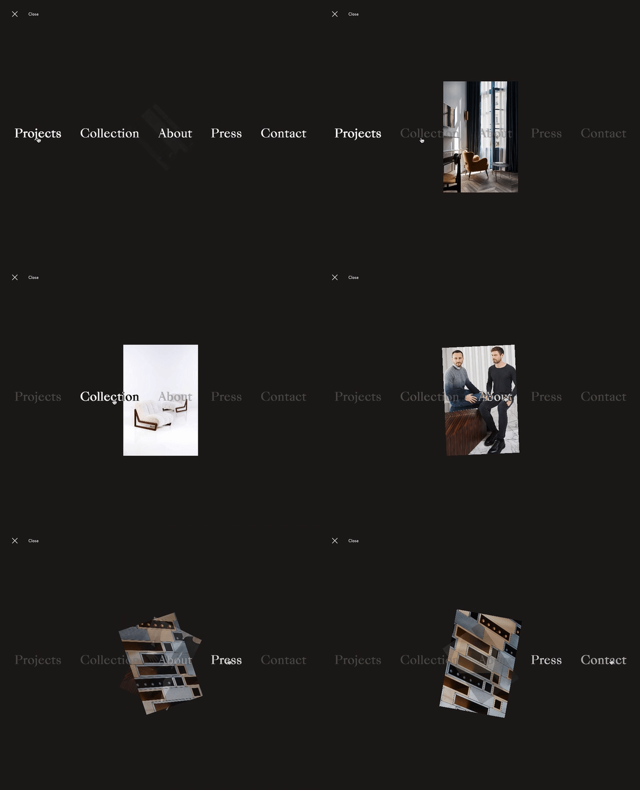
Use these tips to make your navigation better.
Sticky menus. Users will always see the menu at the top of each page when scrolling down. It will help them quickly move backwards and forwards and understand where they are if they had to navigate away from your website.
Breadcrumbs. This is a good old element that helps the client always identify their current position, continue browsing or get back.
Bold buttons. They captivate attention and serve as the call to action elements on your real estate website. Make all the buttons on your website visually appealing, keep them consistent and place all across your site.
Clear titles. Don’t reinvent the wheel – use traditional titles for menu sections and pages. Everyone would understand what you have on the “About Us” page or what to expect from the “Recent News” section.
Logo. Don’t forget about it. Use it as a link to the Home page. It’s clear as day, but lots of websites lack this feature. In 2019, yeah.
Footer. Place the sections people will be looking for if they like what they saw in the footer – address, phone number, directions, contact form.
An interesting fact about real estate agent website design: the “About us page is ranked third in terms of the frequency of user visits.
To turn your “About us page into a lead generator, just do simple things:
- tell your business story and explain the core benefits you deliver;
- add social buttons and CATs;
- use testimonials to prove your awesomeness;
- create custom typography to add a personal touch to the design;
- embed videos for a storytelling effect.
4. Powerful search tools
Why people come to your real estate website? Right, the property listings.
Every website design for realtors should have a powerful live search feature providing clients with optimal “shopping experience.
When people are in a quest for a new home, they take into account every tiny detail like the number of bathrooms and the year built, let alone the neighbourhoods, home type, and square feet.
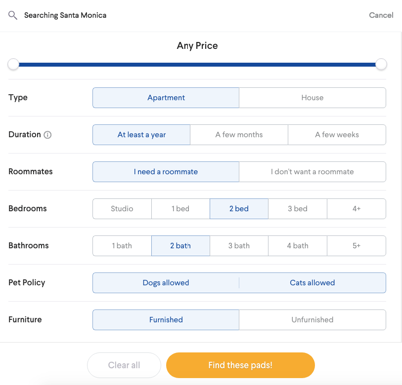
Make sure that your search tool has extra filters for buyers and sellers to find available options according to the predefined parameters easily. Allow people to search by a keyword and save their favourite search results.
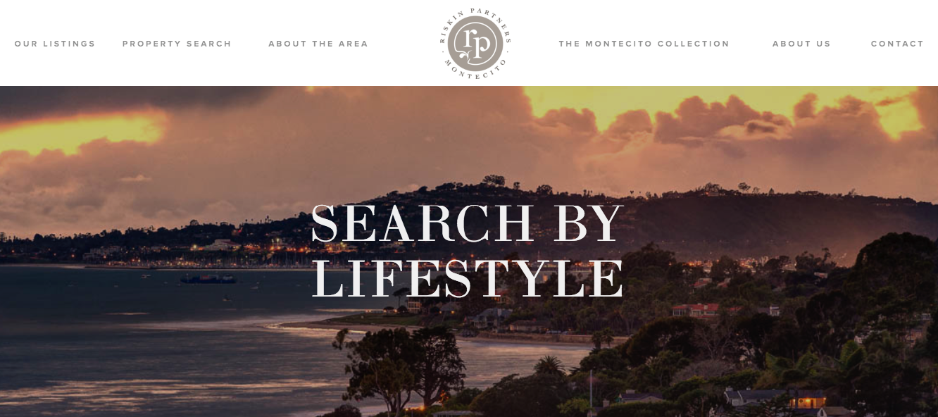
The great idea is to offer search by some unique parameters that people can relate to – lifestyle, for example. They will not treat it as merely a property but rather as an experience. Montecito Real Estate shows houses by the beach, with hiking trails or tennis courts, with a ranch or a garden, and much more.
You can opt for several search tools:
- a simple search bar on the landing page to get quick results;
- a search area with extensive filtering for advanced users who have a clear vision of desirable search results;
- an embedded map to show available proposals within a set area.
5. Many CTAs
Call-to-actions are supposed to grab attention and generate more leads.
Some stats on why integrate CTAs in custom real estate web design:
- strong CTAs are likely to increase conversions by more than 200%;
- welcome gates are the most effective placement for CTAs as they can increase CTR up to 10-25%;
- eye-grabbing CTAs in the uncluttered design can boost conversions up to 232%.
If there are no CTAs on your site (although it is unlikely), then it’s high time you distributed some across your web resource.
Ideally, a CTA element is present on every page encouraging people to buy, rent or sell properties.
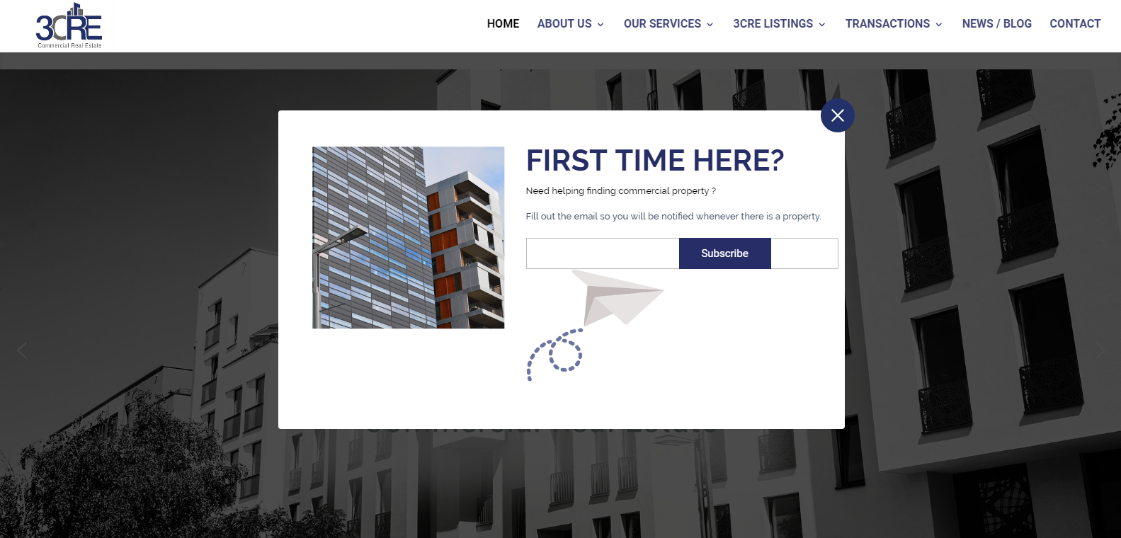
When designing your next link, button, or form, remember about these simple rules:
- use real estate industry-specific language patterns;
- make CTAs brief and clear;
- use prompting and stimulating verbs;
- evoke feelings and emotions if appropriate;
- emphasise “fear-of-missing-out;
- add a bit of creativity;
- consider user search scenarios on different devices.
“Ghost” button design can work great for the secondary call to action buttons. Their natural fluid shape doesn’t look obtrusive yet remains visible.
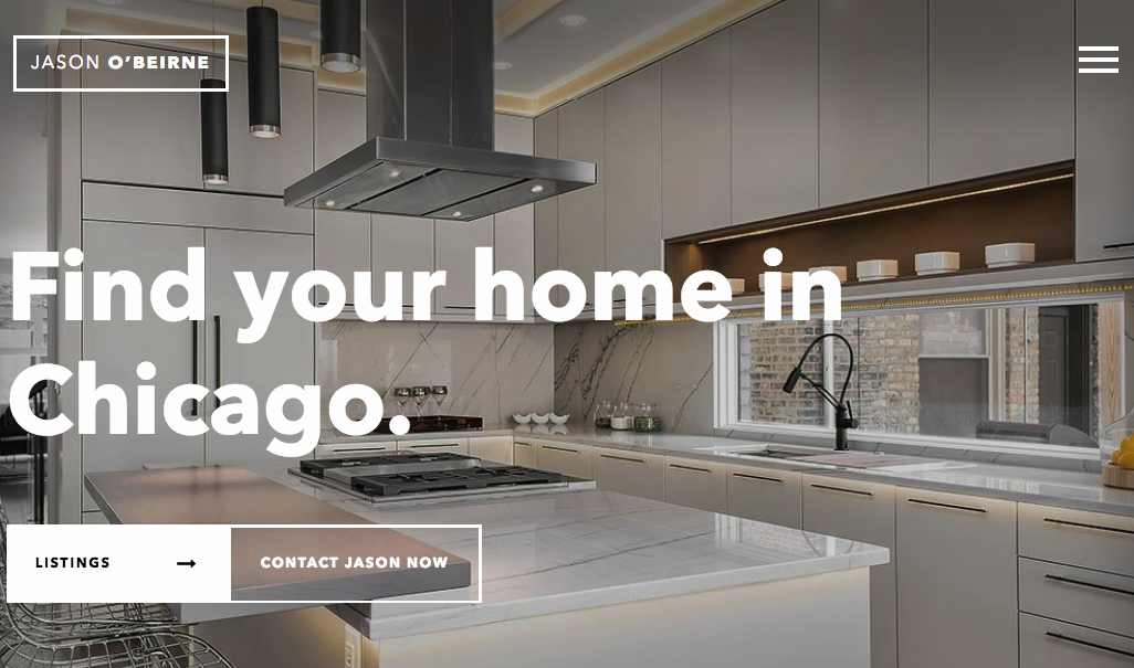
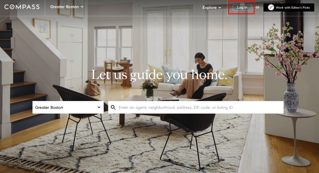
Use them wisely though and A/B test if you can.
6. Scannable content
When a person drops by your website, they should understand at once what your company does. Be straightforward when preparing content for your site.
Remember that:
- 5.59 secs is an average time users spend scanning website’s textual content;
- 60% of users tend to consume well-designed content driving user engagement than read plain dry texts;
- 8 out of 10 users are likely to abandon a website with good content that doesn’t display properly on mobiles.
Keep in mind that every piece of textual and visual content in website design for real estate company should matter to deliver value.
Users are more likely to scan your landing page than reading into every word you say.
The good idea is to present your services or the kind of property you’re dealing with in the first two-three blocks on your landing page. It will help you reach out to the target audience and generate trust.
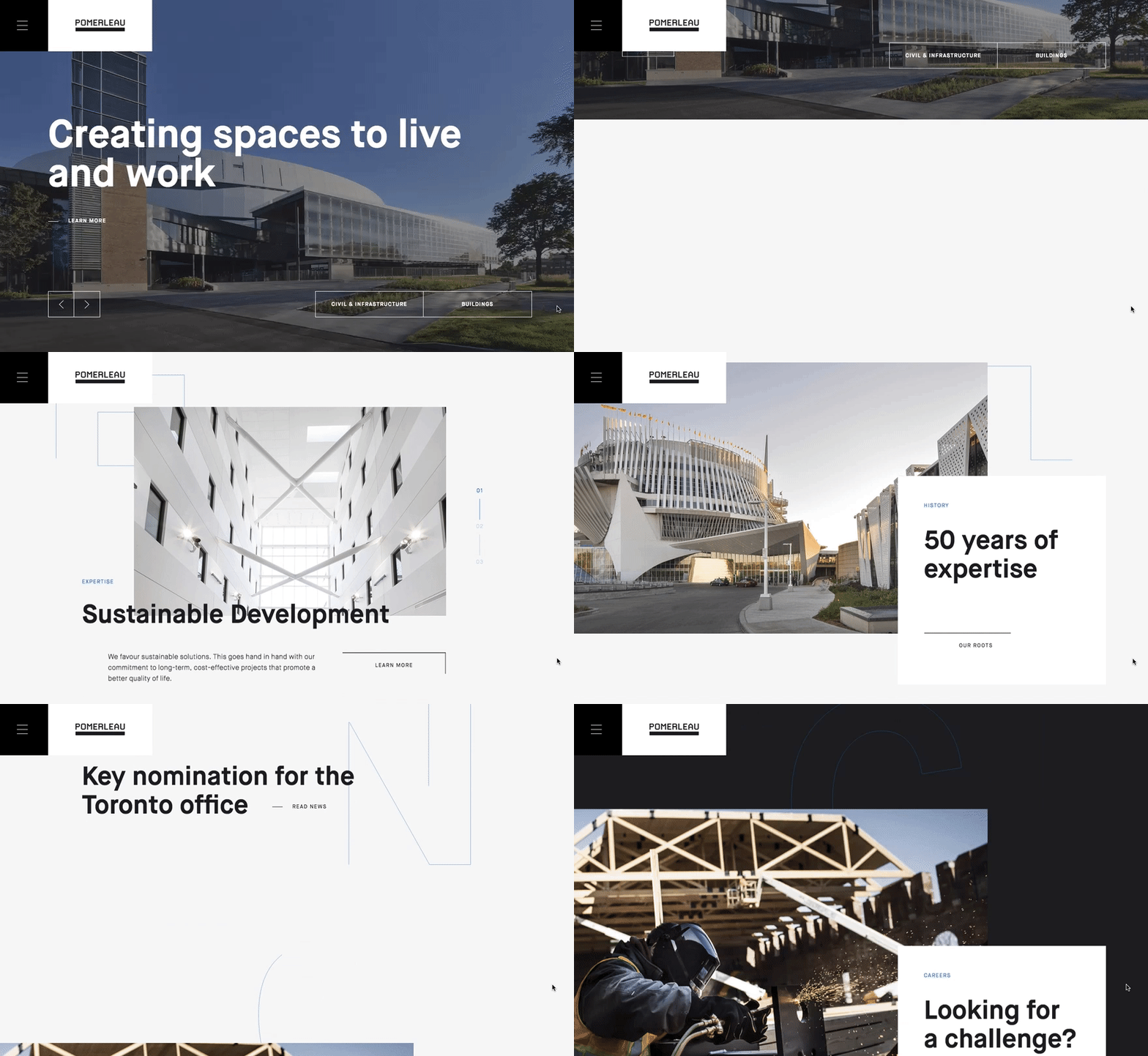
Carefully plan the filling for every page on your platform. Long before the design stage, you should have a clear vision of the message each web page is to deliver.
To increase the engagement, you can devote a separate section for showcasing featured properties, closed deals and recommended real estate.
Plenty of website designs for real estate have only a search tool and property listings on their home pages so that customers can immediately see available options.
Others present their services, let users check property options and offer to get in touch. No matter what content you have prepared for your landing page, it should serve your marketing goals.
7. Micro-interactions
Another hot trend in web design for real estate agents is micro-interactions that create engagement and provide feedback in response to users’ actions.
Micro-interactions are great for mobile property websites. They may come in the form of swipes, input actions, animated elements, CTAs, tutorials, and guidelines.
Website design for real estate agents may be seasoned with cute micro-interactions:
- animated downloading process;
- transitions for the filter, image, or settings icons;
- funny loading bars;
- creative animation for burger buttons;
- pushy input fields.
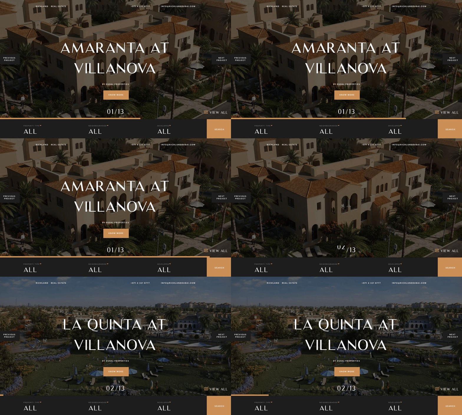
Lots of web developers and designers ignore micro-interactions although they give an opportunity to create the benefits they present:
- enhance the navigation and simplify interaction;
- inspire web users to share your content;
- draw attention;
- add a personal touch to a website;
- show care;
- contribute to the brand image.
How to develop those micro-interactions? Bear in mind the following:
- look at your website through your clients’ eyes to find out how they interact with it;
- review user flows and journeys to identify the opportunities for micro-interactions usage;
- consider micro-interactions as an element of fun;
- don’t overuse interactive elements, be relevant;
- write in an understandable language to add humanity.
8. Property images
Byers and tenants don’t want to spend time visiting the physical property anymore; they prefer online investigation instead.
If you can’t afford to create 3D walkthrough tours to show the property, make sure to upload excellent quality images that look stunning across all the devices and browsers.
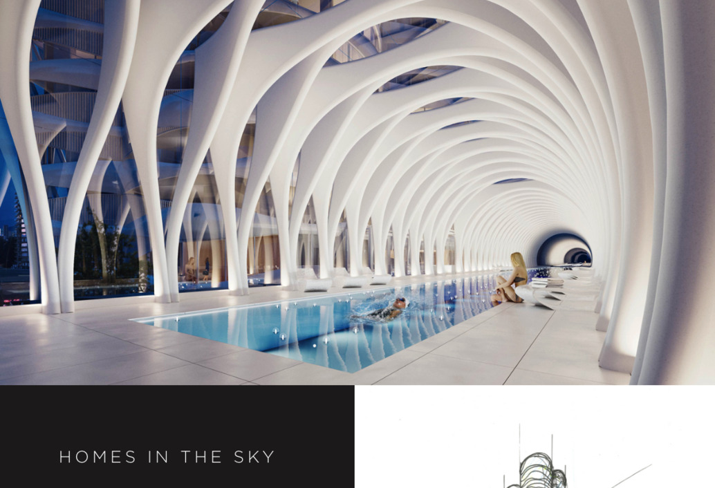
Leading real estate companies have in-house photographers responsible for updating property galleries.
Remember that the quality of images on your site influence users’ opinion on your brand. Some real estate agents use clips and short videos to promote available property offers.
Also, there are innovators among property companies who benefit from a massive growth of AR/VR technologies.
The brand-new technology is being used everywhere from healthcare to entertainment industries. The number of AR users is expected to reach 2.4B by 2023 with the global market size of 18.8B USD.
COVID-19 situation has spurred RE companies to turn to immersive experience to let users grasp the look and feel of property units without undergoing a risk of infection.
ReinVR offer solutions that make it easier to visualise a floor plan and help you sell faster.
Mixed reality is a go-to for the real estate industry. 3D property tours and 360-degree videos help to create the customised user experience and boost conversions.
Ikea already has an augmented reality app called Ikea Place that allows visualising a chair, a table or a carpet in your apartment before you buy it. It’s not exactly a real estate website design example, but it’s absolutely awesome and inspirational!
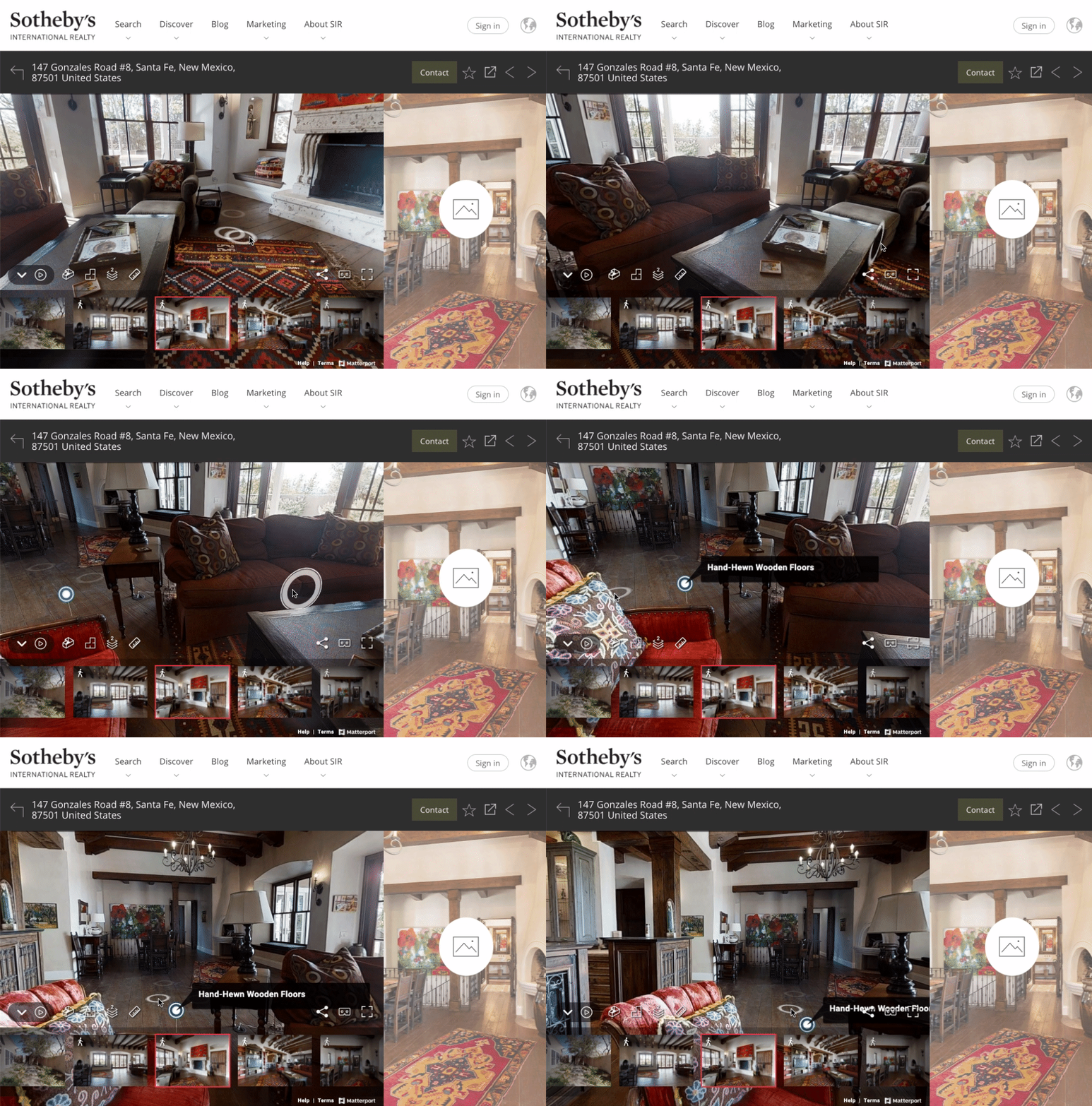
Find more real estate website design inspiration at Sotheby’s, Realtor.com (2 AR features — Street Peek and Sign Snap), Homesnap (real-time property boundaries view).
Yes, integrating the experiential technologies in realtors web design may cost an arm and leg, but the value it adds will amaze even the most demanding entrepreneur.
9. Home valuation tools
Money matters can be one of the things preventing people from selling or buying a home or renting an apartment. To be helpful, let users know what their homes are worth or whether or not they can afford the option they like.
Consider integrating the valuation tools and mortgage calculators into your web design. You can display a calculator on the landing page or embed a valuation tool into each page with a property description.
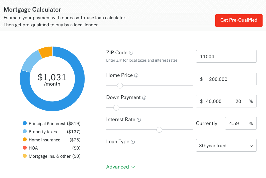
Of course, the automated valuation may not be 100% precise, but it will be able to provide customers with an insight into the market value of the real estate. To provide your clients with a more accurate result, you can always offer them professional assistance and onsite property value analysis.
10. Regular updates
Lastly, remember that even the most successful online business should develop. That’s why it is crucial to review and update your real estate site from time to time.
A UX design audit is a great means to an end. It’s aimed at improving the current version of a website to generate more leads and increase sales.
It is super beneficial for real estate website design development:
- it enhances the overall usability and accessibility of a website;
- it makes the design more consistent;
- it improves the SEO aspect and Google rankings;
- it makes your content more engaging.
Read more about UX design audit in our blog or reach out to us directly.
Either you’re going to incorporate some essentials we’ve talked about or follow some new waves, always put your client in the spotlight.
Examples of best real estate website design
We’ve gathered three amazing examples of realtor website design presented on Awwwards that rock. A bit of inspiration to you 🙂
Nooklyn
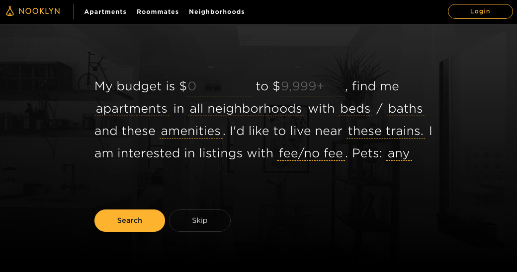
Nooklyn have a creative search right on the first screen of their homepage. It’s like a real phrase a person might be having in their mind that includes the required parameters. Of filters, if you may.
Anyway, a user can start searching – which is the target action – right here right now. All the details are explained below the search section, together with the relevant call to actions.
Richland Dubai
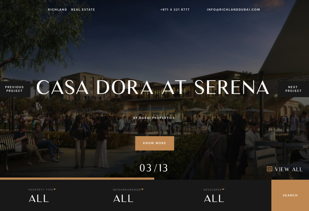
What we like about Richland website is its landing page.
Designed according to cutting-edge web design trends, it has a horizontal scroll, micro-interactions, custom animation, immersive photography.
The search tool is built right into the landing page, allowing users to filter results by property type, neighbourhood, and developer.
The photography is superb and demonstrates properties in all their beauty. Site pages describing available real estate options are very informative and tell everything a potential buyer would like to know: property features, amenities, payment plans.
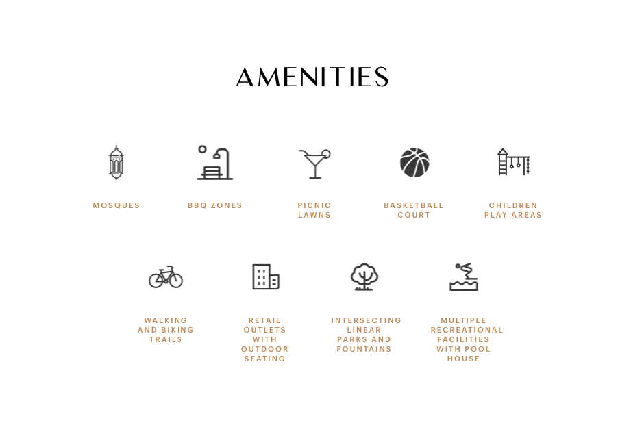
Stylish, modern and slick. Nailed it.
RadPad
The use of background videos immediately creates a feeling that you are right there in the streets of Santa Monica, CA. Or on a busy road in Chicago. Oh wait, here you are flying over a street market in LA.
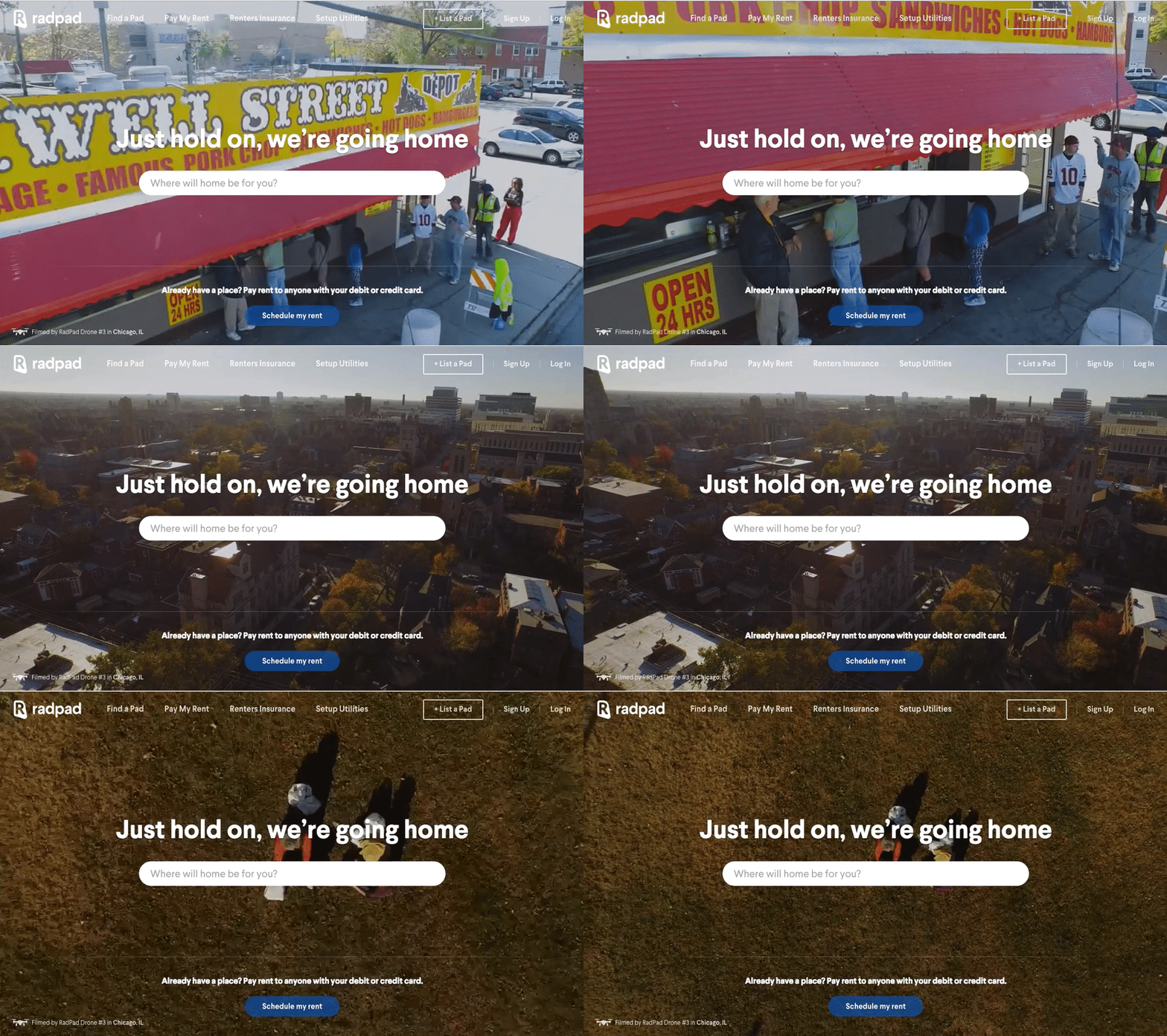
The videos shot with the drone allow you to feel the vibe of the city and imagine you already living there, although you may be just planning to move there.
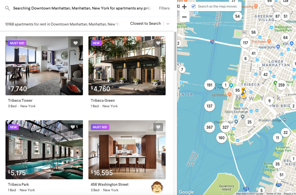
If you type a city in the search bar, you’ll be taken to an interactive search page that works similarly to Airbnb (or Airbnb works similar to it, who knows): when moving the map, the search results to the left update according to the area in focus.
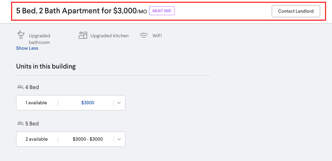
Each listing has a clean layout and gives you all the needed information regarding amenities, terms, and several ways to get in touch: send a text, a Facebook message, or contact a landlord using a contact form. The “Contact landlord” ribbon shows up on top of the page instead of the header if you’ve scrolled past the “Contact landlord” button. Thus you don’t get puzzled about finding a phone number or a message link.
In addition to the interior photos of an apartment, a user can check the street view. While it’s a Google Maps powered street view which is not rocket science at all to implement, it’s great the RadPad included it and provided their clients with as much information about the house as possible.
And the drone videos, yes!
Custom real estate website design for The Office Group
TOG, a web platform for renting offices, coworking spaces and meeting rooms, is one of our top clients.
The company was looking for real estate web design developers who would develop and migrate a brand-new WP site with multi-siting and multi-language features.
The end product ought to have worked flawlessly with an existing database.
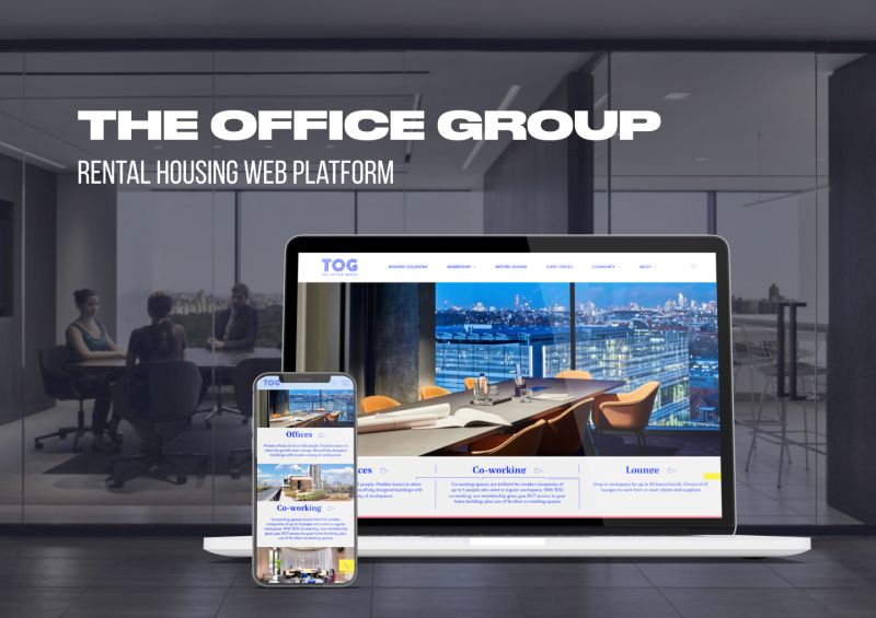
Brave New World was our partner in the TOG project. They created the design and developed a digital marketing strategy for the company.
The layout is clean and neat, and it matches the TOG corporate style. Numerous effects like galleries, custom sliders, sticky scroll, lazyload make it brisk and fresh.
The core features include:
- responsive, mobile-friendly design;
- intuitive navbar in the header and footer;
- search function with filters;
- engaging “About us page;
- professional real estate photography;
- video storytelling;
- pop-up contact us form.
The takeaway
Making a good property website is not so complicated as it seems to be. It may be affordable and time-efficient if you know your core audience and have a clear idea of your online presence.
The websites of popular real estate companies highlight their corporate style and emphasise on their brand image. The designs are different, yet look authentic and neat.
At the same time, these sites have all the essentials and industry-specific features that make them appealing to the web audience.
The takeaway for you – even the most user-friendly web design should be revised from time to time.
What to keep in mind:
- the target audience for whom you are building a real estate website because the design for luxurious property buyers and college students who want to rent a room is different;
- the more details about the property you include the better, so implement 3D walkthroughs, drone videos, VR/AR tours;
- usability combined with aesthetics – even the best shot photography will fail to do the trick if you didn’t think about the customer needs and expectations.


