What separates design from art is that design is meant to be… functional.
Cameron Moll
Do you know that 94% of first impressions relate to your site’s web design?
The user whose expectations were met is likely to stick to a website and come back later, and it’s not about some extraordinary creative works like shots on Dribbble.
It’s more about the human-centred design approach that allows creating user-friendly interfaces that are both functional, easy to use and attractive.
This rule of thumb works for every domain and business, including real estate, medical & healthcare, and crowdfunding.
And if you think that FinTech websites should look discreet and emotionless by default, well, let us dissuade you.
Interest and desire to support are the core of financial investments. Why not evoke them from the very first visit?
The top crowdfunding platform design examples we’ve gathered in today’s piece will demonstrate how easily you can grab client attention, turn leads into regulars and create the brand persona.
Where to start: crowdfunding platform design best practices
No matter what niche your crowdfunding business belongs to, its primary goal is to attract investors willing to support projects.
This is that “golden thread” that should run throughout the functionality and design of your platform.
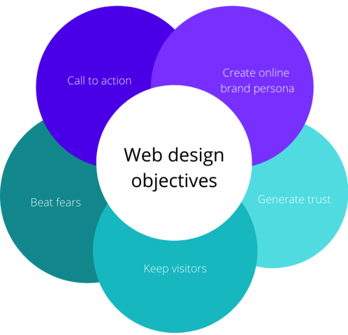
It can be divided into 5 smaller objectives:
- to generate trust;
- make visitors stay longer on your website;
- beat user fears;
- call to action;
- create an online persona for business.
UI and UX tools to help achieve these goals:
- proper colour scheme;
- consistency of design style and elements;
- readable fonts;
- hierarchy and accents;
- handy navigation;
- familiar elements;
- complex forms are divided into steps;
- design responsiveness;
- deep elaboration of cards, forms, filters;
- micro-interactions (animation, hints, sticky header);
- social proofs (clients, maps, infographics);
- trust (founders’ photos, partners/clients and investors).
Best crowdfunding platform design examples
For this research, we’ve checked a good number of crowdfunding platforms from different niches and of various kinds.
Here are our favourites, the examples of a crowdfunding platform design that really deserve your attention.
Let’s check them out.
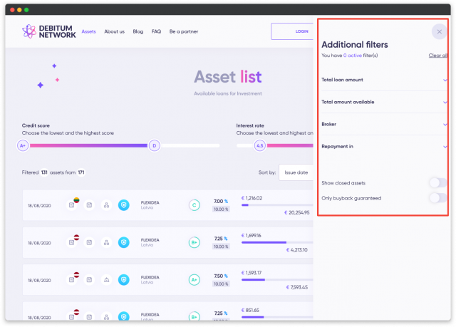
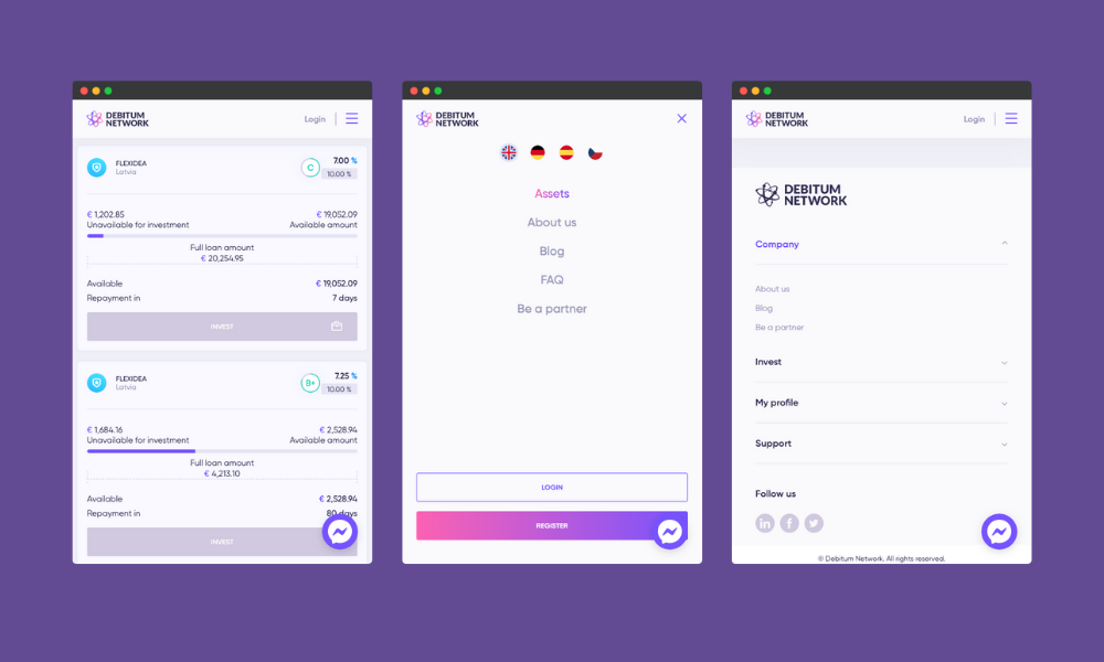
1. Debitum Network
This crowdfunding platform has a mellow colour palette and call-to-action buttons with the accent colours.
Debitum Network positions itself as the provider of loans to businesses and the first FinTech platform using unified credit scores. So, every design element on their platform generates trust.
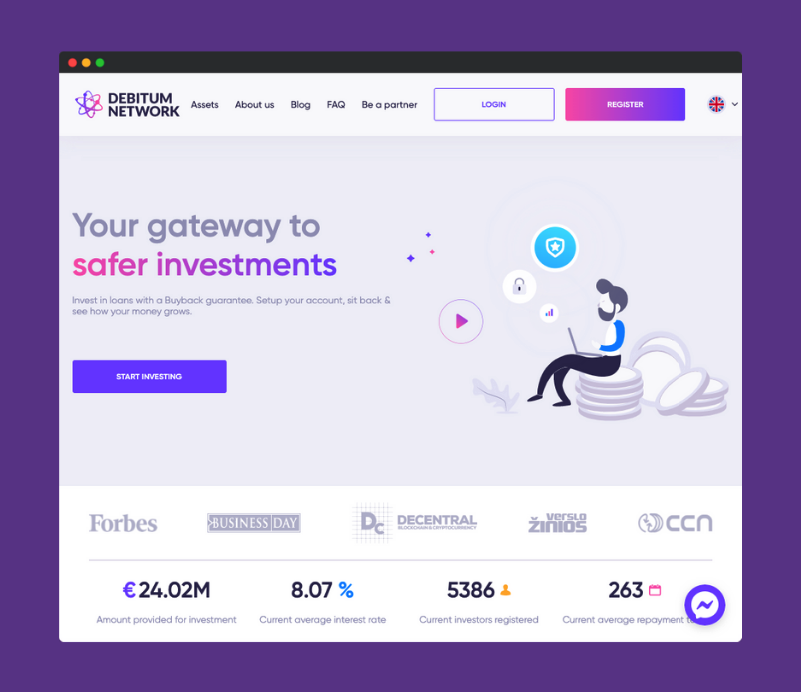
What we like:
- the About video on the homepage presenting the company to a visitor;
- light animation and stylish images;
- handy navigation: dropdown menus, sidebar filters, “Go back” arrow button in the top right corner;
- the team’s photos and contacts, maps;
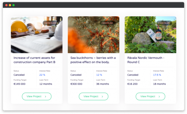
- lightweight investment offering design with clear hierarchy and accents on the most critical data: country, interest rate, target loan amount, repayment term;
- mobile responsive menu and investment offerings.
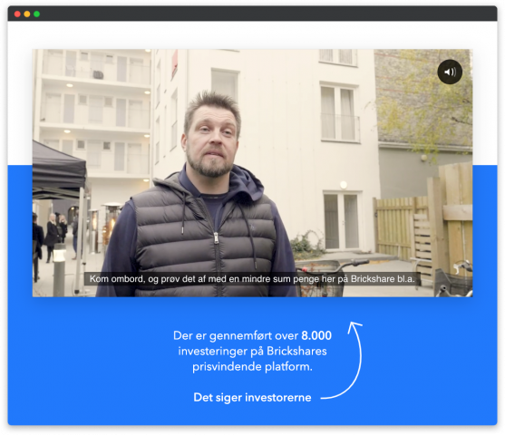
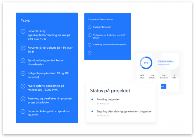
2. Brickshare
Another excellent example of the crowdfunding platform design that aims to create user confidence.
Brickshare, an online middleman between real estate projects and ordinary property investors, has an aerial online portfolio designed in white-blue tones. Together with the investor testimonials video on the homepage, this colour combination has a relaxing and comforting effect.
Investment offering design
Key details of the offerings are placed on the right in smaller blocks. This way, a potential investor can quickly figure out whether a particular offering is of any interest to them and whether there is time to consider investing in it.
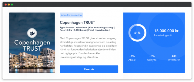
A single offering page is very well done in terms of the overall aesthetics and information architecture.
Again, the key info like funding status, interest rate, and the number of investors go on the right and sticks as we scroll down. It’s quite similar to what we see in e-commerce design when price and product description with key parameters are always visible (although it’s not a general practice because it depends on the product category and target audience).
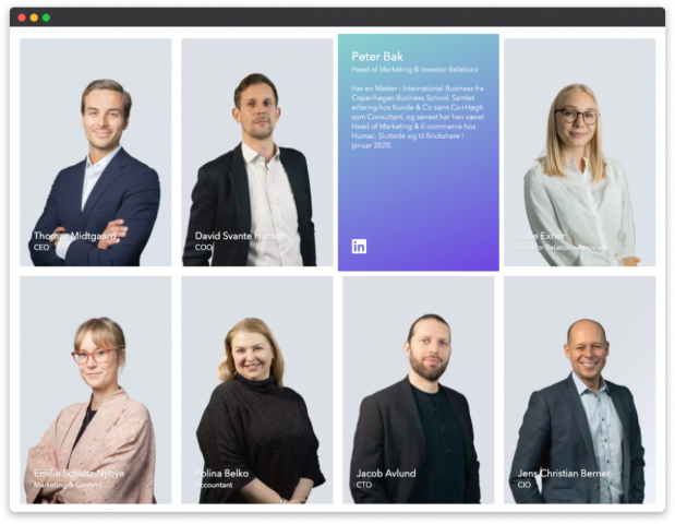
Communicating trustworthiness
Video with investor testimonials on the homepage, lots of data about investment offerings and a dedicated team member page create a feeling of reliability and trust.
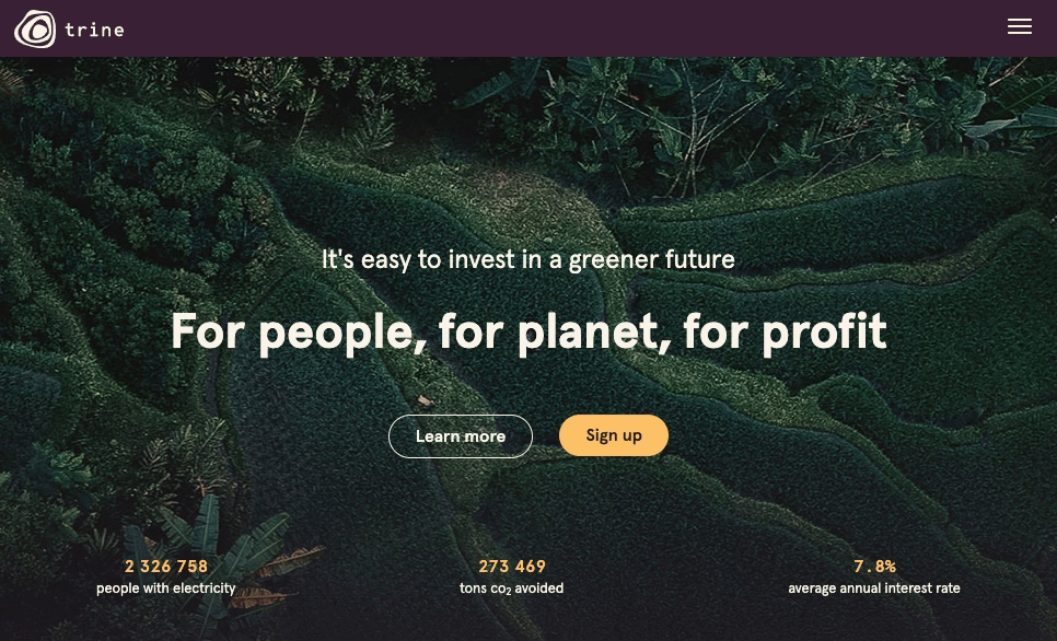
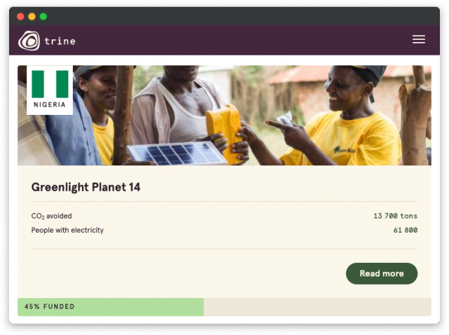
3. Trine
It’s a crowdfunding platform with a focus on environmental protection and solar energy.
When the user lands on Trine, the first thing they see is a hypnotising image with a light moving effect. Green and yellow colours immerse the user into the feeling of well-being and cosiness.
Investment offering design
The positive vibe is seen everywhere: images are big and bright, people are smiling. The number of investments made and the tons of CO2 avoided works as social proof: people always reference what other people are doing and tend to follow the socially accepted patterns.
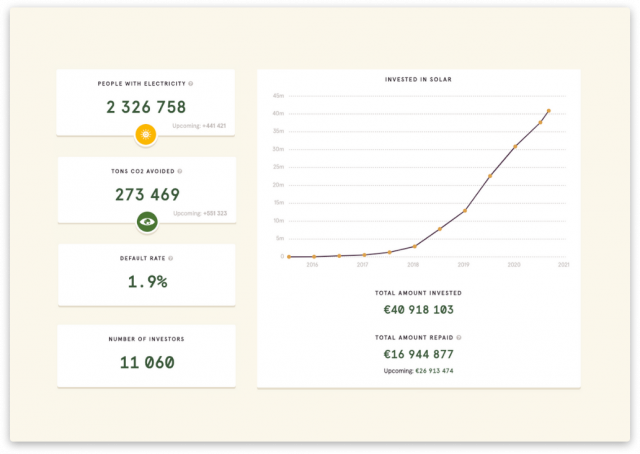
Building trust
Our progress page shows graphs, a map that shows the positive impacts, and the key numbers, including the default rate. To be completely transparent, Trine provides an explanation of how the default rate is calculated.
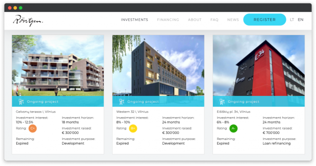
4. Rontgen
Rontgen is a Lithuanian real estate crowdfunding platform with neat and laconic design.
An eye-catching pic and a contrasting background colour immediately draw attention and make a user engage with the website.
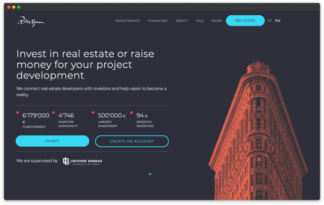
Primary and secondary call-to-action buttons have relevant colour accents. Secondary buttons are designed as ghost buttons, and this approach provides a clear hierarchy.
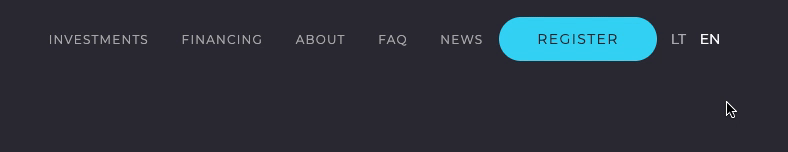
The navigation is not overloaded with too many items, and the login button is nicely hidden right under the Register button (hover over to reveal it).
Investment offering design
Since Rontgen provides investment opportunities in real estate, the property images are quite big.
Even though there are some minor issues with padding, the information in the investment offerings is quite well structured so that users get the most important details at once:
- investment interest;
- investment purpose;
- project status;
- duration;
- funds raised;
- remaining amount.
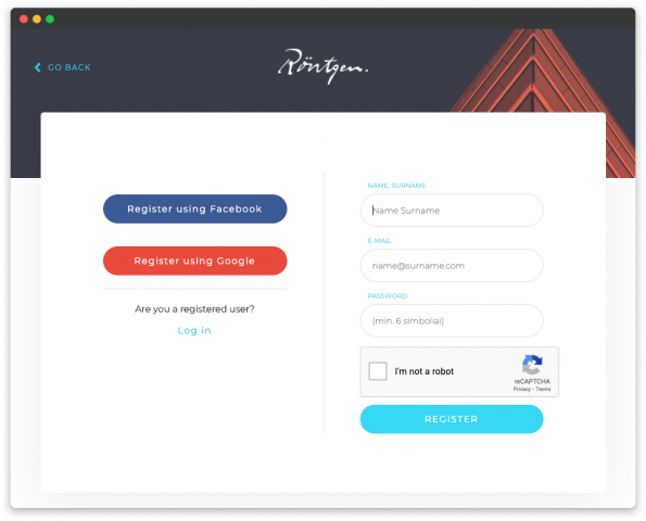
Investor registration
Registering at Rontgen is quick and can be done via email or social network profile; no hardcore questions or quizzes at this step.
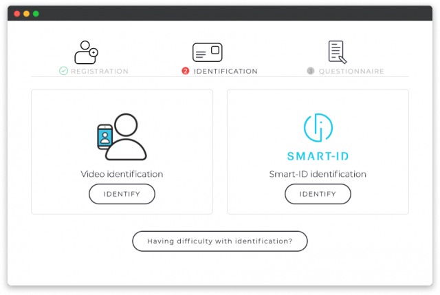
Upon registration, though, a user has to go through the identification process to be able to see the details of the offerings.
Lithuanian residents have 4 identification: by video, Smart-ID, phone number, or by uploading documents. Other investors can only opt for video or Smart-ID.
5. LendInvest
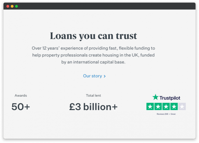
LendInvest provides development and buy-to-let mortgages for landlords and developers across the UK and knows how to grab user attention from the first second.
The background video evokes associations with the growing constructions, and a high contrast dark-grey and yellow colour palette create a feeling of luxury and prosperity. The primary call-to-action is bright and yellow.
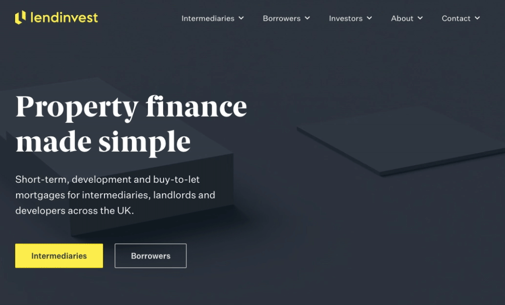
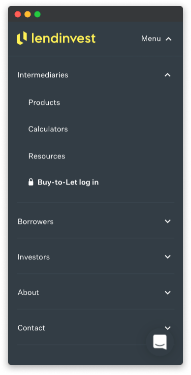
Navigation is self-explanatory and user-friendly with clear information hierarchy. The mobile version has the same nestedness and convenience thanks to enough spacing between the menu items.
Building trust
On the homepage, there are various achievements, awards, and a TrustPilot rating — together, these elements create trustworthiness and reliability. Our story button allows showing the company to a potential client and get them on the right side.
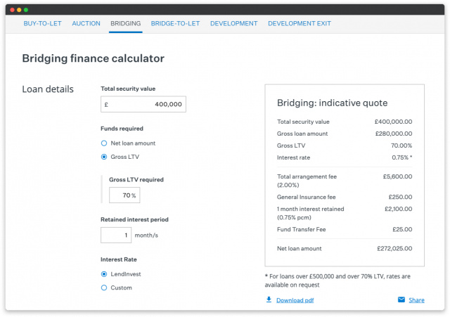
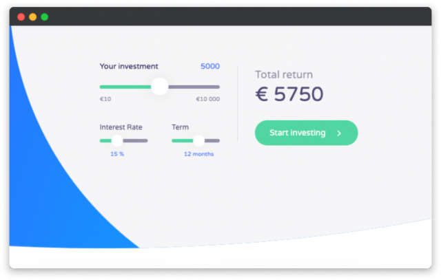
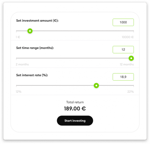
Loan calculator
A calculator is an excellent tool for potential investors to analyse profits. Also, it’s a perfect marketing tool to engage users and keep them exploring your crowdfunding platform opportunities and terms.
LendInvest has several calculators for different loan types, and even though they lack UI work, they present the financial details clearly and sufficiently, which is much more important than cute bells and whistles. All calculators are optimised to fit all information on mobile devices.
6. Wisefund
Wisefund is a European fundraiser building secure bridges between lenders and borrowers. Their website design is bright and clean with visible micro-interactions (the effect created by figures moving after the cursor in the picture).
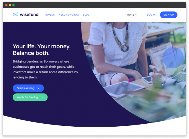
Links to main landing pages for investors and fundraisers are visible right beside the logo, while the rest of links to secondary pages go on the right, under the “More” dropdown.
Investment offering design
Offerings are neat and clean. All essential details are easily scannable thanks to the right accents and visual weight distribution.
A super user-friendly calculator provides ballpark return estimates and goes right on top of the investment offering list. Actually, we have seen calculators mostly on homepages or other informational pages; however, placing it on the offerings page makes more sense as it pushes users to invest.
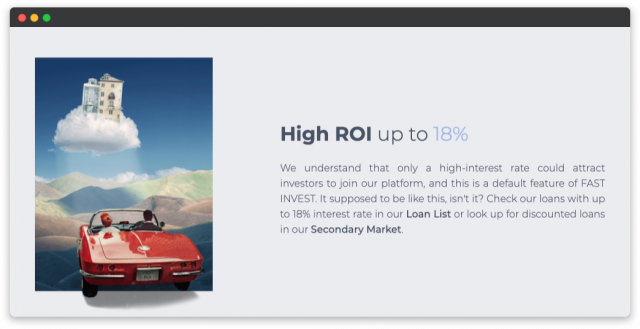
7. Fast Invest
The trophy of the most creative design for crowdfunding platforms goes to Fast Invest!
Its website is created according to the latest design trend — neomorphism — and clearly speaks to a younger generation of investors.
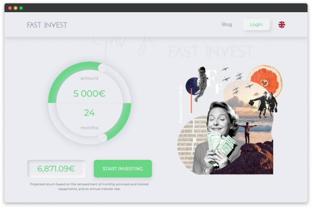
Neumorphism helps this P2P lending platform stand out against the crowd and look modern and very stylish. The other side of the coin — poor UX, which means you should be very careful when opting for neomorphism.
What we like here is the company desire to make a difference. You can see it everywhere from design elements to content.
Bold copy makes the right impression and fosters confidence; just look at those titles and philosophical expressions.
Other crowdfunding platform design examples
A few more top examples of a crowdfunding platform design that make you stick to a brand and become their loyal client.
- British Pearl — beautifully designed the first screen with an embedded video and gradient, clickable links to partners.
- Swisspeers — visible hierarchy that consists of the size, fonts and indentation.
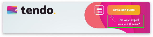
- Tendoloan, Payday UK — important little things to calm the user down.
- Starupxplore — systemised digestible content with clickable links.
- Stock Crowd IN — immersive background video.
- Monethera — handy calculators.
- Crowdhouse — video testimonials.
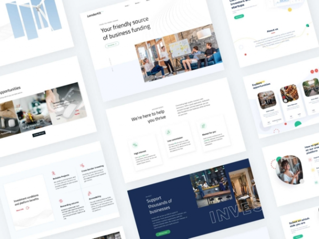
LenderKit — crowdfunding software with professionally designed themes
We have helped several crowdfunding businesses build their platforms: CapitalRise, Shojin, Homegrown, InvestMySchool and Glenhawk. Check our portfolio to see how they’re set out and look, and you may find the design solutions you’ve been seeking for long.
For those who want to start the fundraising business, we’ve got LenderKit — crowdfunding platform software.
It’s a hybrid solution that can work as a plug-and-play platform, or we can customise it for your specific business flows.
You can choose from several off-the-shelf design layouts specifically designed to promote your business. Each theme is integrated with the LenderKit admin back office and web portal, so you can launch the crowdfunding platform faster and at a lower cost if required.
Other benefits of LenderKit themes:
- in-built theme builder to design custom landing pages;
- themes help you promoting services at early stages;
- cross-device responsive design;
- theme designs comply with the investment flow;
- KYC-ready investor onboarding.
Check LenderKit themes and let us know whether you’d like a guided demo!
The takeaway
We hope the best examples of a crowdfunding platform design we’ve studied out together gave you a couple of good ideas.
The main takeaway (and this is what we implement in practice) is human-centred design.
Only those crowdfunding sites which are built on user patterns and evoke proper emotions have high conversion rates.
The design shouldn’t be necessarily intricate with massive forms or tons of animation. You can make it simple with the right accents and user-friendly elements.