A while ago we reviewed the must-have features of a real estate investment website which is a subclass of investment websites in general.
If you plan to build your own crowdfunding platform or investment website, the features below would give you ideas for your own business.
What you will learn:
A successful investment platform feature list
The digital-only experience, gamification, virtual assistants – financial institutions flirt with customers to enhance user engagement, increase conversions, and get more leads.
And revenue, of course.
Why do financial institutions need a good website?
The benefits a robust financial platform brings are numerous:
- customers tend to take you more seriously;
- you can reach out to more people;
- a website is to show off your services and expertise;
- it is much easier for web surfers to contact you online;
- you can take advantage of digital marketing tools;
- finally, an eye-catching site is an excellent way to impress visitors.
Who will use your website?
We presume your target audience can be quite mixed: regular clients and prospects, startups, other businesses and potential partners, regulatory bodies, online readers, competitors.
However, the web is full of boring static financial templates that look formal and shower you with lots of things at once. For this reason, the search for information becomes a difficult quest that leaves you with nothing but frustration.
If you’d like to make a difference, check our collection of financial website designs that will impress you right away.
This website by Triodos Bank is made by humans and for humans.
A funny captcha game launched when you open the landing page is humorous and non-obtrusive. Well, you can actually skip it, but we suggest that you go ahead and play around a little bit.

The comprehensive navigation and minimalistic content make surfing a portal a real breeze.
It’s easy to see who the website is targeted for, however, instead of building a regular menu with regular labels the website talks to the visitors and encourages them to click the “answers” that take them to separate pages with more information on the investing process.

The video commercial on the landing page adds vivacity and doesn’t affect the overall loading speed.
Astella Investimentos
The online presence of Astella Investimentos is a combo of a stylish design, interactive interface, and relevant content.
Following hot trends such as translucent buttons, micro-interactions, huge images, and many call-to-actions helps the firm to encourage random strangers to convert into paying clients.
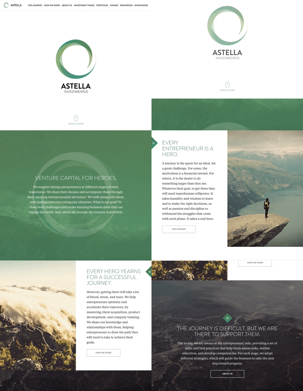
The menu is brief, intuitive and it eliminates any sufficient efforts needed to find specific content.
IEX
The digital marketplace crafted by IEX is geared towards backers and businesses interested in trading securities online. Despite the complicated nature, the platform doesn’t look cluttered.
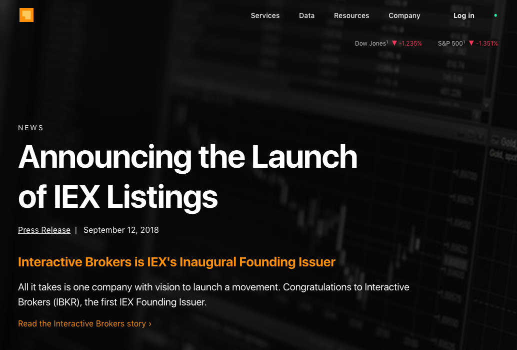
The concise menu and the navigation scheme in the footer mirror the site structure.
What we like about this example is the login area for users, interactive calculators, and embedded stats sections. Besides, they definitely figured how to talk to their audience and what key aspect of the cooperation to highlight.
Tetley Investments
Another living example of an efficient implementation of web design mainstreams.
The high-quality video on the “About us” page tells the company’s business story better than thousands of words.
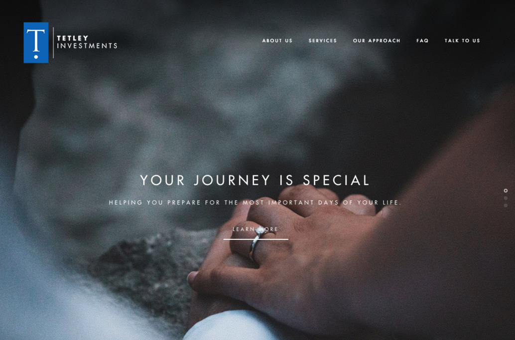
The “Services” page is a successful pair of Media + Copy that allows online readers to skim the internal web pages easily. When you drop by this site, you can easily find what you seek – be it the frequently asked questions, company’s social profiles, or a place to get in touch.
Exante
The Exante trading project offers to run all your investments at one single place by opening a multi-currency account.
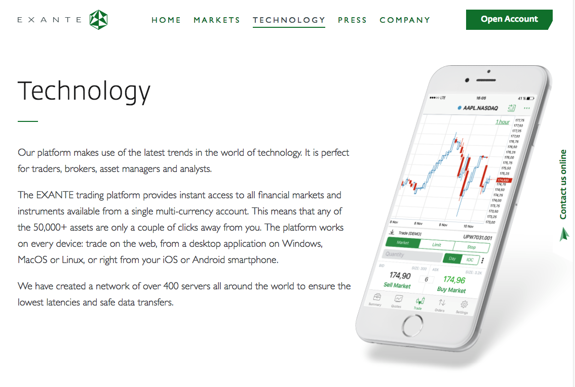
Among the top features of this site are:
- personal accounts for users;
- a mobile application;
- sophisticated animation showcasing the current state of the market;
- a built-in live chat;
- a recent news section;
- a fat footer.
Essential features for the investment website
All the above-mentioned examples of financial websites have something in common – a list of features that sets them apart from the crowd. Let’s have a closer look at the key features of a successful investment site.
Admin area for users
The login feature is a real must-have for any financial website that is user-oriented and conversion-driven.
A personal profile with basic and advanced functions will serve as a private office for your clients where they can create a portfolio, track current investments and view the situation on the market.
Make the signup procedure light and easy in order not to scare off the users. You may even opt for the registration via social profiles so that accounts can be created instantly.
Some investment companies offer a questionnaire to users so that they can pick up an investing approach that matches their personal goals best. This also serves as a marketing tool to qualify your audience and get a better understanding of their needs.
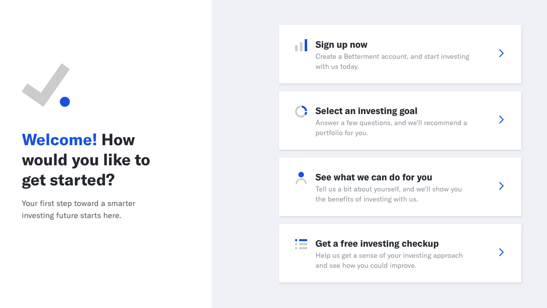
To take the load off your tech support, create a guided flow and prompt users what to do at every step of the signup process.
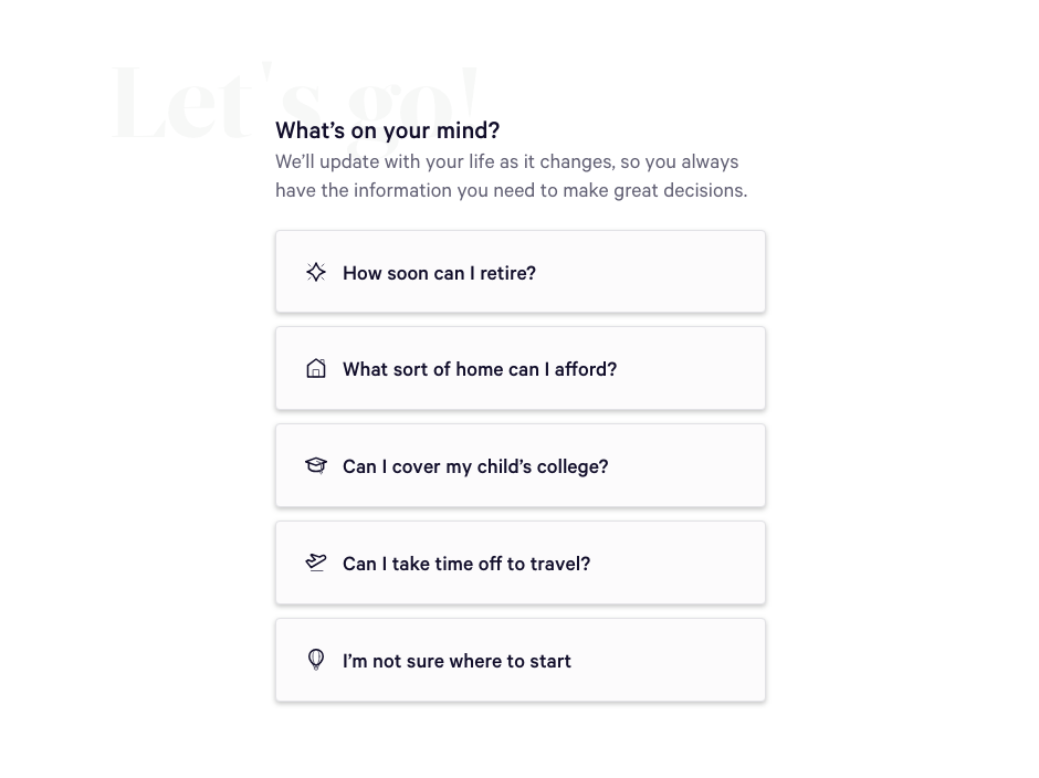
If you want to get a competitive advantage over your rivals, you can equip personal dashboards with the news feed and access to a personal support manager.
Money management tools
Money management tools take a special place on the feature list you need to make if you want to launch an investment website.
People always seek the best way to manage their funds. In the ideal scenario, they can do it easily and quickly in one place. Give your customers powerful dashboards with tools for cash, investment, and credit management.
You can integrate third-party plugins instead of building it all from scratch – saves time and money in the long run.
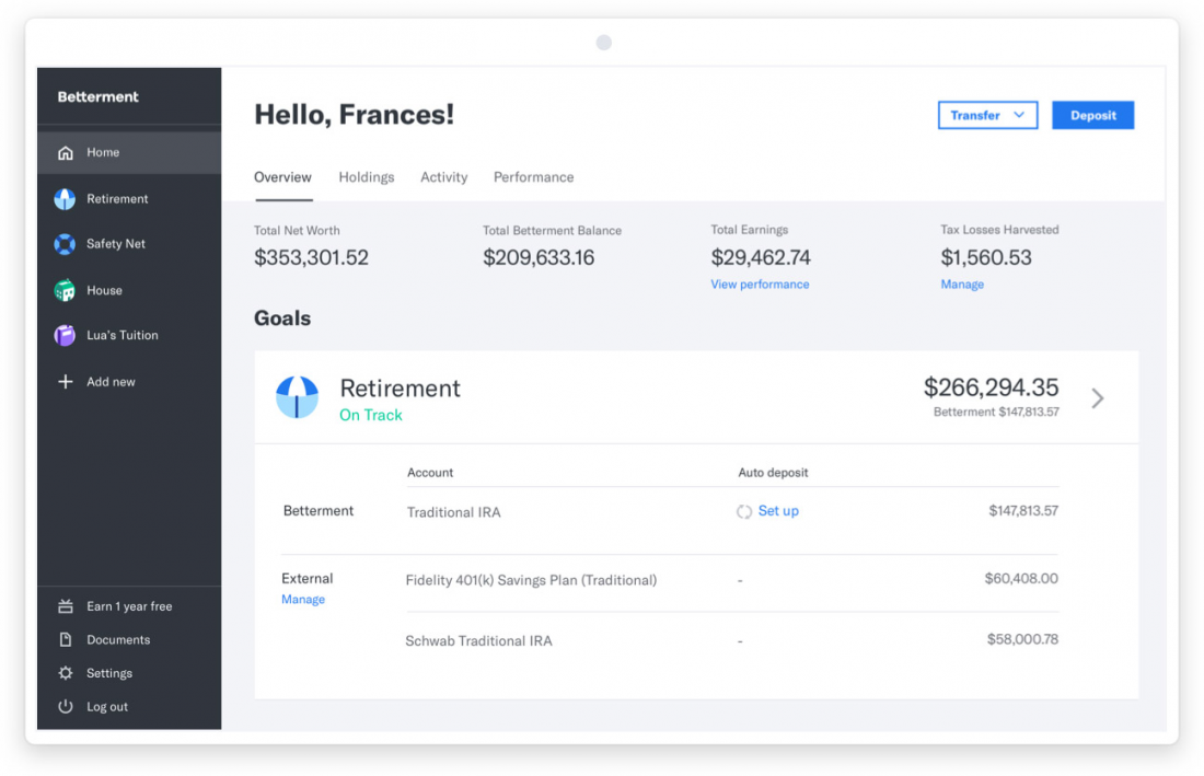
Notify customers about overdue payments and send alerts in case of fraud detection.
All the content should be visually pleasing and informative so take advantage of infographics, pie charts, dynamic bars, etc. Use daily, weekly, and monthly reports to give your clients a clear picture of their financial and investment activity.
An excellent way to increase the loyalty of your clients is to provide concierge services. People will appreciate it if their investment advisors are accessible with a tap of a finger.
Security and privacy protection
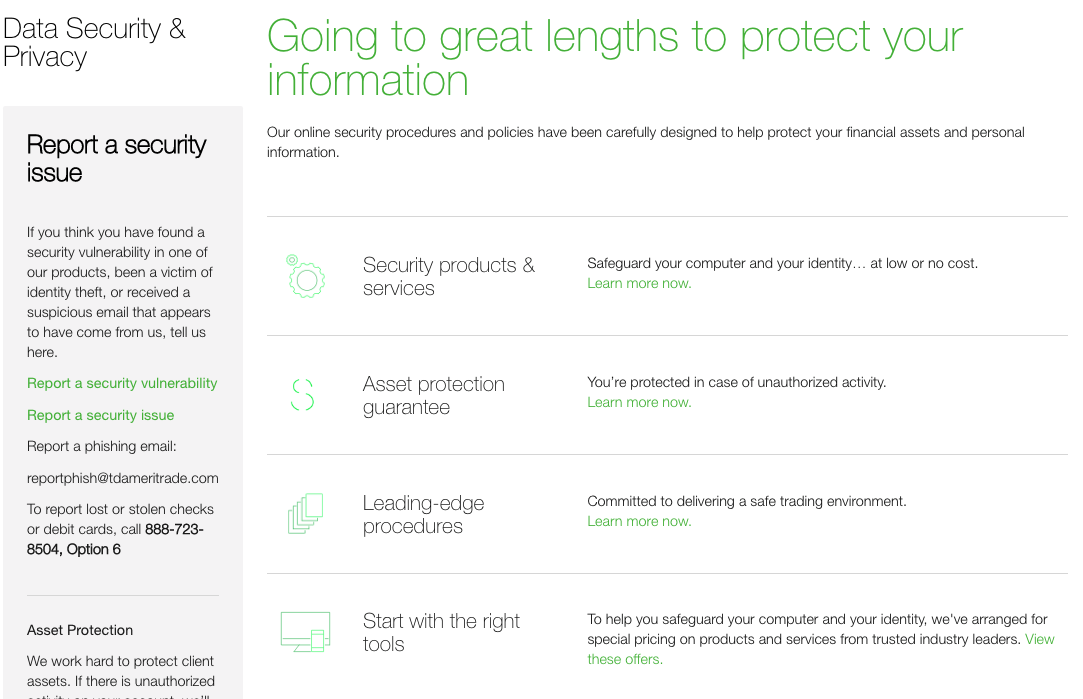
The cardinal rule for every financial institution to follow is enhanced security.
An ever-developing technology forces the appearance of more sophisticated forms of financial fraud. Take the protection of the personal info seriously as people need to be confident that their data won’t be stolen while they interact with your website.
How to make your investment software robust and credible?
- Take proactive measures to prevent DDoS attacks and build a solid IDPS (Intrusion detection and prevention system);
- use encryption algorithms to provide the security of online payments;
- rely on the blockchain technology for large and sensitive transactions;
- protect your platform against phishing techniques;
- develop a gradual sign up procedure and two-factor authentication to protect investors’ funds and personal records;
- make sure that only those employees who are involved in the client support process have full access to personal data.
Remember all the noise about GDPR last year? People’s privacy is not a laughing matter. In fact, it’s become quite a €50 million dollar matter for Google recently, so don’t let it slide.
Your clients should be aware of your security and data protection policy and it’s wise to devote a separate page or create a security centre for this.
Relevant content
Investment website development is just one aspect of creating a digital investment business.
A clever copy is a must. And there’s always the temptation to make long copies describing why you’re the best among competitors.
However, instead of persuading people into using your services, big amounts of textual info force them to close your site and never come back.
Why so?
The point is that the web audience doesn’t want to spend hours browsing your site. They are eager to find out whether or not your services match their needs.
In a perfect world, they want to do it in a few seconds.
Financial services are a complicated thing, and it’s pretty hard to write a winning pitch that will sink into the heart immediately. Some companies are super successful in doing this though.
Take a look at how the guys from Wealthsimple have done it – laconic and informative.

On the homepage, you’ll find the company’s features, services, the pricing list, and key business figures. And have some fun along the way, too.
What is great is that they use plain and friendly language so that even an investing newbie can understand what they mean.
If your portfolio is very sophisticated, you can place some details on a separate page, make a FAQs section or run a blog. In fact, a blog or some sort of a news section is always a good idea.
Product comparison
Another essential thing among the tips for features of an investment website is tools for comparing investment opportunities.
When choosing a basket to put some of their eggs in, backers are very selective.
It, somehow, reminds shopping, a very risky one though. If you don’t like a product, you can’t take your money back.
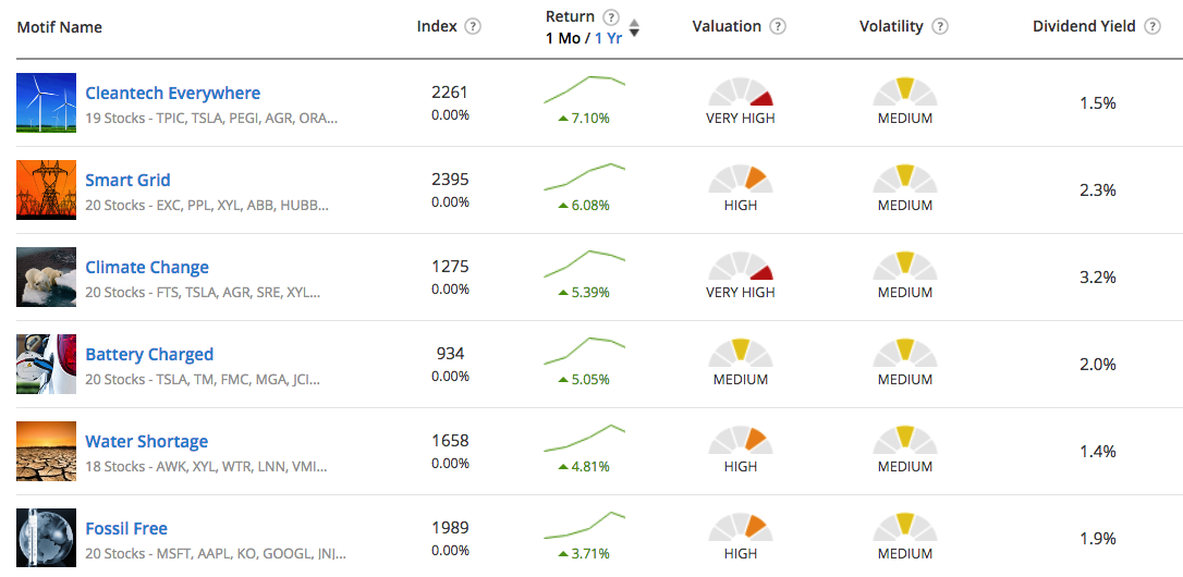
That’s why it is very important to let consumers see the difference between financial proposals, calculate gains, and estimate risks.
How to implement this?
You can embed dynamic charts displaying the key characteristics of each tool.
By switching from one to another, a person can easily understand which fits the bill.
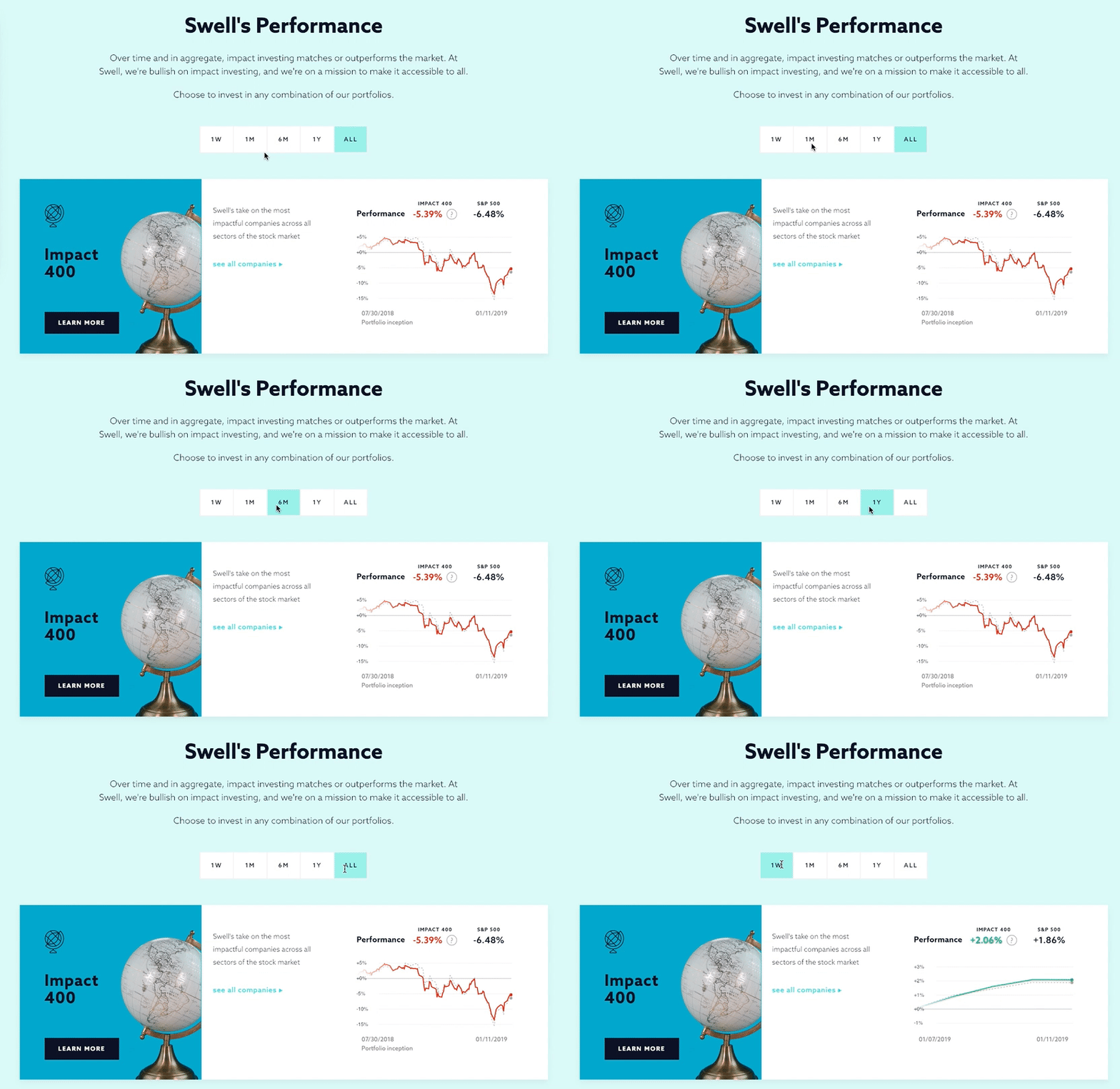
Alternatively, you can opt for charts with interactive sliders which instantly deliver the outcome once the parameters are changed.
The easiest solution may be to create a particular website section with several options where users can set parameters and compare available options.
Powerful mobile app
Do you have a mobile app for your financial platform? If not, you should develop one asap!
A powerful mobile application is by far one of the most important points in your investment website features list.
It gives tons of benefits to you as a business owner:
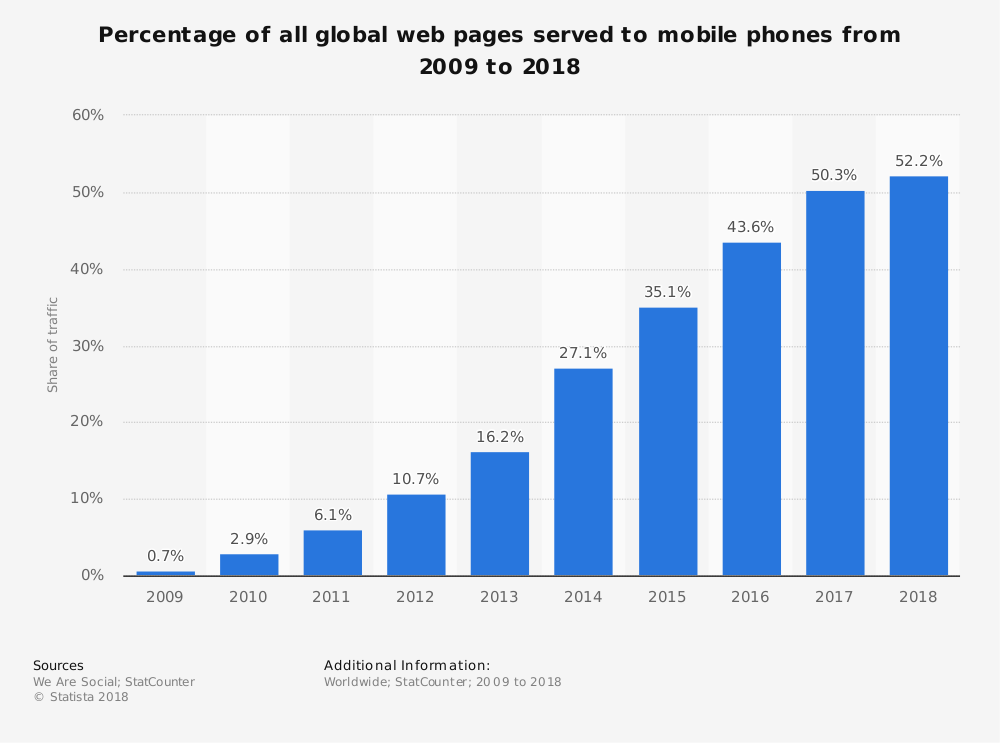
- A mobile app is another funnel for your leads and conversions as more than 52% of the global web traffic in 2018 has come from smartphones;
- users can easily access you without the necessity to add your website URL to bookmarks or memorise it;
- it is a great way to collect users’ info and give them some discounts and special offers based on this data;
- you may want to run marketing campaigns within your app to learn your clientele better;
- push notifications can serve as an excellent method to increase the personalisation of your services;
- finally, not all the investment gurus have a mobile app – create yours to stand out.
Client support
The last in our kit is customer service. The positive shift from the business-oriented to customer-centred approach allows the clients to feel more engagement and care.
Earlier it was difficult for companies to demonstrate the unique concept in assisting consumers because everyone used call centres.
Today there are lots of other and better ways to stand out.
Virtual assistants are becoming incredibly popular. To cut costs and boost user engagement, you can develop a chatbot that will be dealing with typical inquiries.
Reap the benefits of socials. Networks used to be only for private communications, but today they may be applied as another channel for operating customers’ requests.
Game-designed elements. The Digital Generation fancy different “game-based things which they can get in return for the positive feedback, 5-star rating, or app usage.
So, why not to incorporate some of them into your activity?
Videos do matter. As the practice demonstrates, videos have become the most favourite medium of information.
From face-to-face calls and video tutorials to webinars – there is plenty of scope for action.
To finish up
Investing and financial services seem to be the wrong place for creativity and the flight of fantasy. Let’s sum it up:
- Be bold. You can always find a more engaging way to set out your web resource than dull information and dry figures.
- A bit of imagination, advanced technologies, and cutting-edge trends – everything works perfectly for changing the core features of a site into your competitive edge.
- Keep in mind that you work with people and for people. Show that you care, provide excellent customer support, and take great care of private data security.
That was a short overview of the fundamental features of a custom investment website.


